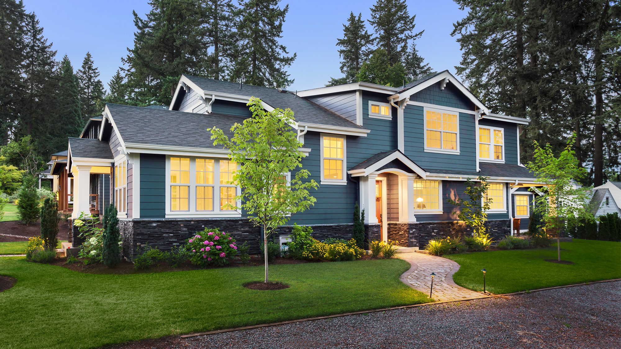
hikesterson/iStock
Choosing a paint color for your home’s exterior can seem like a crazily daunting task. So many options! So crucial in making the right first impression on guests or potential buyers! Should you go with basic beige, ho-hum neutral colors or (way) outside the paintbox?
Thanks in part to influential designers like Joanna Gaines, more homeowners today are stepping away from the traditional paint colors and choosing less common, modern palettes, like cheery teal or moody charcoal gray.
“We’re seeing homeowners go a bit bolder when it comes to curb appeal,” says Erika Woelfel, vice president of color and creative services at Behr. “While variations of white traditionally make a popular exterior paint color choice for many different types of housing styles—and are an easy way to play it safe—dark grays and browns are increasing in popularity … [or] painting the body a bold color like green or blue, or adding a pop of red on the front door.”
Sue Kim, senior color designer at Sherwin-Williams, agrees.
“Accent colors and colorful pastels are suggesting that homeowners are taking a step outside of their comfort zone,” she says.
Here’s a look at some of the top trends in exterior paint colors right now.
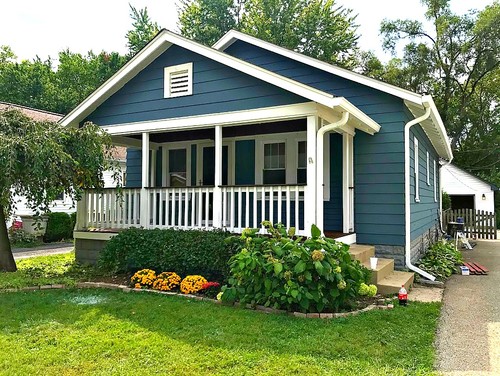
1. Sea blues
Photo by Paintco Professional Painters
Eager to venture beyond a neutral palette, but antsy about committing to too much flashy curb appeal? Watery hues are a charming way to settle the conflict.
From faint skylike shades to rich jewel tones, blues can make a big splash, and don’t get you caught up in the learning curve that more outspoken colors involve. Take Oceanside, Sherwin-Williams’ choice for 2018 Color of the Year—an intense shade of blue-green that, according to the company’s color experts, encapsulates a sense of adventure.
On the contrary, blue—perfect chameleon that it is—can also offer up a serene vibe. Given the technology taking over our days, Kim says, a sea-meets-the-horizon blue lends a feeling of calm when you drive up to your house.
“A light and crisp sea blue provides a renewing moment that we’re craving,” she says.
Try: Sherwin-Williams’ Oceanside or Behr’s Waterfall
———
Watch: The Colors That Will Help and Hurt Your Home Sale
———
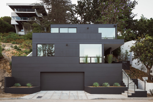
2. All black
Photo by ANX / Aaron Neubert Architects
It might feel like a scary choice, but an eye-catching dark exterior can really make your home (and the trim) stand out.
“An interesting trend we’ve been seeing is all-black exteriors,” says Sue Wadden, director of color marketing at Sherwin-Williams. “It makes a statement and is a marked departure from the light neutrals of Scandinavian design.”
It’s no surprise the look has proven a go-to for certain top-tier celebs. Whether it’s Calvin Klein‘s all-black-and-glass mansion, including shutters and trim, in the Hamptons or, just down the road, Madonna‘s moody black farmhouse-style compound, a black exterior demands a certain degree of chutzpah. But if you can pull the trigger, it’s a contemporary look that conveys a fearless sophistication.
Try: Sherwin-Williams’ Tricorn Black for a bold black, or Benjamin Moore’s Twilight Zone for a matte look.
3. Taupe
Photo by Atelier A Bellavance Architect
If you’re looking for an alternative to beige, greige, or gray, Woelfel recommends a taupe exterior—a cross between dark brown and gray paint colors.
“Grays remain a key neutral for exteriors, but warmer tones in taupe and brown are on the rise,” she says. “Taupe is a great foundation paint color that looks stunning on a variety of architectural types and pairs well with white trim, shutters, and a bright-red front door.”
But a word of caution: When going with taupe (or any shade of brown or gray, really) be sure to consider your home’s position in relation to the sun.
“It will drastically impact how the color appears,” Woelfel says.
Try: Sherwin-Williams’ Tavern Taupe or Behr’s Classic Taupe
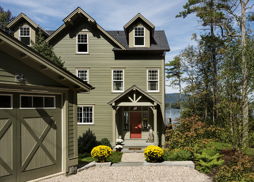
4. Spanish moss
Even if you live in the ‘burbs, a nature-inspired paint color can make your home look and feel more like a retreat. That’s why Vincente Wolf, a spokesman for PPG paints, recommends going with a woodsy green exterior, like Spanish moss—even for the trim.
“It has all the brownish tones of tree bark, which allows the house to slip into nature and makes the greenery pop, too,” Wolf says.
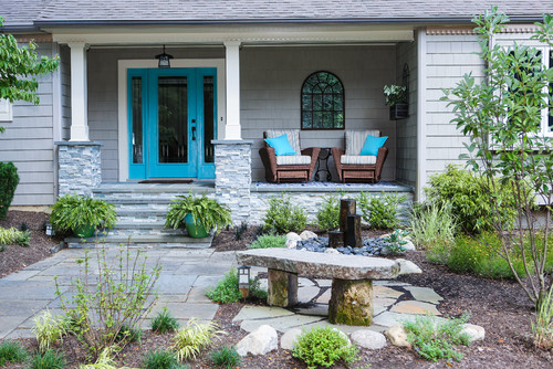
5. Neutral with a bold front door
Not ready to take the plunge on a new paint color, but want to up your curb appeal? Consider a fun front-door color to change the entire look of your exterior. Try a bright red, blue, or even pastel to show off your home’s personality, and cover shutters and trim in a more neutral exterior color.
“A bold color makes an impression on anyone who walks through the front door,” Woelfel says.
Try: Behr’s Flirt Alert or Modern Masters’ Satin Tranquil Blue
The post It’s What’s on the Outside That Matters: 5 Trends in Exterior Home Colors appeared first on Real Estate News & Insights | realtor.com®.

No comments:
Post a Comment