Wednesday, March 24, 2021
10 Minimalist Decor Fails That Make Your Home Look Like a Sad, Lonely Abyss
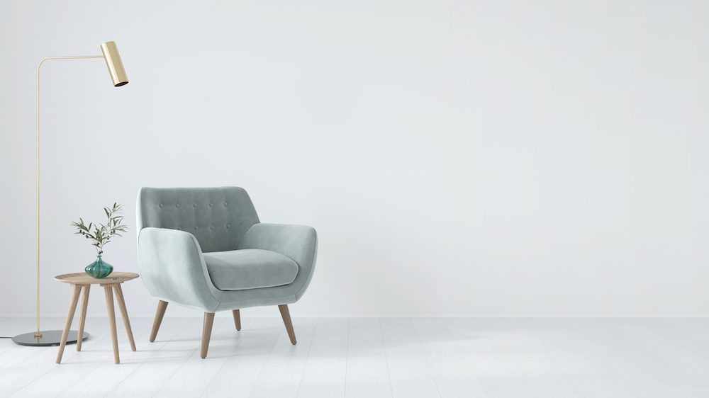
Getty Images
Many of us dream of achieving that minimalist aesthetic we see on design blogs—clean lines of counters and shelves unmarred by clutter, closets and drawers that reveal just a few perfectly displayed items. In a world filled with so much stuff, it totally makes sense that we want to pare down.
Still, though, there’s a fine line between the calm serenity minimalism can bring, and the sad echo chamber that results from taking your purge too far.
Hellloooooo?! Does anyone actually live here in this living room with one couch, one chair, and one (empty) vase? Sure, it’s nice not to face piles of magazines, books, and family photos crammed on surfaces and to simply sip your tea in a serene space—but after a while, it can get a little lonely.
The fix? Don’t go overboard with minimalism in the home. If you’d like to create a living space that’s more like a home and less like a hospital, here are 10 minimalist moves to not try at home.
1. Empty kitchen
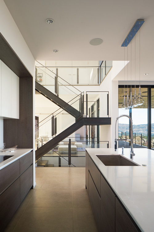 Photo by Stephenson Design Collective
Guess there’s no coffee allowed in a minimalist kitchen, right? If you can’t leave out a single appliance on your countertops, you’ve drunk too much minimalist Kool-Aid. Ditto for the lack of dish towels. These kitchen workhorses don’t have to be bright orange, but you do need a couple on hand. Rethink the efficacy of your look here, and then get back to us.
2. Cold bathroom
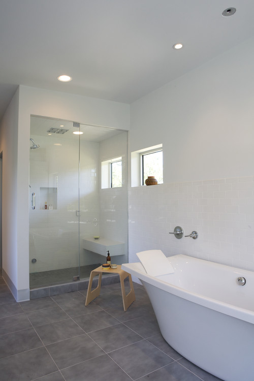
Photo by Webber + Studio, Architects
Um, where are the towels here? And without a bath mat, you’re guaranteed to slip on that tile floor every time you exit the shower. Perhaps that single square of fabric that’s supporting your back in the bathtub is meant to pull triple duty as a wash cloth and hand towel as well? Even so, this look is a complete and utter fail. But at least the lone pot on the window sill adds a tiny bit of color.
3. Barren home office
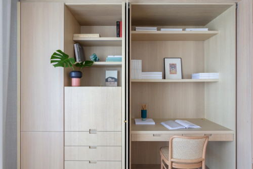
How nice that your thoughts are always organized in that simple journal, and your No. 2 pencils are sharp and ready to go. Plus, nearly all the books sport matching white spines! This plain office is a fantasy, of course, and it’ll likely strike fear in the hearts of most work-from-home drones who need two or three coffee mugs, dozens of scribbled-on sticky notes, and files bursting at the seams in order to be productive.
4. White on white
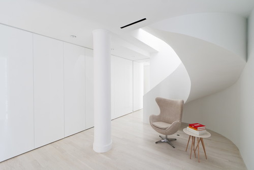 Photo by Resolution: 4 Architecture
Minimalist fans will tell you that 50 shades of white (or gray or greige) is your goal for walls and floors, but we’re here to say that living in this type of space is no picnic. It’ll show scuff marks, crumbs, dog fur, and every single dust bunny. A simple rug is an easy solution here—just vacuum it and you’re done!
5. Fiddle-leaf figs
What is it with that single bamboo leaf in a tall glass cylinder? Or a lone fiddle-leaf fig tree standing sentry in an empty corner? These forays into the natural world are sad attempts at “life” in a lifeless home. Flowers from your local Price Chopper are allowed once in a while, people! Get thee some tulips or daffodils—or at least add a few other stalks to your vases.
6. No storage
Single-use furniture is a big minimalist mistake in the home, in large part because it doesn’t allow you to take advantage of drawers, shelves, nooks, and hidden compartments. With this glass console and tables, you’re stuck with just the top surfaces—and, of course, you’re cowed by the stark style you’re clinging to so you’ve cleared away every possible item.
7. Bare shelves
You get to put one thing on that sideboard or book shelf, so take your time and think carefully. This single piece has to express your life’s goals and personality, yet also look chic and simple. Will you pick a glass bowl or a piece of knotty wood? Stay tuned for next week’s episode of #minimalismisnofun.
8. Uninviting rooms
Can’t wait to watch the big game in this TV room, said no one ever. How much fun is it to jockey for a few inches on the single side table and hear the room echo every time you put down your beer? Don’t expect folks to clamor for an invitation to your house once we’re done with this pandemic.
9. Furniture with missing pieces
Minimalist furniture has simple lines, whether curvy or straight, but it doesn’t have to mean that pieces are missing, like sofa backs or chair arms. Something happened to this set of green leather seats along the way, but we’re not sure exactly what.
10. Empty entryway
This homeowner’s got one hat—and one hat only—and no coats, scarves, dog leash, or other clutter shall grace this threshold. The plant, however, is there to greet her at the end of a long day. This lonely foyer is enough to make you cry out for an Amazon box, some junk mail, or just a mat on which to wipe your minimalist feet. Alas, it’s not allowed here (clean ’em off outside).
The post 10 Minimalist Decor Fails That Make Your Home Look Like a Sad, Lonely Abyss appeared first on Real Estate News & Insights | realtor.com®.
Tuesday, March 23, 2021
‘Rock the Block’ Reveals One Design Move That Just Doesn’t Work

HGTV
Season 2 of “Rock the Block” has created some incredible kitchens and living spaces, but now, the competitors must move on to their master suites.
In the latest episode, “Rock the Main Bedrooms,” the host, Ty Pennington, introduces the guest judges, Egypt Sherrod from “Flipping Virgins” and her husband, the DJ Mike Jackson. These two will judge the four design teams on their bedroom suites and on how much value their upgrades add to these homes.
With a total of $225,000 for renovating the home, these four teams will need to stick to a strict budget this round, in order to save enough money for the rest of the house.
Check out how each pair of designers re-envisions the space they’re working on, and you might be inspired to change up your own sleeping quarters, too.
Curtains on a wall never really work

HGTV
Two of the contestants, Nate Berkus and Jeremiah Brent of “Nate and Jeremiah: Save My House,” want to make their master bedroom memorable, so they decide to add floor-to-ceiling curtains on the headboard wall.
They reason that this feature will make the room feel plush and cozy, while adding visual interest.
Unfortunately, once the curtains are up, it’s clear that this design move just doesn’t work. The guest judges hate the look.
Sherrod says that she thinks the curtains shrink the room, while Jackson points out, “It almost feels as if there’s unfinished work behind there.”
Apparently, Berkus and Brent should have gone the more traditional route of paint or wallpaper for a feature wall. Next time, perhaps they’ll keep their curtains on the windows.
Stretch a feature wall across the ceiling for a bold look

HGTV
After losing the bedroom challenge last season, Alison Victoria of “Windy City Rehab” is determined to impress with this bedroom suite.
She tells her partner, Mike Holmes from “Holmes on Homes,” that she built a headboard wall last season, but it wasn’t bold enough.
This time, she wants to build a wood headboard wall that stretches up and across the ceiling.

HGTV
“The headboard wall and the ceiling, they’re going to be the first thing the judges see when they walk in,” Victoria says. “So it’s really just got to set the tone for the entire suite.”
She adds that she feels that reclaimed wood is so warm, “It’s perfect for a bedroom, where people just want to feel the most at home.”
Victoria uses reclaimed wood with an adhesive backing for the showstopping look. It’s a smart and easy way to make a big first impression.
Ombre tile is a new style that truly wows

HGTV
With an impressive bedroom design, Victoria and Holmes want to continue to impress in the bathroom. Victoria comes up with the idea of using an ombre tile design, with dark tile on top that transitions to pure white tile below.
“I love the tile, because it’s so different,” Holmes says when the tile is up.
However, Victoria knows that the grout will be the difficult part of these walls. She plans to use two different grouts, a dark grout up top and a light grout below, and midway, blending them together, just like the tile colors.
“It is a giant risk trying to go with two different grouts and trying to blend those grouts to make it ombre like the tile,” Victoria says. “If it doesn’t come out right, I’m gonna risk the win for us.”
Luckily, Victoria’s tile and grout work together well and the bathroom looks amazing. It’s a dramatic blend of light and dark that really makes this space stand out.
There’s more than one way to mix light and dark tiles

HGTV
While Victoria’s ombre wall is impressive, there are other ways to mix light and dark. David Bromstad of “My Lottery Dream Home” and Tiffany Brooks of “50K Three Ways” give their master bathroom some dramatic tile, too.
“I’m sure everyone’s expecting us to do green or a blush—or some sort of blue even,” Bromstad says. “No, no, no—black: black shower. It’s going to be so sexy.”
They choose a bold black tile for the shower and one wall behind the bathtub, then a creamy beige for the rest of the room.
The two colors look great together, creating a unique look that’s stylish and memorable.
“The higher the contrast that you have, like blacks and whites,” Bromstad says, “the more elegant the space is going to be. It’s like a tuxedo.”
Combine the closet and laundry room for more convenience

HGTV
Mika Kleinschmidt of “100 Day Dream Home” admits that the other three teams have demonstrated impressive skills. She’s not sure that she and her husband, Brian, will be able to create the same bold looks.
“I don’t think that we’re going to out-design our competitors,” Mika says. “I do think we can be creative about layouts, things that they won’t think about.”
So, while the three other teams put most of their focus into the bedroom and bathroom, Brian and Mika work hard to make their closet ultra-functional. They break down a wall to connect the master closet to the laundry room, creating a massive and highly convenient space.

HGTV
‘Rock the Block’: Who wins this round?
While the judges are impressed with all the bedrooms, Victoria’s ombre tile and chic wood headboard wall get the win this time.
So, Victoria and Holmes get to take home their second victory of the season, proving that sometimes, taking design risks can really pay off.
The post ‘Rock the Block’ Reveals One Design Move That Just Doesn’t Work appeared first on Real Estate News & Insights | realtor.com®.
Sayonara, Shiplap? 5 Styles Chip and Joanna Gaines Have Ditched—and What’s Taken Their Place

Discovery+
Chip and Joanna Gaines are home renovation royalty. They’ve gone from the debut of their smash hit, HGTV show “Fixer Upper,” in 2013 to running their own network, Magnolia.
A large part of their success (aside from their adorableness as a couple) is their keen sense of design, which they’ve honed into a highly marketable style known as modern farmhouse. And while the tenets of their signature style have endured (think: reclaimed wood, white paint, comfortable no-frills furniture), their aesthetic hasn’t remained static by any means, and has evolved over time.
Curious to see how Chip and Joanna’s decor style has changed over the years? Here’s a look at some of their early fads that have since faded from their repertoire, and the new styles that have taken their place.
1. Chip and Jo’s old style: Painted brick

HGTV
The new style: Let brick’s natural color shine

Discovery+
While Chip and Joanna were all about painted brick a few years back (whether it be on a fireplace, an exterior, or a feature wall), in their new show “Fixer Upper: Welcome Home,” Chip and Jo warn against being too quick to paint old brick.
“When you paint brick, it’s a bit of a controversial thing,” Chip says to one client in the episode “Planting Roots in Waco.” “This antique brick—like, people pay a lot of money to get this cool, old brick—it would be a disservice to this brick to paint it when it’s this cool-looking.”
2. Chip and Jo’s old style: Lots of black accents

HGTV
The new style: More colorful designs

Discovery+
Chip and Jo once filled their fixer-uppers with lots of black accents; but these days, Jo incorporates more color into her designs.
In the “Fixer Upper: Welcome Home” episode “Girls’ Home Reimagined,” she decorates a girls’ home, filling the homework room with blush-pink chairs and a deep-green wall color.
In the episode, Jo explains that her choices are based on color psychology.
“I was looking into, like, the psychology of colors, and green is peace and calming and stability, and then the blush is more for the idea of, like, youthfulness,” Joanna explains. “And so I just kept thinking hopefully these colors, without words, it just makes these girls feel safe and comfortable in here.”
3. Chip and Jo’s old style: So much shiplap

HGTV
The new style: Wallpaper accents

Discovery+
Chip and Joanna were once known for their ample use of shiplap. But these days, it seems they’ve replaced their old favorite wall siding with wallpaper.
So far in their current series “Fixer Upper: Welcome Home,” they haven’t used shiplap at all. They have, however, used some excellent wallpaper to bring some interest to a room. In the episode “Modern Take on Old-world Charm,” they go all-out by putting wallpaper on a ceiling!
“It just feels like there’s a lot of visual interest kind of everywhere you look, but it is still subtle and simple,” Joanna says of the wallpaper accent.
It’s a great look, and while wallpaper gives a different vibe than shiplap, it still has that identifiable Chip-and-Jo look.
4. Chip and Jo’s old style: Massive front porches

HGTV
The new style: Simple home exteriors

Discovery+
In the old days, Chip and Joanna often added front porches to their fixes. They knew that a little bit of sitting space out front was a great way to make a home feel bigger and make the exterior look more welcoming. However, their most recent renovations on “Fixer Upper: Welcome Home” don’t include a front porch at all.
Instead, they spend their budget on other exterior features. For example, in one episode they splurge on some fancy copper gutters.
“When I think about this cream exterior, with these antique shutters, a French blue door, copper gutters is, like, perfect,” Joanna says.
So while Chip and Jo may be building fewer porches, their exteriors still look stunning.
5. Chip and Jo’s old style: Dark kitchen counters

HGTV
The new style: Light countertops

Discovery+
Chip and Jo used to do a lot of dark countertops in the kitchen. The dark color would give the space some extra chic style, but when they used dark cabinets as well, it would make the kitchen look a little too moody. However, Jo has fixed that in recent renovations by using white countertops, which perfectly complement the dark cabinets she still loves.
These light counters are a small change, but it’s clear that they make a big difference.
The post Sayonara, Shiplap? 5 Styles Chip and Joanna Gaines Have Ditched—and What’s Taken Their Place appeared first on Real Estate News & Insights | realtor.com®.
Monday, March 22, 2021
4 Essential Tips for Updating Your Kitchen Countertops

Getty Images
Countertops can make or break a kitchen. Over time, any well-used work surface for meal prep, dining, and cleanup endures normal wear and tear. But if your countertops have seen better days and you’re feeling stuck in a kitchen design rut, it might be time for an upgrade.
“Countertops play an integral part in a kitchen’s aesthetic and functionality,” says Young Huh, a New York City–based interior designer. “It’s an update that instantly modernizes the look of the room and can truly change how you cook and enjoy the space.”
Think you’re the only one mulling over a kitchen countertop revamp? Think again. In a recent kitchen trends survey by Houzz, countertops came in as the most popular feature renovating homeowners plan to upgrade.
If you’re ready to upgrade your kitchen countertops but have no idea where to start, the following must-know tips will point you in the right direction.
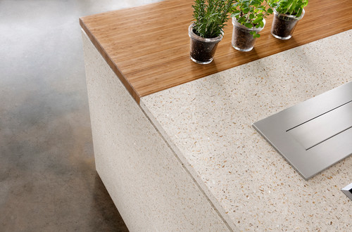
1. Prioritize zero-maintenance materials

Silestone
For red wine and coffee lovers or home chefs who cook frequently with olive oil (which can wreak havoc on natural stone), experts suggest opting for engineered stone countertops that are resistant to damage and stains.
“Zero-maintenance surfacing is a top client request for both kitchen and bath updates,” says Huh. “They want a surface that captures the drama of natural stone without the constant sealing and upkeep.”
And amateur cooks aren’t the only ones who see the value of engineered stone. Chef Thomas Keller selected Dekton for kitchen countertops when he renovated his flagship restaurant, the French Laundry, in Yountville, CA. Culinary influencer and cookbook author Amanda Frederickson selected Silestone for her Nashville, TN, kitchen.
“When we began planning the kitchen renovation, I initially considered marble because I love its texture and feel,” says Frederickson. “But then I realized for someone who cooks as often as I do, it would have been a mistake. They would have gotten stained from accidentally dropping acidic food on them or chipped with all the pots and pans that go through my kitchen.”

Silestone
Kevin Busch, vice president of operations for Mr. Handyman, says granite kitchen countertops are currently among the most popular.
“These countertops can be customized to fit the unique look and feel of your kitchen,” he says.
Busch says they rank high in durability, last long, and maintain their original look. Costs typically range from $50 to $80 per square foot but can be more costly with more exotic slabs.
For a marble look without the hassle, Huh recommends and also uses Et Calacatta Gold from Silestone or Dekton Aura 15. Huh says both are durable, require no sealing, and have low or zero porosity.
“You can truly live in the space without worry of stains from everyday use,” says Huh.
2. Mix, match, and get moody

Dekton
Homeowners nowadays aren’t afraid to play with color and are even willing to take their countertops to a darker, more dramatic place.
“While white may be a safe mainstay when it comes to kitchen design, many of my clients have been turning toward warmer, darker hues in their kitchen palettes,” says Richard T. Anuszkiewicz, an interior designer in Nashville, TN. “I love this pivot as it naturally brings a distinctive element to the space.”
Two of his favorite countertops are Dekton Kelya and Dekton Laurent.
Busch says wood typically isn’t the first material that comes to mind when thinking about kitchen countertops, but “a high-quality wood can create a stunning, vibrant, and long-lasting countertop.”
Pricing can range widely, depending on wood type, but Busch says butcher block countertops tend to range from $30 to $85 per square foot for materials only.
3. Keep countertop trends in mind
Trends rise and fall so you never want to fill your kitchen with design choices that’ll age poorly. But there are some current countertop trends that experts believe will stand the test of time.
Huh loves the cohesive look of matching the countertop material with the backsplash. “It creates a very clean, European style that’s emerging in the U.S. market,” she says.
If you have the space, go for a waterfall-edge island like the one in Frederickson’s kitchen.
“It’s full of drama and instantly pulls your eye into the space,” says Huh. Frederickson also used the quartz surfacing as a backsplash, and topped it with a shallow shelf to keep spices nearby while she cooks.
Experts also advise homeowners to look at the thickness of the countertop they’re buying and stick with slimmer formats. Typically, a thinner the countertop will be more affordable and easier to install.
4. Go eco-friendly
“More and more of my clients are prioritizing eco-friendly materials with smaller carbon footprints,” Huh says. For homeowners seeking such countertops, there are a variety of options out there.
Silestone, for example, offers an engineered quartz that is produced with 100% reusable energy.
Busch says countertops made of recycled glass and cement can be a great way to add a clean, industrial, durable surface to a kitchen. This type of countertop costs about $100 to $160 per square foot.
“Sturdy and visually appealing, this countertop material can be customized and is a top choice for those seeking a green alternative,” says Busch.
The post 4 Essential Tips for Updating Your Kitchen Countertops appeared first on Real Estate News & Insights | realtor.com®.
The Year’s Biggest Bedroom Design Trends Are So Dreamy They’ll Make You Forget 2020 Ever Happened

Tessa Neustadt/Houzz
The last year of quarantine had every room doing double duty, but some would say the bedroom bore the brunt of the multifunction trend. That’s because the boudoir was no longer just for sleeping but also for working and learning (or retreating from those in your home who were also working or learning).
And now that 2020 is sufficiently far in the rear-view mirror, you might be interested in upgrading this retreat for actual R&R. Yes, it’s time to look toward the new design trends of 2021.
This year will see decor that makes your bedroom feel more intimate and personal while expanding its uses permanently. Trends this year add warmth and uniqueness to bedrooms, turning them into a relaxed and calming environment.
Here’s how you can build a better bedroom that’s an oasis of comfort and a place to recharge any time of the day.
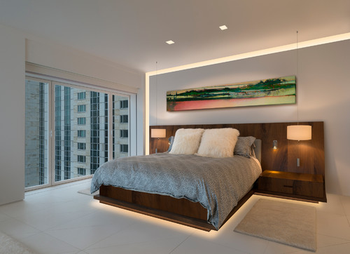
Canopy beds
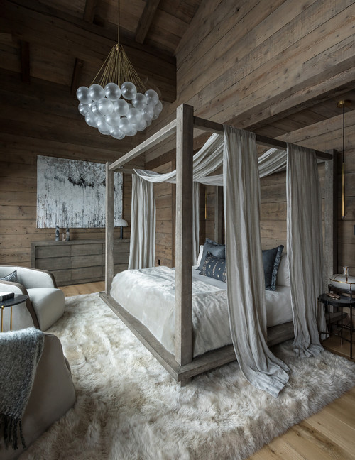
The most important piece of furniture in any bedroom is, well, the bed. And this year, we’re ditching the mattress on a ho-hum frame and trading up for a statement bed.
“More homeowners are choosing canopy beds for their master bedroom in 2021,” says Kelly Marohl, owner and interior designer at The Greenspring Home in Baltimore. “The height of a canopy bed draws your eye upward and makes a huge statement when you walk into the room.”
As canopy beds are becoming more popular, you can find one in just about any style, such as wood, metal, and even upholstery.
Headboards are happening
Fitting right in with the statement bed trend, headboards are also having a moment right now.
“Headboards are becoming a big focal point as the trend moves away from a minimal look,” says Cara Newhart, an interior designer and host of the “Make Space” podcast. “Oversized, upholstered headboards create a showstopping accent wall.”
Big, bold headboards featuring a statement fabric like velvet are in, as are textured ones with caning or fluted trim.
Armchairs that you’ll actually use
Photo by Wesley-Wayne Interiors, LLC
Some armchairs are pretty objects to look at—or pile laundry on—that never actually see active duty as seats. But as we’re home more, armchairs are getting more use. It simply comes down to incorporating some extra functionality into our existing spaces.
“Having even just one more space to sit and read a book in that feels fresh can be a game changer,” says Newhart.
Look for accent chairs with a focus on texture such as cerused (or limed) or warm woods with rattan, wicker, or cane details. And if you love color, consider a bold pattern or statement fabric (think velvet) to add interest and personality.
Going green
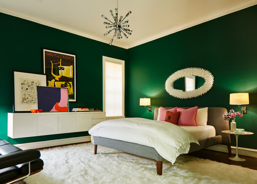
“One color and its many shades that’s trending is green,” says Phillip Ash, founder of Pro Paint Corner. “Emerald green is rich, warm, and brings to mind nature and the outdoors. We all could do with an outdoor pick-me-up!”
For bedrooms doubling as offices, two-toning the color on the walls between emerald green and cream is a perfect way to divide your office area from your bed.
“These colors have been proven to emit a welcoming and peaceful feeling,” adds Ash.
Desks for nightstands
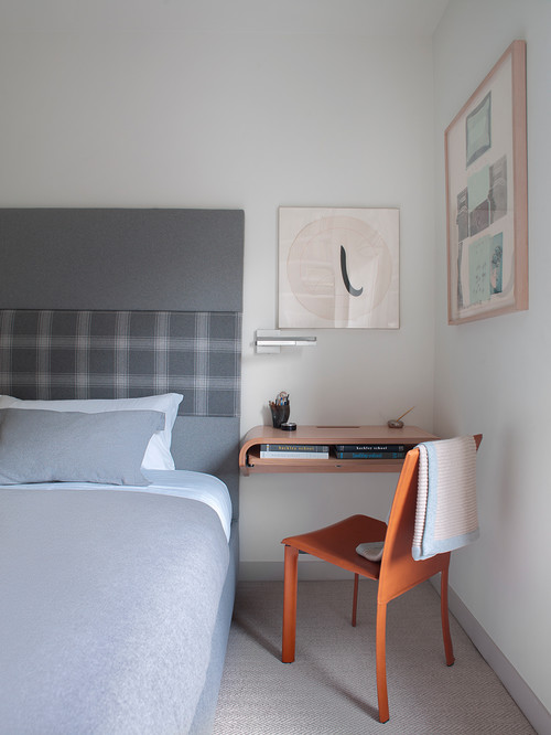
Photo by larson architecture works
“A design strategy I’ve loved forever is finally getting some major traction: replacing your nightstand with a gorgeous desk,” says Newhart. “This not only adds additional functionality to your bedroom but also fills in the awkward corner space that’s leftover when you opt for a smaller-sized nightstand.”
Bonus: Many new desks come with charger drawers for your tech.
Mindful lighting
The perfect lighting is a game changer in the bedroom. And you can expect that this year, the classic setup of a ceiling light and two matching bedside lamps is getting revamped.
“People are rethinking their bedroom lighting by adding floor lamps, swapping table lamps for plug-in wall sconces, and trying out lighting trends such as lining the edges of the ceiling and wall with LED strip lighting,” says Newhart.
Other lighting upgrades include bulbs that change colors depending on the time of day. The color temperature of the light during the day is cooler and bluer. And in the evening, the bulb gets warmer and more orange to better support sleep.
Detailed dressers
2021 is all about squeezing texture in anywhere and everywhere. So look for dressers with fluted fronts or caning on drawer fronts as well.
“Other popular textures are focused on natural elements in warm palettes such as wood tones, woven rattan, and cane webbing,” says Newhart. “Hardware-wise, matte black is having a moment, as is wooden hardware that complements the natural textures on the dresser.”
The post The Year’s Biggest Bedroom Design Trends Are So Dreamy They’ll Make You Forget 2020 Ever Happened appeared first on Real Estate News & Insights | realtor.com®.
Need a Vacation? ‘Home Town’ Reveals How To Have One at Home

HGTV
On “Home Town,” Erin and Ben Napier work hard to make new houses feel like home, but in the latest episode, they meet a client who’s pining for a vacation getaway. Can her house be renovated to feel like a ritzy resort?
In the Season 5 episode “Retreat Yourself,” Erin and Ben are helping their own show’s producer, Angie Tarrant, find a new home in Laurel, MS. Tarrant ends up buying a 1910 Victorian for $170,000, which leaves Ben and Erin with a renovation budget of $140,000.
After living in New York City, Tarrant is excited to settle down in a small town, but she’s also itching for the luxuries of a five-star hotel.
“We love vacationing. We love going to resorts,” Tarrant says. “What I would like to do is feel that way at home.”
Here’s how Erin and Ben infuse this old home with vacation vibes, which contains plenty of lessons that might inspire some changes around your own abode, too.
Make a statement with a bold house color

HGTV
Erin knows that Tarrant loves bold, saturated colors, so she decides to take a risk and paint the house orange.
However, Erin knows that she’ll need to use just the right tone of orange, or the house could look too wild. She tests different colors on the side of the house and chooses a soft, pumpkin hue. The warm tone stands out without seeming too eccentric.

HGTV
When the color is finally on the house, Erin says that she’s relieved to see how it turned out.
“Sometimes you think you’ve swatched it enough and you’ve made the right choice,” she says. “And then you see a lot of it and you’re, like, ‘Oh this is a little stronger than I thought it’d be.'”
Sometimes making a bold choice can really pay off. When Tarrant finally sees her house, she loves its unique look: The house is warm and playful, the perfect vibe for someone new in town.
Pick a front door that matches the exterior style

HGTV
From the very beginning of this project, Erin is determined to replace the dated front door.
“I hate leaded glass,” Erin says. “I want to find a historic door that is appropriate for the architecture.”
So she finds an antique door that complements the 1910 architecture and stains it so that it has a natural wood tone.
“We’re going to stain it so that’ll be, like, this quiet, natural wood moment in an otherwise vibrant color palette,” Erin says.
In the end, it’s a beautiful door that matches the classic architecture of the house and also complements the new color.
This proves that sometimes a house doesn’t need exterior work. Sometimes simply switching out the front door updates the whole look of the house.
Add ocean vibes with mermaid tile

HGTV
Tarrant has a deep connection to Florida because that’s where her mother lived before passing away recently. So when Tarrant says she’d like her house to feel like a resort, Erin decides it should feel like a Florida vacation retreat.
But how can Erin transport this Mississippi home to the Sunshine State? With small, Florida-inspired details, of course!

HGTV
For example, Erin uses an ocean-inspired accent tile in the bathroom.
“I want her house to feel like a Key West Victorian, and so Floridian little elements like fish scale, I think that kind of does it,” Erin says.
Tarrant loves the tile pattern, which David, the tile installer, calls “mermaid tile.” It’s a fun, nautical nod, and since Erin uses it only in the shower niche, it gives a suggestion of the coast without making the bathroom feel like it’s themed.
Rearrange plain tile for a fresh look

HGTV
While the right tile can make all the difference in a shower, Erin knows it can change the look of a kitchen, too. She smartly chooses a plain, average tile with stripes, but she lays them in a pattern so that the lines go in different directions, creating visual interest and a unique look.
“It’s going to kind of look like a seersucker quilt,” Erin tells Ben.
When the backsplash is done, the tile looks great. The pattern makes this simple tile look like a unique (and far more expensive) feature.

HGTV
When Tarrant finally sees the kitchen, she adores this tile treatment most of all.
“The backsplash is, like, my favorite ever,” Erin says.

HGTV
Give your swimming pool features that feel like a resort

HGTV
Tarrant wants her new home to feel like a luxurious vacation spot. Obviously, she’ll need a relaxing pool—but the pool in her new backyard is ugly, dirty, and far from relaxing.
Still, Erin has a vision for this yard.
The team makes sure to clean up the landscaping, making the yard feel like a lush resort space rather than an overgrown jungle. Then, Ben lays down a new pool liner, which has a pebble print, making the pool feel a little more like a beach. But this liner isn’t just for looks.
“The padding is there to be like a moisture barrier, but if something hits it, it won’t puncture the lining,” Ben says.

HGTV
When the pool is done, Tarrant loves the look, especially the new pool details.
“The liner looks like real rocks, that’s so cool,” she says.
With just a few smart updates, this backyard has turned into a great place to relax.

HGTV
The post Need a Vacation? ‘Home Town’ Reveals How To Have One at Home appeared first on Real Estate News & Insights | realtor.com®.