HGTV; realtor.com
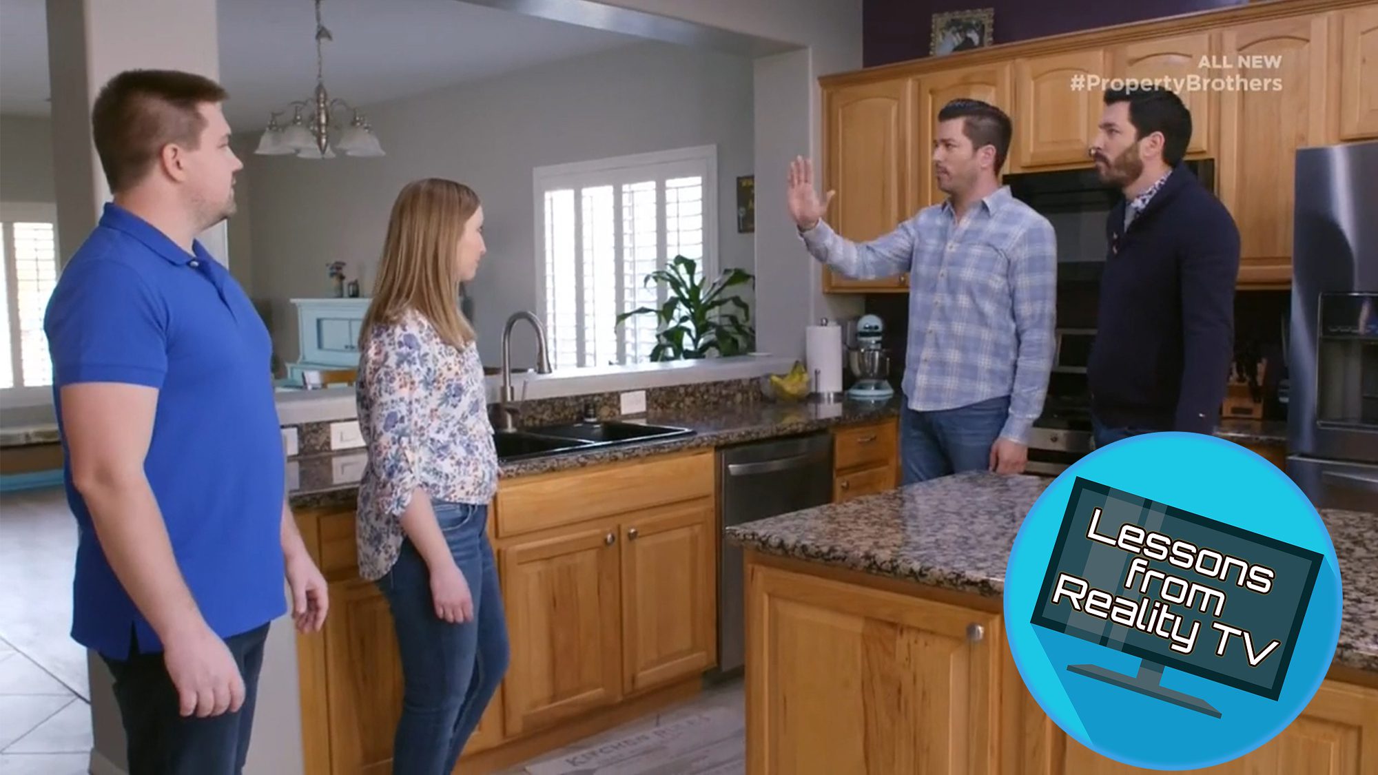
Jonathan and Drew Scott are back for their second season of “Property Brothers: Forever Home,” where they renovate real estate so it fits the homeowners’ needs and lifestyle for the long haul.
And in this season premiere, “Big House, Awkward Layout,” Drew and Jonathan have their work cut out for them with Las Vegas couple Ben and Erica, who are parents of three and stuck with a house that, while large, lacks flow or, for that matter, any real sense of style.
With a (relatively) small $80,000 to renovate with, the Scott brothers have to get creative to upgrade the floors, change the layout, and freshen up the decor. Here’s how they’re able to fulfill every point on this couple’s wish list—read on to learn some of the brothers’ best tips on making a home stylish, colorful, and kid-friendly on the cheap.
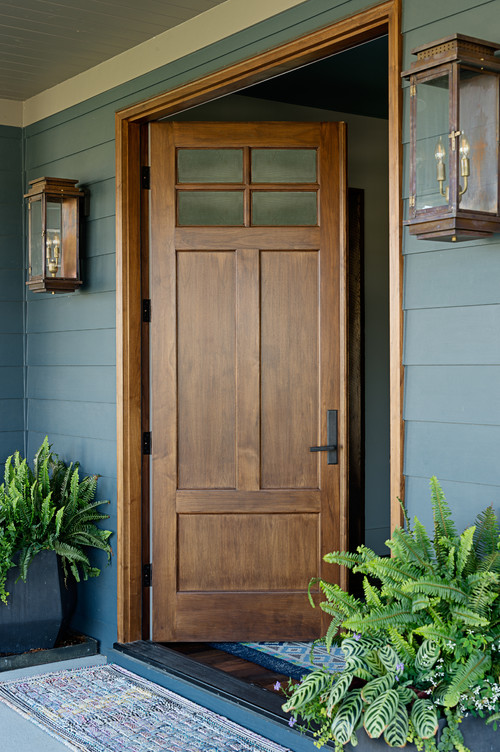
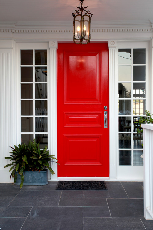
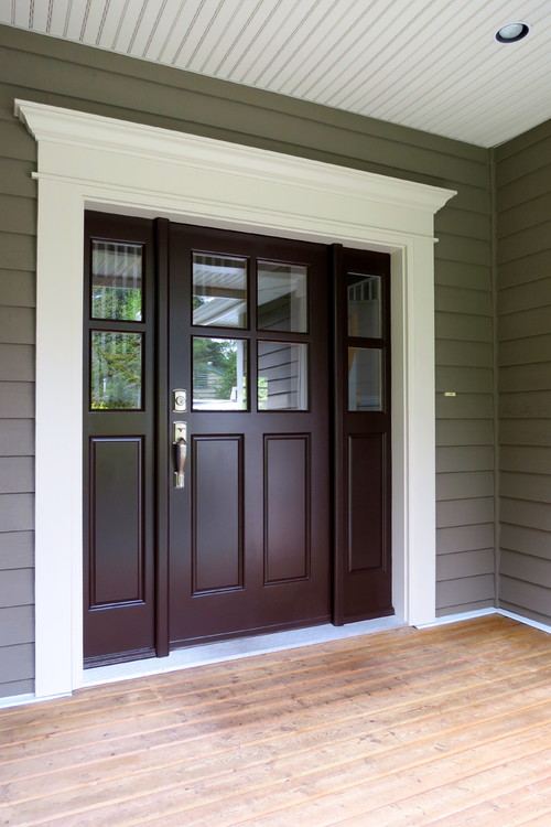
Get more light in your living space with a glass door
From the beginning, Ben and Erica know that they want plenty of light in their home. In fact, when Jonathan’s new floor plan means closing up a window, the couple can’t stop talking about adding another window somewhere else.
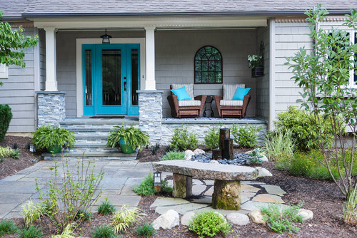
And while, in the end, the couple end up getting all the windows they could possibly want, Drew and Jonathan come up with a trick to stay in budget and still give this living space a little extra light: a glass front door.
Of course, in the interest of privacy, this door isn’t completely translucent, but the glass panels definitely allow more light in the living room. As sunlight pours in through the front door, it brightens up what would otherwise be a dark corner of the living room.
With this new door, the Scott brothers remind all homeowners that they don’t necessarily need to add an expensive window to make their space brighter. Sometimes a cost-efficient new front door will do just the trick.
HGTV
Consistent flooring gives a home good flow
When Drew and Jonathan first tour Erica and Ben’s home, they can’t help but notice the awkward flooring. Both tile and laminate run through the living room, making the area feel choppy and disconnected. Erica explains that this flooring was meant to be a temporary solution when they replaced the carpet.
Jonathan ends up installing brand-new flooring in a herringbone pattern, giving the living room a consistent—and chic—look.
HGTV
Open up the kitchen
Of course, Jonathan’s renovations include taking out a kitchen wall. It’s often an easy fix for a closed-off kitchen, and it always impresses homeowners with a larger kitchen that opens up to the rest of the living space.
Not only is removing the wall a big style improvement (giving the kitchen a fresh look with a large, inviting island and stylish cabinets), it’s functional, too.
When Ben and Erica first see their new kitchen, Ben is thrilled to see so many of the appliances far away from one another. More space means less of a chance for bumping into each other in the kitchen, and Ben notes that this will make cooking and cleaning easier for both of them.
Add the right splash of color
The brothers are pleasantly surprised when the couple ask for lots of color in their new house, so they roll up their sleeves and start in the kitchen. They give the island a pop of green and install a green backsplash to match. The kitchen is full of color, but the deep green still makes the space look distinguished.
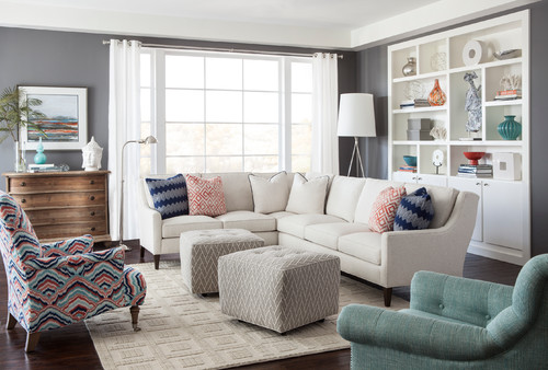
Still, Drew and Jonathan are not quite sure how to incorporate Ben’s affinity for purple. In the end, they add some eggplant-colored fuzzy pillows to the living room. It’s enough of Ben’s favorite color to add some dimension to the space—but not so much that it overpowers the room.
HGTV
Bring the look together with gold fixtures
Erica and Ben love their new green island and backsplash in the kitchen, but it’s the gold accents that really bring this colorful kitchen together.
“The pendant lights over the island are gorgeous,” Drew says, “I like the fact that they’re geometric. It has that pop against the white and the green cabinets, exactly what this kitchen needs.”
Indeed, these fun light fixtures are a perfect accent to this kitchen, both in color and style. It’s proof that sometimes it’s really the details that matter most in a home’s look.
HGTV
Upgrade with a matching mudroom with storage
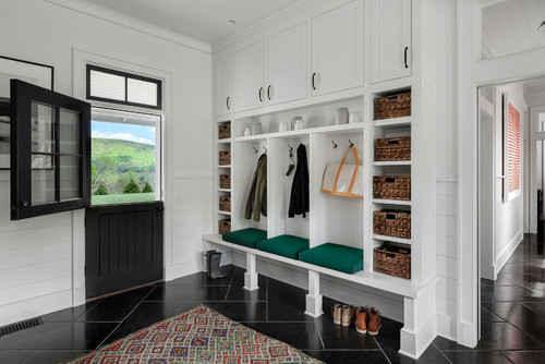
For a family of five, it’s important to Drew and Jonathan to give this family a functional mudroom, so they design a space that’s tailor-made.
The new mudroom has lots of storage up high and down below, and it matches the style of the rest of the living space. It adds to the design flow and keeps the house uncluttered. It’s stylish and functional!
HGTV
So, do the Scott brothers deliver?
Once Jonathan and Drew are finished with the renovation, it’s clear that the home has finally reached its full potential. From the smooth flow from dining room to kitchen to living room to the updated, colorful style this couple loves, this forever home is a major success. And even with all of these improvements, the brothers manage to stick to their $80,000 budget, making this family extra happy.
The post The Property Brothers Unveil What May Be the Best Kitchen Ever appeared first on Real Estate News & Insights | realtor.com®.





 I thought I’d share a slightly different angle of our kitchen today. The island appears more blue when the sun drenches it, doesn’t it? I love blue/green paint colors that change depending on the lighting. Please excuse the overflowing baskets on the open shelves – we keep snacks in those.
 Have a wonderful day! . Island Paint Color: Oval Room Blue by @farrowandball Black rail on island: FINTORP rail system from @ikeausa . . #cottagestyle #farmhousestyle #countrykitchen #cottagekitchen #mycountryhome #betterhomesandgardens #mybhg #cottagedecor #ikeahack #hgtv #countrylivingmag #fixerupper #southernliving #cozycottage #thecottagejournal #ikea #farmhousekitchen #falldecor #fallhomedecor
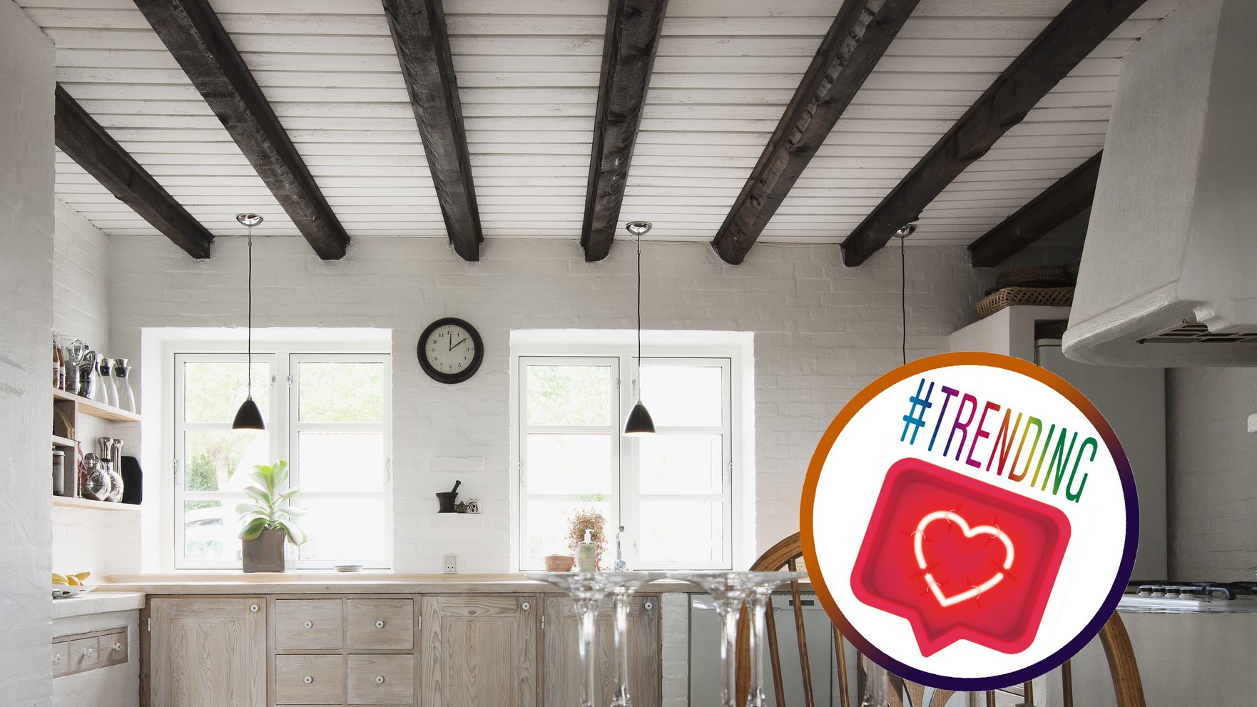
 Our beats per minute will never be the same! -What do you guys think about this mix of black, white, and wood in her country kitchen? We wanna know! COMMENT BELOW!!!

 @homeaura
  credits to @urbangreyhome . . . . . #interiorstyling #moderninterior #moderninteriors #ltkhome #interiorgoals #hyggehome #interiordesigninspiration #homeinteriordesign #inspiremehomedecor #realhomes #interiordeco #interiorinspo #makehomeyours #interiordesign #interiorstyle #interiorandliving #homedecor #interiors123 #myhomestyle #interiorinspirations #howyouhome #kitchendesign #kitcheninspiration #kitchengoals #kitchendecor #kitchenstyle #kitcheninspo #kitchenidea #kitchen
