
asbe/Getty Images
Of all the things stressing you out right now, you probably haven’t stopped to think about the colors of your walls. But colors (especially the ones you look at everyday) can have a huge impact on your moods. While some hues might relax you into a sense of calm and peaceful night’s sleep, others can dramatically increase your everyday stress levels.
Since we know you don’t need any more sources of stress these days, we decided to pair up with several color experts to bring you a list of the five most anxiety-inducing colors—and, of course, some alternatives to replace them.
Here are the top colors you absolutely won’t want on the walls of your home during a pandemic. Or maybe even ever again.
1. Red
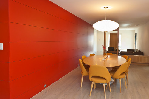
Photo by Scudder Construction LLC.
“Red is an emotionally stimulating color that increases our heart rates, respiration rates, and raises our blood pressure by activating the pituitary gland,” says interior designer Kobi Karp.
But red isn’t just a stress-inducing color—it also really stands out.
“That’s why stop signs, stoplights, and fire equipment are usually painted red,” says Karp.
Unless a loud color makes you happy, it might be time to try something a little less abrasive.
Try instead: Lavender
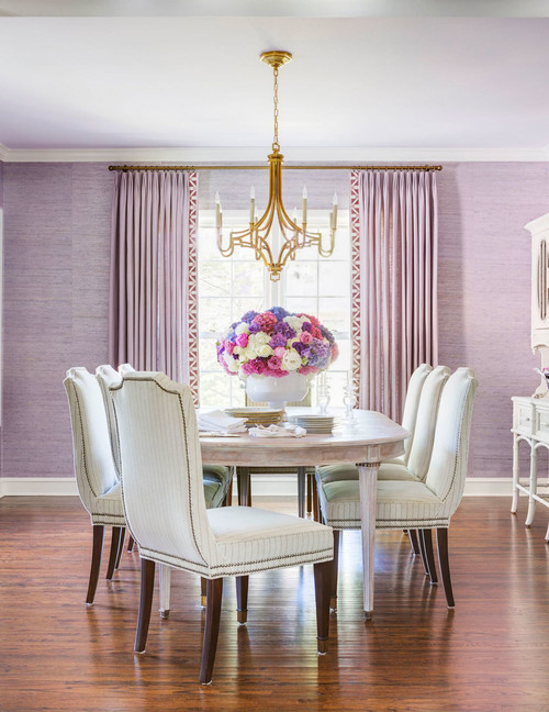
Photo by Molly Ray Young
“Lavender is a more calming shade associated with a sense of serenity,” says Karp. “It makes you feel uplifted and may even spark some creativity.”
Try Rhapsody Lilac from Sherwin-Williams to bring some Zen back into your former red room.
2. Stark white
![]()
Photo by Summit Signature Homes, Inc.
White might seem like a harmless hue to paint your interiors, but stark white? Not so much.
“When painting an interior wall of your home stark white, you’re creating a clinical atmosphere—not something conducive to relaxation,” says Alex Davis, color trends engineer and creator of wellness site Ryan and Alex Duo Life.
“Blue-based whites are thought of as crisp and clean, but often reflect too strongly with the lighting,” Davis adds.
Try instead: Cream
![]()
Photo by The Refined Group
You don’t have to change your entire color scheme to get something more chill—just swap out your cool whites for something warmer, like cream.
“Moving to a yellow-based white will still achieve your desired effect of a clean look, but without turning your living room into a hospital,” says Davis.
Get away from that clinical look with White Tie from Farrow & Ball.
3. Neon anything

Photo by Chimera Interior Design
Neon has been trending in recent years. Throw pillows, kitchenware, and even coffee table decor are all great examples of when a little neon can go a long way. But on your home’s walls, it can be overbearing.
“When neon anything is used in the same space, such as with several bright shades in a small space, it induces stress and even headaches,” says Karp.
Try instead: Jewel tones
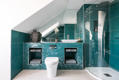
Photo by Magic Projects London Ltd
Have your favorite color without the headache.
“Soft jewel tones are a good alternative if you prefer bright colors like neon,” says Leni Calas of Ward 5 Design. “Try deeper tones such as mustard yellow, teal, eggplant purple, or even cobalt. This will give you a spark of color without putting strain on your eyes,”
Check out Caribbean Blue Water from Benjamin Moore for a relaxed blue that still brings the bold.
4. Chartreuse
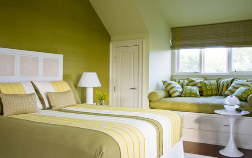
Photo by Houzz
This yellowy green named after the French liquor of the same color has become a hit in recent years because it’s a surefire way to make your interior stand out—but not always in the ways you imagined.
“Greens with a lot of yellow are electrifying,” says Miriam Silver Verga of Mimi & Hill. “We love using chartreuse as an accent color, but too much can be overwhelming.”
Try instead: Sea foam

Photo by Allison Ducharme Interior Design
Rather than going too green, get your earth-color fix by choosing something that’s more blue than yellow.
“Sea foam is a visually appealing color that not only has soothing and calming effects, but also adds brightness to any room,” says Karp.
Try Sea Salt by Sherwin-Williams for a green that won’t make your hair stand up.
5. Black
![]()
Photo by Timber Trails Development Company
While black and white can definitely lend to a contemporary and chic look, much like its lighter counterpart, pure stark black is likely to do little more than make your space feel dark and gloomy.
“A true black can be stressful and oppressive to paint a whole room with,” says Verga.
Try instead: Charcoal
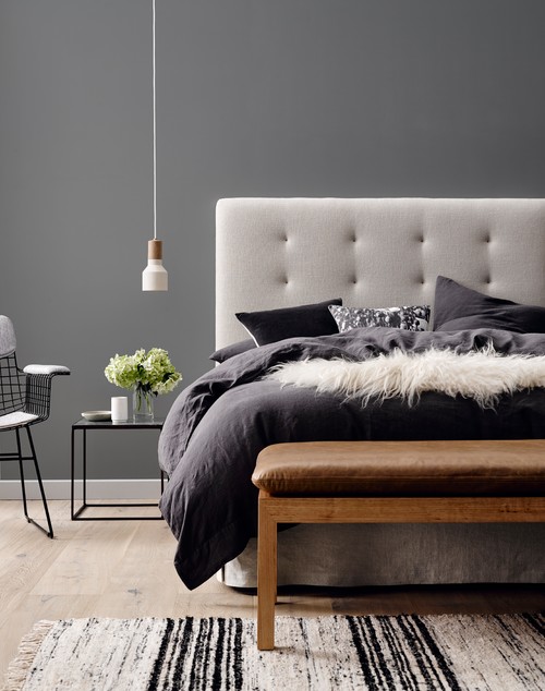
Photo by Wall2Wall Interiors, LLC
Since gloomy is about the last thing we need to feel these days, try switching things up with a charcoal hue instead.
“Charcoal is a cozy, deep color—the opposite of stressful,” says Verga.
You can still get all that dramatic allure, without the depressing feels, by opting for a color like Kendall Charcoal from Benjamin Moore.
The post 5 Stress-Inducing Paint Colors To Avoid During COVID-19 (and the Ones To Try Instead) appeared first on Real Estate News & Insights | realtor.com®.
No comments:
Post a Comment