snorkulencija/iStock; realtor.com
White paint comes in a full panoply of neutral shades: ecru, dove, pearl, eggshell. Many of us have a tendency to gravitate toward these unsaturated paint colors for our homes—with good reason! Neutrals are safe and go with everything. A white wall will make your artwork pop, and it won’t clash with that emerald-green sofa you just splurged on. But after a while, so much noncolor in one space can feel a bit clinical. You may find yourself wanting to branch out and craving some color.
Your goal: Liven up your living room with a colorful new neutral that’s just as appealing as staid white. Although the idea of floor-to-ceiling color may be intimidating, just know that plain ol’ white is not the only direction to go in your main living area.
“Muted colors, including pastels, can be associated with a tranquil, serene environment and are also perfect for a living room,” says Dee Schlotter, senior color marketing manager at PPG paint brand.
Or you might go in another direction and pick a darker, jewel-tone shade. Sara McLean, a stylist and color expert at Dunn-Edwards, says more and more she’s seeing saturated hues in living areas.
For some inspiration, here are six colors that go beyond the white family, plus some styling and coordinating color tips to help you achieve a living room you truly love.
1. Chinese Porcelain—PPG
PPG
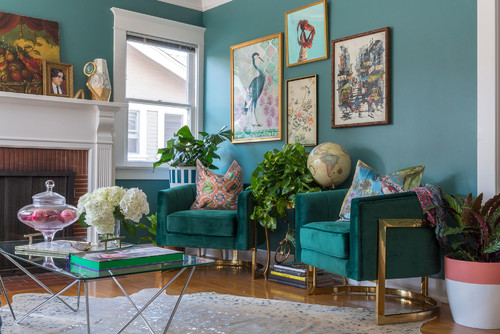
This vibrant azure hue, Chinese Porcelain, is a refreshing alternative to white paint colors—and it also happens to be PPG’s 2020 color of the year.
Schlotter says it’s a breath of fresh air compared with neutrals of the past decade.
“This hue works in so many painting projects because blue is a most-loved color and it provides the perfect, agreeable backdrop for vivacious shades to pop,” she says.
Pair this pick with additional blues and tufted, velvet furniture, or try throwing in some bright yellow or saffron colors that Schlotter has seen trending in textiles. She also recommends it with metallic finishes like Hushed Copper from the PPG metallic tones collection.
2. Quaint Peche—HGTV Home by Sherwin-Williams
HGTV Home by Sherwin-Williams
Pêche is French for “peach”—and this tasty hue called Quaint Peche can be a perfect shade on living room walls.
“It’s an elegant pastel that’s unexpected in the living room,” says Ashley Banbury, senior color designer for HGTV Home by Sherwin-Williams. Banbury would style this color with accents of white and sky blue for a light and airy design aesthetic.
3. The Green Hour—Dunn-Edwards
Deep green hues like The Green Hour transform a room and work with a variety of neutrals and bright tones, says McLean. Pinks and apricot play up this shade, as do the brass accents on these boxy club chairs.
“This green pairs well with a vivid coral such as Amour, antique bronze finishes, and leopard print for a splash of Upper East Side flair,” she says.
Or go for a modern take and add glossy black trim work in Stargazing to aged brick and concrete floors for a downtown L.A. vibe, she adds.
4. Pale Powder—Valspar
Valspar
Beautiful and timeworn, Pale Powder is reminiscent of an artisan’s workspace.
“This color speaks to our desire to look to handmade crafts to bring warmth back into the home,” says Sue Kim, color marketing manager for Valspar.
Reach for this shade if you have gray furniture, and pair it with touches of blue and red to bring the colors together.
5. Pale Jasper—Dunn-Edwards
Dazey Den
“This quiet coral looks fantastic when paired with trending sunset colors, though it’s also striking with cool grays or white,” McLean says.
Pale Jasper can adapt to whatever aesthetic you have going on in your house, whether it’s contemporary (remember Millennial pink?) or more midcentury retro.
McLean would add Dunn-Edwards’ color of the year Minty Fresh to this shade, along with deep aqua and crisp white for a superior paint palette.
6. Blonde Beauty—PPG
PPG
“Yellows are optimistic, energizing hues that exude happiness,” says Schlotter.
Homes that use a color like Blonde Beauty are often perceived as welcoming and family-oriented. We love the idea of pairing this light yellow with a navy blue accent color and plenty of natural wood accessories.
The post 6 Trending Paint Colors for Your Living Room—That Aren’t Boring White appeared first on Real Estate News & Insights | realtor.com®.

No comments:
Post a Comment