
realtor.com
It doesn’t matter how perfect your home is—if your listing photos don’t stand out, potential buyers won’t come by to take a look. In our series “Lessons From Listing Photos,” we dissect the smart updates sellers have made to their homes, and how their listing pictures highlight the home’s best assets.
There’s something remarkable about an original Craftsman house—especially in a city like Portland, OR, where the old houses are as treasured as the beautiful landscape. The neighborhood of Irvington, in northeastern Portland, is actually home to the largest collection of historical homes in the state, including this massive five-bedroom, three-bathroom Craftsman built in 1912.
Through the decades, the owners had maintained many historical architectural touches, but the property was desperately in need of updating in 2013, when it was sold for $762,000. Luckily, the buyers knew exactly how to modernize it while honoring its past. And when it came time to sell, their hard work paid off.
They listed it for $1,395,000 in July 2020—during the COVID-19 pandemic, no less—and sold it less than a month later for $1,600,000. That’s right! Not only did the home sell for more than $200,000 over listing price, but the sellers also doubled the value of the home.
So how did they make this magic happen? And how can you re-create that success in your own space? Below, our experts shed light on the fruitful design moves that were made to this home.
Exterior
The exterior of this home received such a huge overhaul that it’s barely recognizable, and our experts all said this was a good thing.
“The black and white color scheme is a huge improvement. It makes me want to walk in, whereas the brown and orange made me want to run away,” says Denver-based interior designer Sari Mina Ross.
“That crisp, clean black and white palette with that subtle hint of green on the door would be immediately appealing to a home buyer,” she adds.
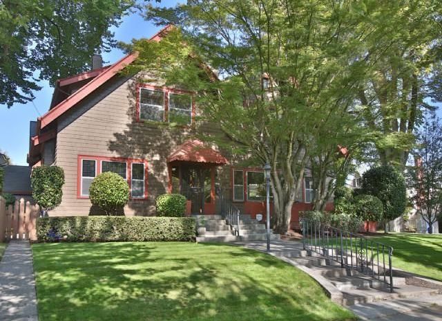

Real estate agent Crystal Swearington agrees that the exterior of the home is very important when listing it.
“Curb appeal is everything when enticing a new buyer to stop at your home,” says Swearington. “Removing the front railing makes the steps wider and more inviting.”
Interior designer and home stager Susan Young says the color change modernizes and updates the home.
“Removing the awning helps to modernize the house as well,” says Young.
Living room
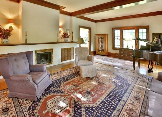
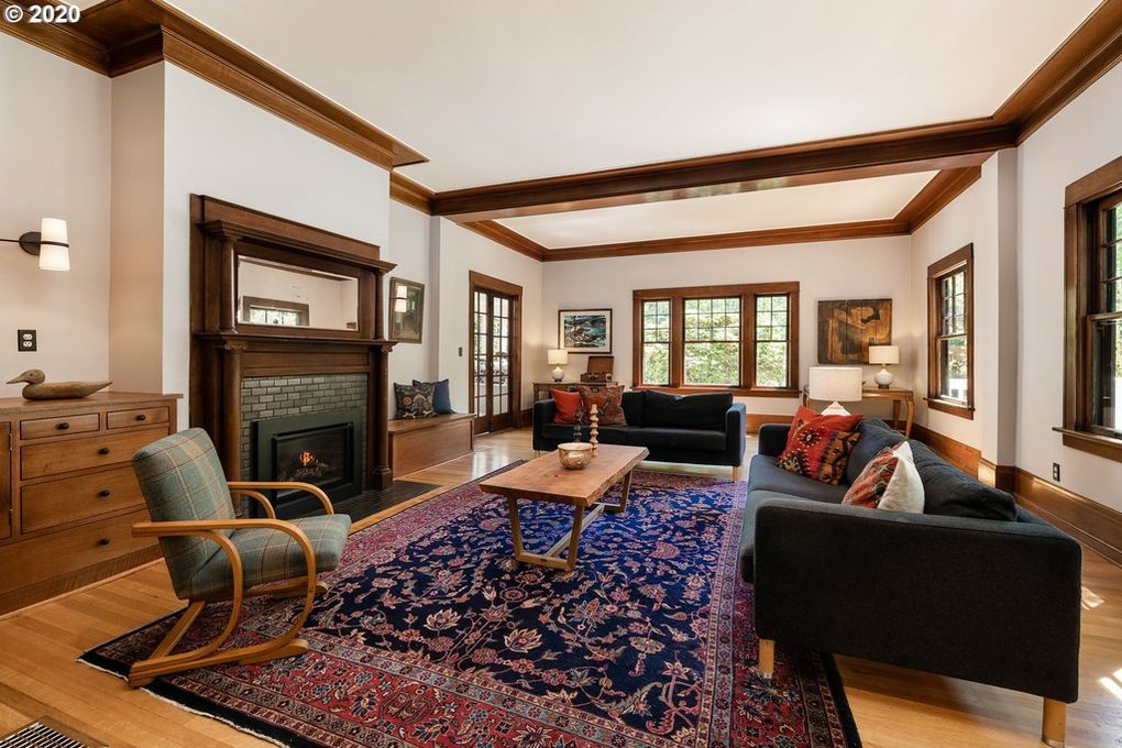
In some ways, the “after” photo of the living room appears older—but that’s the point.
“The changes here bring back the architectural appeal that the ‘before’ photo failed to convey,” says Ross.
“Love that they used a salvaged piece on the fireplace that is so era-appropriate to the Craftsman feeling,” she adds. “And this furniture layout feels far more expansive. It takes your eye all the way to the windows, which are another huge selling point.”
Swearington says the photographer hired to take the second set of listing photos also had a part in this successful sale.
“Part of the appeal of the after is where they took the photo from,” she explains. “That angle shows more of the windows and shows the depth of the room.”
Reading room


The reading room underwent some major changes, but Ross says she’s happy about one thing that stayed the same. Any guess what that might be?
“Keeping the built-ins instead of tearing them out was a good move,” she says. “Home buyers love those kinds of details—a place for books and photos, and all of the kinds of things we all have and want to display.”
But even though they left the shelves intact, they did give them an impactful color update.
“This room looks refreshed with a coat of navy paint on the fireplace and matching shelves,” says Swearington. “Also, buyers love a nice, clean white trim, which adds to the design elements of the space and makes it look larger.”
Kitchen
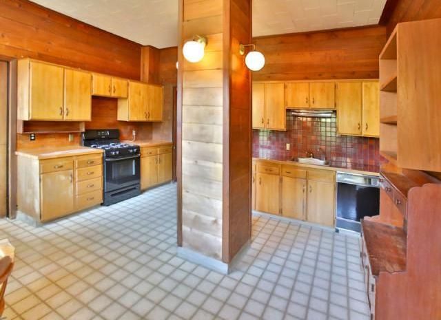
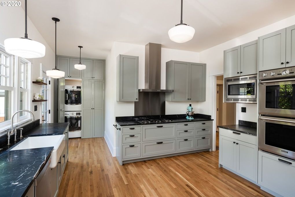
“This kitchen remodel has transformed a deal-breaking space for a home buyer into a huge selling point,” says Ross. “The key here, of course, was losing that beam in the middle of the room. Now, it’s fresh, inviting, and open—just what a buyer loves.”
“Before, there was just too much wood tone everywhere,” says Young. “The seller picked a lovely shade of gray for the cabinets and a neutral creamy white color to update the walls.”
Swearington points out two major changes: One is expensive, while the other is fairly affordable.
“Changing from a dated linoleum to wood or tile flooring elevates this design to a modern kitchen,” Swearington says. But that’s not the upgrade she loves the most.
“The main updates in this room that made a huge difference are the lights. I tell my sellers if they have a limited budget, new light fixtures go a long way to making a space look new,” she explains.
Dining room

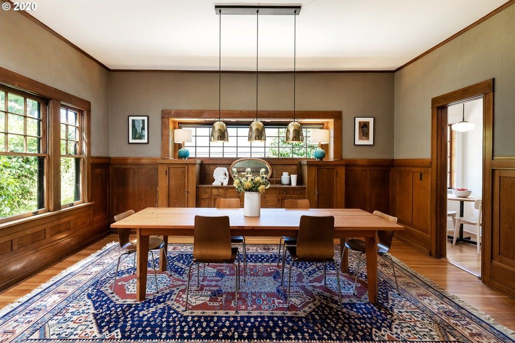
According to Ross, the dining room took both a step forward and a step back in time—and that landed it right where it needs to be.
“Getting rid of the wallpaper and painting the walls a muted, neutral color means that the original architectural details—the molding, built-ins, and windows—are once again the stars of the room,” she says.
Ross also notes the impact of the new lighting above the dining table.
“It’s more proportionate to the room, compared to the too-small ‘before’ pendant,” she says. “It also adds a little hit of contemporary polish to the space.”
Young noticed a sneaky detail that might be easy for most to miss: The sellers moved the area rug from the living room to the dining room, where it fills the space perfectly. It just proves that you don’t have to buy all-new furnishings to revive your home. Play with what you already own, and you may save big on your budget in the long run.
The post Lessons From Listing Photos: This Historic Home Doubled in Value After a Subtle Renovation appeared first on Real Estate News & Insights | realtor.com®.
No comments:
Post a Comment