
realtor.com
It doesn’t matter how perfect your home is—if your listing photos don’t stand out, potential buyers won’t come by to take a look. In our series “Lessons From Listing Photos,” we dissect the smart updates sellers have made to their homes, and how their listing pictures highlight the home’s best assets.
Home buyers everywhere want houses with up-to-date interiors, but there’s probably no place on Earth where trendiness matters more than Los Angeles.
That’s probably why this massive four-bedroom, four-bathroom home in the notoriously hip neighborhood of Eagle Rock was such a success when it hit the market for the second time in just a few short years.
The sellers picked it up in January 2017 for $1,730,625, and by 2018 the renovations were underway. Once construction was complete, it hit the market again and was sold in June 2020 (during a pandemic, no less) for $2,600,000. You read that right—that’s a difference of nearly a million dollars.
So how does that happen? How do you buy a slightly outdated house and sell it for a million dollars more than you paid in just a few years? That’s exactly what we’re here to find out.
Our experts in real estate and design enlighten us about the most productive design moves the sellers made and, most of all, how you can apply them to your own home.
Entry
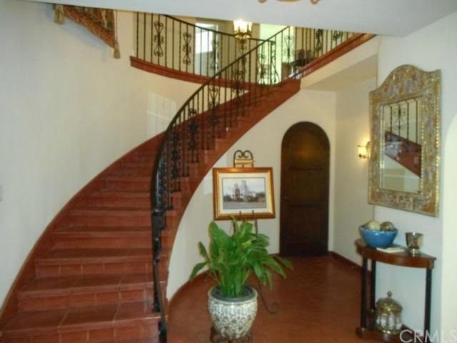
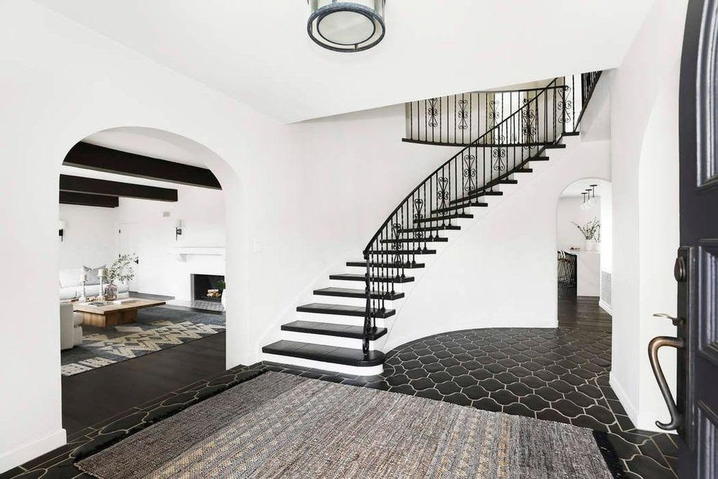
Hello, big change! There’s no need to walk outside and back in again—you’re in the same home. You’d never know it, though. And our experts are in love with all the upgrades this entry received.
“The entrance can make or break how a buyer will feel walking through your home,” says real estate agent Aislynn Radley, of Crosstown Marketing Group, who explains that if buyers walk into a home that doesn’t immediately appear outdated, they can focus on the home itself and not the updates it needs.
“Curved staircases are no longer popular and can date a home, but thanks to the choice of a more modern Spanish tile, the space is respectful of the home’s original architecture while also carrying a sophisticated look,” says Radley.
But retiling your entry isn’t the only takeaway here. Interior designer John McCulley, of McCulley Design Lab, says the space looks much bigger because the homeowner “simply removed the previous wall mirror, side table, plant, and art easel.” And when you’re buying a home, bigger is always better.
Designer Megan Dufresne, of the MC Design Shop, agrees. “In the before photo, all of the clutter drowns out the inherent architectural drama of this entryway. The after photo brings it all back,” she says. “This is an amazing first impression for a home buyer.”
Living room
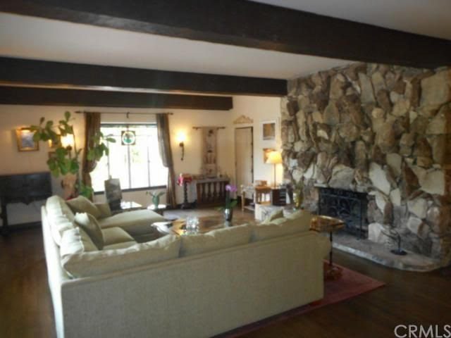

Every room in this house was drastically improved by the renovations, but perhaps the greatest improvement happened in the living room.
In fact, the only clue that you’re in the same room in these before and after shots is the ceiling beams, a key element that real estate agent Hayden Prentice, of JBGoodwin Realtors, zeroed in on.
“Ditching the stone fireplace invites home buyers to gawk up at the exposed beams,” she explains. “They visually lengthen the space, making it feel much less cramped.”
Dufresne doesn’t miss the fireplace, either.
“What’s great is all of these changes make the home feel more, not less, like its original architecture. Now the fireplace truly feels Spanish, as do the sconces. They’re totally era-appropriate,” she says.
She also applauds the furniture changes in this room.
“Flipping the sectional around welcomes you to this room instead of cutting you off from it. The room feels twice as big with just that change,” Dufresne says.
Breakfast nook


This breakfast nook may look totally different after its glow-up, but there’s one perfect feature they didn’t touch.
“The stained-glass window is celebrated in the revamped space and sets a beautiful, serene tone,” Radley notes.
But that wasn’t the only major positive move that happened here.
“Adding the new windows and taking away the overhead lighting fixture made all the difference here. It just opened up this space,” says Dufresne. “Also, peach walls are never going to help sell a home.”
McCulley explains how just repositioning a piece of furniture can make a huge difference.
“The new table’s horizontal orientation feels much more efficient and connects well to the exterior window,” he says. “This layout also provides a flexible function for dining and provides a nice worktable during the day.”
According to Prentice, the changes to the breakfast nook make this house much more appealing to buyers.
“Adding sleek furniture that complements the space, increasing natural light by removing drapery from windows, and adding sightlines to the kitchen or other areas of the home all increase the likelihood your buyers will visualize themselves spending their morning there before rushing off to work,” she explains.
And isn’t that exactly what they were trying to achieve?
Bathroom
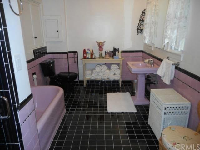
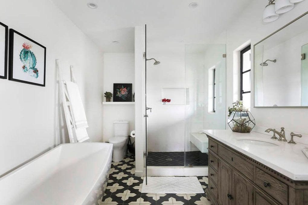
This pink paradise may appeal to the vintage crowd, but it’s hard to argue against the new, renovated space—and the experts agree.
“This isn’t a huge bathroom, but the redesign makes it feel so much bigger,” says Dufresne, who adds the color just had to change for this house to sell quickly.
“The before pink is extremely specific,” she explains. “The after color palette is so much more appealing to a broader range of home buyers.”
Prentice was also not a fan of the pink.
“If the original state of this bathroom is giving you indigestion, you’re not alone,” she jokes. “Adding new fixtures and light colors will leave prospective buyers feeling squeaky-clean.”
Radley is also impressed by the changes.
“This space still has the same components but has been remastered to allow a larger shower and more storage, which appeals to today’s buyers,” she says. “And, once again, the dark and light Spanish tile choice offers a cohesive style upgrade while matching the home’s architectural style.”
Patio
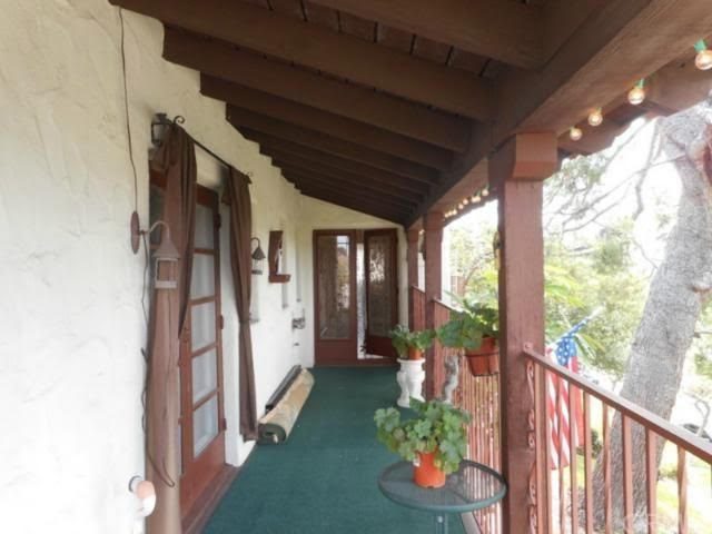
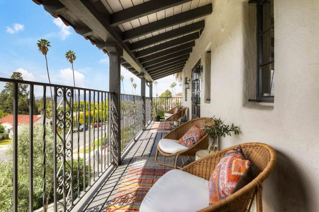
A properly done exterior space extends the living area in a home, and according to Prentice, that’s exactly what happened here.
“By removing drapery and adding lounge chairs, this patio has been transformed from a walkway to an actual living space,” she says.
“Using a dark color for all of the trim to contrast against the existing light walls elongates the patio and creates a more open space,” says Radley, who also likes the new additions to the space. “The furniture choices match the era of the home perfectly. Everything fits, and there is nothing left to do but relax in the space.”
The post Lessons From Listing Photos: This Successfully Flipped Spanish-Style Mansion Has Our Full Attention appeared first on Real Estate News & Insights | realtor.com®.
No comments:
Post a Comment