Monday, February 10, 2020

These Looks Are Hot! 5 Decor Ideas From Instagram to Warm Up Your Living Room

These Looks Are Hott! 5 Decor Ideas From Instagram to Warm Up Your Living Room

Onzeg/iStock

Maybe it’s the weather—and the fact that we all have a near-survivalist mindset about staying warm right now—but this week’s most popular looks on Instagram certainly seem to be bringing the heat.

That’s right—as we do every week, we scrolled through hundreds of posts on the social media giant to uncover the top trending decor of the moment, this time with an eye on the living room. What we found were five looks that are sure to inspire you. Plus, we’ve done the heavy lifting of identifying the products you can buy right now to help you get through the last days of winter. So snuggle up and dive in to this week’s hottest living room looks.

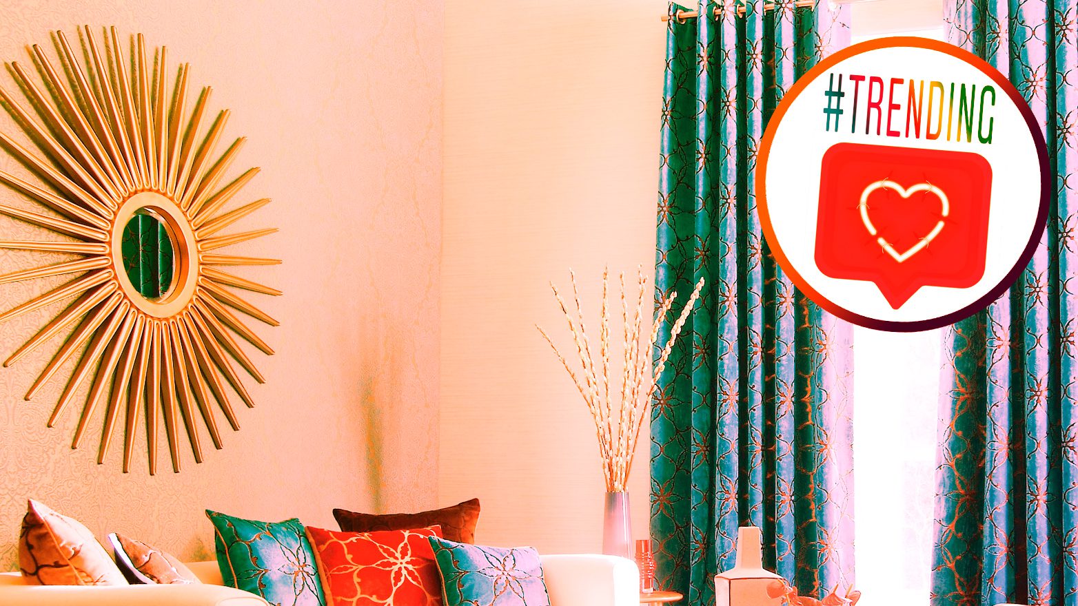
1. Wicker sun mirror

Here comes the sun, no sunscreen needed. We can’t get enough of the bright rays this wicker sun mirror brings to @cozy.happy.home’s space.

“This sun mirror is a perfect way to liven up boring space,” says designer Lauren Holmes of Zen Staging With Lauren. “Grandma’s wicker stylings are back in a big way. This mirror makes the room better, and wicker is on-trend for 2020—a call back to the 1970s of boho chic stylings.”

Get the look: Add some wicker sunbeams to your living room with this Magical Thinking woven wall mirror.

———

2. Rattan floor lantern

Another trend this week that’s sure to cast a warm glow on your living room? This rattan floor lantern featured by @fridlaa (reposted by @my_homely_decor).

“What I love about this light is that when lit, it’s not overpowering the space with too much light and ruining the Zen vibe,” says designer Sherri Monte of Elegant Simplicity. “It actually does a great job diffusing the light in an interesting way and creates a bit of intrigue on the living room floor.”

Get the look: Give your living room an intriguing glow with this handwoven water hyacinth rattan lantern.

———

3. Scandinavian-inspired fireplace

If you don’t already have a hearth in your home, this Scandinavian-inspired fireplace posted by @kajastef is going to make you want one.

“This Scandi fireplace is hot,” says Holmes. “Less is more with this minimalist brand. It’s modern, smooth, and superchic. I would add a cool white paint with a yellow undertone for an extra touch of warmth.”

Get the look: Add your very own Scandinavian-style hearth with this EcoSmart Flex Right corner bioethanol firebox.

———

4. Distressed wall

Transform your cold living room by adding (or exposing) a distressed wall—just like this one we see from @jess.at.home.

“Distressed walls are fascinating for two reasons: They invoke wonder and imply history,” says designer Colin Haentjens of the Knobs Co. “Especially in rooms that are mostly finished and have only one distressed wall, the incompleteness invites visitors to visualize what could be there. The sense of surrounding ‘completeness’ also reminds inhabitants that the room has its own story.”

Get the look: Give your space an inspired mystique with this distressed wood peel-and-stick wallpaper.

———

5. Vintage crates

Ditch your sterile coffee table for something more tactile and simple, like these vintage wooden crates featured by @perfect.homess.

“Vintage crates are perfect for the home transitioning from farmhouse to boho chic,” says Holmes. “What’s old, imperfect, and a little worldly is on-trend at the moment. You can easily pick some up at local flea markets, and if you have several, make storage cubbies.”

Get the look: Get your very own boho-chic storage scheme by shopping local antiques stores or this homemade rustic crate collection.

The post These Looks Are Hot! 5 Decor Ideas From Instagram to Warm Up Your Living Room appeared first on Real Estate News & Insights | realtor.com®.

Is Temporary Wallpaper as Easy as It Seems? A DIY Reality Check

gilaxia/iStock

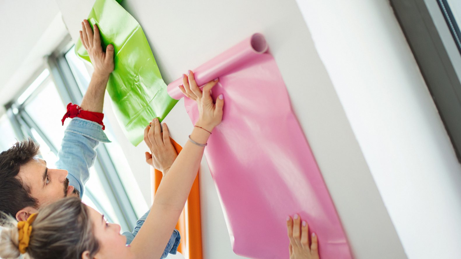
Not just for Grandma’s house, wallpaper is making a big comeback. One problem: Putting up wallpaper is quite the task. And removing the stuff is a whole different headache! The solution? Temporary wallpaper.

One of the main benefits of temporary wallpaper is that it’s, well, temporary. Remove the adhesive on the back, and it goes up—and comes down—with ease, and without leaving a sticky residue behind.

It’s a cheap DIY project without the need for professional installation, which regular wallpaper requires. It’s also perfect for renters who don’t want to damage walls.

But are all the claims of temporary wallpaper too good to be true? In this second installment of our new “Monday Makeovers” series, which highlights popular DIY projects, I tried putting up temporary wallpaper in my own apartment and learned exactly what it takes.

What’s the best temporary wallpaper for you?

There are some papers that require water to activate the adhesive, but for the most part, temporary wallpapers have a self-adhesive. You simply peel off the paper backing and apply it, like a big sticker.

Generally, more expensive wallpapers (like the ones made by Hygge & West, which go for about $65 per 24-by-32-inch tile) are thicker, and will thus flatten more easily on your wall and be forgiving when you accidentally stick a piece and have to pull it up.

Cheaper wallpapers (like this $29.99 option from Target, which covers 27.5 square feet) will still get the job done. But beware of cheap wallpaper that comes in a roll, because with that curl, it’s going to require a little extra work to finesse it onto the wall.

wallpaper
Peel-and-stick wallpaper from Target

Target

One caveat: Matching the patterns at the edges so that they look like one continuous design can also be tricky. Not sure where to shop?

Sandy Cabelis of Cabelis Interior Design has a few favorite brands: “My go-to companies for great temporary papers are Tempaper and York Wallcoverings.”

Tammy C. Bolden, principal designer and owner of Bold Interior Designs, also recommends Tempaper, as well as Mitchell Black.

“Both vendors have fashion-forward designs that are easy on the budget,” she says.

How to prep your wall and wallpaper

The first thing you’ll want to do is wash your walls. This will make your paper stick better.

Just make sure you wash 24 to 48 hours before you start wallpapering—long enough for the moisture to evaporate without accumulating another layer of dust.

Next, measure how tall and wide your wall is, and cut pieces of paper that will cover your wall, plus a few inches to spare (this can be trimmed later with a utility knife or X-ACTO blade). Then lay your pieces on the floor so you can plan where you will put them.

A test run on the floor is particularly important when lining up your wallpaper pattern. For example, if you have a wallpaper design that features florals, laying out each strip of paper on the floor will help you match up each flower in the design.

Another great reason: You can plan where you want the design elements to land.

Maybe your wallpaper design features a large tree, which you want centered in the middle of your wall. You can pick out the section you want to feature in the center and work outward from there, cutting out the pieces that work on either side.

“Start with the area of most importance and work your way out,” says Cabelis.

Applying the wallpaper

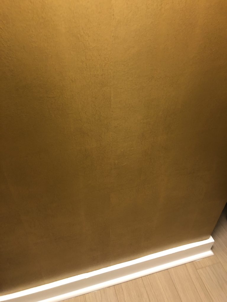
I decided to add temporary wallpaper to a wall in my walk-in closet, and chose Devine Color metallic gold paper ($30, Target).

I measured the wall, cut two long strips of wallpaper that fit my measurements, and laid them on the floor. Then I grabbed a step stool and ruler and started applying the paper.

I started in the top left corner of the wall, peeling off just enough backing so that the very top of the paper would stick to the very top of the wall. Then, I slowly pulled down the paper (small section by small section), while flattening it with the ruler to remove air bubbles and wrinkles.

wallpaper
Here I am about to flatten this section of wallpaper with a ruler.

Jillian Pretzel

I found it was much harder to apply the paper at the top of the wall, since I could barely reach it, and didn’t feel I had full control of where the paper would stick.

Since I’d removed so much of the backing, I ran the risk of getting wrinkles. Even after pulling up the wallpaper sections a few times and reapplying, I still had a few small air pockets I simply had to surrender to.

My wallpaper job isn’t perfect, but people probably wouldn’t notice the imperfections unless they were really looking for them.

wallpaper
When I wanted to redo a section, I pulled the paper slowly off the wall at a diagonal.

Jillian Pretzel

Once the wallpaper was down, I used an X-ACTO knife to trim the bottom and create a clean finish. It’s not perfect, but it works.

Putting up these two strips took me about 15 to 20 minutes, so if you’re planning to wallpaper a larger area, plan to take breaks, as your arms may get tired. Mine sure did!

wallpaper
I found that the bottom of the wall is certainly easier to wallpaper than the top.

Jillian Pretzel

Wallpaper finishes

For this project, I didn’t run into any windows, AC units, or any other obstacle you might find on a wall. If your wallpaper does run into one, just roll the paper down as far as you can go, and use your X-ACTO knife to cut in line with the top of the object.

wallpaper
I’m planning to add a wall mirror to complete this accent wall. It’ll make this closet look like a chic dressing room.

Jillian Pretzel

So, is temporary wallpaper worth DIYing?

One of the biggest questions I had when starting to put up my temporary wallpaper was: “Could it really be so easy?”

My answer: yes and no.

For one thing, putting up this wallpaper so that it looks perfect is a challenge. And although my wallpaper was a solid color, I imagine that lining up patterns would add yet another level of complexity.

I also learned that there is, in fact, some risk of damaging the walls.

Temporary wallpaper manufacturers, like Chasing Paper, recommend using the product on painted surfaces with a satin or semigloss finish. On a flat, matte paint finish, the adhesive could take off some paint when you remove the paper.

Still, I was pleasantly surprised by how quickly I was able to go from unrolling the paper to the finished wallpaper (about 30 minutes for this small project). All in all, I’d say this was time and money well-spent!

The post Is Temporary Wallpaper as Easy as It Seems? A DIY Reality Check appeared first on Real Estate News & Insights | realtor.com®.

Friday, February 7, 2020

6 DIY Projects You Can Tackle in a Weekend That’ll Totally Transform Your Space

milanvirijevic/iStock

Sick and tired of staring at the same old interiors in your home? We know the feeling. But makeovers don’t have to eat into your budget or take months on end to complete. In fact, some DIY projects can transform the spaces in your home in as little as a few hours.

So if you have some time to spare this weekend and are looking to remake your home without breaking the bank, we’ve identified several of our favorite DIY projects for you. Here are six transformative projects you can tackle in a single weekend.

1. Make over your interior doors

View this post on Instagram

Dreamy painted paneled door inspiration!

A post shared by Studio BKA Architects (@studiobka) on

One of the easiest ways to give your home a fresh look is by making over the interior doors (just look at this sultry teal design featured by @studiobka). Update boring, plain doors by adding trim and fresh paint, or refinish them in a whole new color and style.

“I absolutely love the glamorous shift a room can take when painting interior doors or trim,” says designer Jenna Sheingold of Jenna Sheingold Studio. “It’s such a simple way to add a beautiful pop of color to any space.”

Make sure to ask a paint specialist about your existing finish, if you don’t know, so that you buy the right type of paint for your use.

2. Update the bathroom backsplash

Much like the doors in your interior, a bathroom backsplash can make or break the look and feel of your bathroom. Luckily for you, it’s easy to swap out the old tile for new, and get something that looks just as professional as this design featured by @cementtileshop.

“Updating the bathroom backsplash is a fantastic way to add texture and style to a bathroom,” says Sheingold. “Common mistakes include not planning out the layout of the tile before starting the application. But you can avoid weird or awkward cuts by premeasuring and developing a layout plan before you’ve even purchased the tile.”

Looking for an even easier way to redo your backsplash? Skip the scraping and grout, and opt instead for stick-on tile.

3. Install new kitchen hardware

In need of a quick kitchen fix that will instantly modernize the entire space? Swapping out your old nickel hardware for some chic burnished brass ones (like we see in this post by @armacmartin) is an easy DIY that will make your kitchen feel brand-new.

“Installing new hardware in a kitchen is the fastest and least expensive way to update the entire look and feel of the space,” says Jane Prizer, director of merchandising at Hausera. “Hardware is often referred to as jewelry in the kitchen. Just as accessories are used to pull together an outfit, cabinet hardware, faucets, and lighting create a finished and unified look in the kitchen.”

Follow this tutorial to get more details on how you can easily modernize your kitchen with a hardware swap.

4. Build a new headboard

You don’t need to spend all sorts of money on wallpaper or a new platform bed to completely remake your bedroom. In fact, all you really need to mimic this rustic-chic look by @thehousethatdiybuilt is a few wooden boards and a bit of elbow grease.

“This is a really economical way to update your bedroom,” says Sheingold. “The material cost is so low compared to buying a brand-new, ready-made headboard, and you’ll feel proud of your efforts.”

Learn more about this weekend project from Home Depot’s handy guide.

5. Add some (rope) shelving

Rope shelving (like this gorgeous display from @rachel_metz) is a light and airy solution to aesthetic storage that doesn’t take up too much space on the walls. It can be used to display books or photos—and best of all, it’s quick and easy to put together.

“Very simple and easy to do, the most important part of this execution is to make sure everything is anchored properly for the amount of weight it will hold,” says Sheingold. “I would recommend lightweight [medium-density fiberboard] or hollow shelves for this. And if you want to add more than a few books, be sure to reinforce the ceiling.”

6. Give your entryway a new bench

Skip spending hundreds on a new bench for your entryway and design one yourself! Use scraps of wood from old furniture, or head to the lumberyard and pick up some fresh pieces.

Either way, don’t forget the fabric and pillows on top (like we see in this post from @schwinteriors). Repurpose some old sheets or throw blankets to make the perfect cushions to complete the look.

The post 6 DIY Projects You Can Tackle in a Weekend That’ll Totally Transform Your Space appeared first on Real Estate News & Insights | realtor.com®.

6 Types of Decorative Molding to Glam Up Walls and Ceilings

YKvision/iStock

You love it when you see it, but how well do you know decorative molding? In fact, naming each may present a challenge. Is it dentil or crown? Casing or a chair rail? And even if you can identify this special millwork, you might not see the real deal (carefully crafted from hardwoods) much in the future.

That’s because this feature is typically skimped on by builders today due to cost, notes Karen Gray-Plaisted of Design Solutions KGP. “But it’s unfortunate because decorative molding takes a room from just a rhombus to one that has character and charm,” she laments.

Decorative molding certainly isn’t new (it’s been around for centuries), but it’s hotter than ever. Here’s more on decorative moldings, including their history and types to seek out as you house hunt or renovate.

Molding history

Photo by Union Studio, Architecture & Community Design

“Molding has long added depth, elegance, and finish to Victorian and Colonial-style homes,” reports Beverly Solomon of the eponymous design firm.

This detail was crafted by the Greeks and Romans as well as our Colonists using hand planes with special blades to cut the shapes. By the time of the Industrial Revolution, machine-cut moldings dropped in price and were snapped up by the masses.

Decorative molding is defined as the trim around doors and windows, molding around the ceiling, baseboards on the perimeter of a room, and any type of paneling, such as shiplap and wainscoting, explains Gray-Plaisted.

It can be made from softwoods, hardwoods, composite materials, polyurethane, stone, and polystyrene with fiberglass, she adds. Today’s composites don’t require sanding or priming, are easy to cut, and are even easier to paint than real wood, notes Solomon.

1. Crown molding

Photo by J. Hirsch Interior Design, LLC 

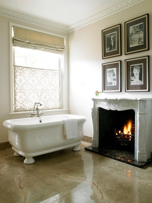
Crown molding is literally what you think—an overhead crowning touch that flares out in the space where the walls and ceiling meet. Also known as cornice molding, it may be elaborate, with decorative cutouts, or simple and linear (Shaker) in design.

This molding can conceal imperfections and is made to sit on both the wall and ceiling to enhance its visibility from below, adds Jeff Valenti, senior merchant of millwork at the Home Depot. Hundreds of patterns and styles are available from many architectural eras, including Corinthian, Doric, contemporary, and art deco.

2. Chair rail

Photo by Vanessa Deleon

This thin wooden detail bisects a room horizontally at heights between 36 and 45 inches, and is designed to protect the wall from dings and scratches caused by chairs.

“A chair rail creates a visual break in the room or wall and can be a great way to incorporate two paint colors, one above the rail and the other below,” says Kevin Busch, vice president of operations at Mr. Handyman.

3. Picture frame molding

Photo by Monks Home Improvements

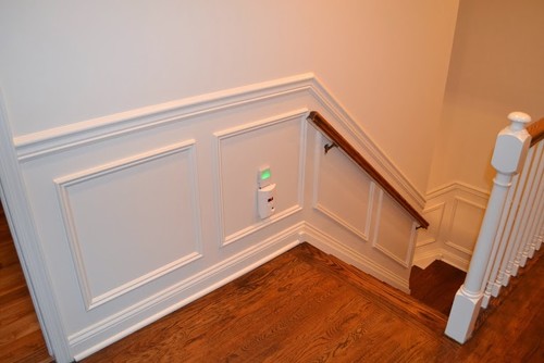
Picture frame moldings are just what they seem—square or rectangular shapes that look like empty pictures. They add a smart level of detail to walls in hallways and stairs. The addition of picture frame molding can imitate paneling on an otherwise plain expanse of wall. Frame molding can also be used on the ceiling to mimic a tray or coffered ceiling.

Wainscot, the wooden panels usually applied to the lower level of walls, often accompanies chair rails, says Busch. “Wainscot may be capped with a chair rail and has the same advantages as a stand-alone rail but adds another visual element to the wall.”

4. Casing

Photo by Smith & Vansant Architects PC 

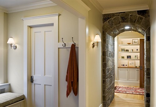
“Casing, which can be applied both inside and out, is the molding that goes around the perimeter of window or door openings,” explains Busch.

Typical casings in these spots are 2 to 3 inches wide, though deeper designs are available to create a decorative shelf.

“Casing refines the appearance of doors and windows by framing them in a smooth continuous surface that can be customized to underscore the room’s design,” adds Valenti.

5. Dentil

Photo by Clare Gaskin Interiors

Originating in Greek architecture, dentil molding is a decorative pattern of teethlike blocks. Dentil was usually built into crown molding and can be found in historic homes, particularly Victorians, both inside (around doors and ceilings) and out (along rooflines). Dentil is a higher-end application as its production is more expensive, and installing it is labor intensive. (Each block has to be cut and measured carefully and placed individually.)

6. Egg and dart

Photo by Ekena Millwork

To identify this decorative molding, look for egg-shaped ovals interspersed with arrows, anchors, or V-shaped darts along a ceiling. Egg and dart (also called egg and tongue) is an ornamental detail that’s often paired with crown molding. Other intricate designs in this same vein include acanthus leaves and rope detail.

The post 6 Types of Decorative Molding to Glam Up Walls and Ceilings appeared first on Real Estate News & Insights | realtor.com®.

Thursday, February 6, 2020

The Property Brothers Ask: Is Your Stove in the Wrong Spot?

Property Brothers Hand Me Down Forever Home episode

HGTV; realtor.com

Drew and Jonathan Scott are always giving their clients beautiful, open-concept living areas. But on a recent episode of their HGTV show “Property Brothers: Forever Home,” you have to wonder: Have they taken this open floor plan too far?

In the “Hand-Me-Down Forever Home” episode, the Scott brothers help college sweethearts Michelle and David update the Ontario, Canada, home they inherited from Michelle’s mom. And while these homeowners say they want an open concept, the Scotts don’t know quite how badly these two want those walls gone until they run into some serious structural problems.

Over budget before renovations even begin, David and Michelle are willing to give up a new playroom for their kids—and endure three extra weeks of construction—to avoid putting a beam in the kitchen.

Will the couple be happy with the results? Read on to find out how Drew and Jonathan pull this project together. Plus, learn their best tricks for opening up a space—no matter what.

Open concept can cost a whole lot

kitchen
Why have walls when you can have this gorgeous open concept?

HGTV

After inspecting Michelle and David’s home, Drew and Jonathan give their clients two design options: The first would include taking down the kitchen walls, even though this comes with a huge price tag. The second involves keeping a structural post in the kitchen, which leaves plenty of budget to move the kids’ play space out of the living room and onto the closed patio.

For Michelle and David, it’s a no-brainer: They need that open floor plan. So, the brothers get to work taking down walls.

While getting that open floor plan may have been hard work, it’s definitely worth it. When the renovation is finished, David and Michelle are seriously impressed.

As Jonathan says, “Open concept is key.”

Fireplaces need updating, too

fireplace
This old fireplace dates the space.

HGTV

While Michelle and David are distracted by their home’s floor plan, Jonathan can’t take his eyes off the old brick fireplace.

“This is what’s dating the space,” he says. The brothers agree that the fireplace looks positively medieval. Plus, it’s really large, taking over the living room and making the space seem way tighter. The brothers know this feature needs to be overhauled.

fireplace
This new fireplace is so much simpler, and the light colors brighten the space.

HGTV

They replace the brick with a simple, understated white fireplace with gray stonework. The fireplace no longer dominates the living space; now it just adds charm.

The wrong place to put a stove

kitchen
The range looks perfect under the window!

HGTV

Lots of people love putting a stovetop in the kitchen island. It makes the kitchen flow well and gives the island extra utility. But in a house with young kids (who will be sitting at the kitchen island), a range within reach could be unsafe. So Drew and Jonathan install the kitchen sink in the island and put the range in the second-best spot: under the window.

While the window spot would usually go to a sink, putting the stove here instead is perfect. The design keeps hot surfaces away from the kids and, with a vent hood built into the ceiling, the beautiful view isn’t obstructed.

Different pendant lights help define each space

pendant light
Michelle and David love their mix-and-match lighting.

HGTV

One of David’s favorite upgrades in the renovation is Drew and Jonathan’s stylish light fixtures.

Drew points out that every light fixture, from the pendant lights over the kitchen island to the chandelier, is different for a reason.

“We don’t want to match, match, match everything,” he says. “We’re trying to give a little bit of beautiful contrast.”

“It sort of separates the spaces, too,” David points out.

Build a play space outdoors

playhouse
This playhouse is the perfect spot to stash extra toys.

HGTV

While Michelle and David decide against building a playroom for their kids, the Scotts know that this family needs a way to keep the kids’ toys from cluttering the living space. So, they think outside the box—or rather, outside the house—and decide to build the kids an amazing playhouse in the backyard.

The best part? This fun playhouse doesn’t cut into the budget. The brothers use leftover and recycled materials (like a planter and flowerpot) to create the free-standing shed.

Do the Scott twins deliver?

While Michelle and David start out with a budget of $150,000, the Scotts know that they can’t do all the fixes the family needs without spending at least $155,000. So, they move forward with a slightly more expensive renovation.

And while the family may be spending a little more than they’d expected, the results are amazing.

Not only do the brothers create a great open-concept living space, they also give the kitchen and fireplace a much needed upgrade, and build the kids a play space in the backyard.

This hand-me-down house may have already been in the family for two generations, but with a sleek, timeless design like this, the family can enjoy it for many more generations to come.

The post The Property Brothers Ask: Is Your Stove in the Wrong Spot? appeared first on Real Estate News & Insights | realtor.com®.