Monday, May 31, 2021

10 Popular Yard Trends That Just Don’t Make Sense

Getty Images

Yardwork is a sweaty labor of love, from planting flower beds to designing your patio. And come summer, it can be all too tempting to hop onto the latest trends you see lining the aisles at your local Home Depot.

But beware—trends come and go, and many just don’t stand the test of time for good reason: They’re uncomfortable, impractical, and, all in all, just don’t make much sense.

Curious what popular landscaping and curb appeal ideas you might regret trying?  Check out some of these all-too-common options below.

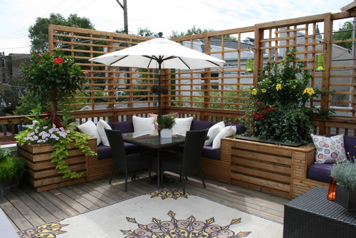
1. Outdoor rugs

Photo by C. Marie Designs, Inc 

Soggy, strewed with leaves, and gross underfoot. This is the result of rolling out a piece of carpet with no protection from the elements. You’ll also be constantly sweeping this fabric and washing it to keep mud and stains at bay.

“Outdoor rugs are beautiful but very high-maintenance in a true outside space,” says Darla DeMorrow of HeartWork Organizing.

Yet there is one place outdoor rugs are OK since they’ll be shielded from inclement weather: “Save these for covered porches,” DeMorrow says.

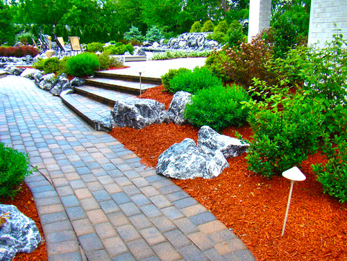
2. Dyed mulch

Photo by Modern Landscape Care and Design

“Dyed mulch needs to go—it’s terrible to work with,” laments Chris Lambton, a professional gardener and co-host of HGTV’s “Going Yard.”

Not only are colors like orange too vivid for most gardens, but the dye used on this product gets on everything.

“It stains my hands, the truck, and anything it touches,” says Lambton. “And the colors just don’t look natural.”

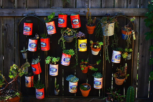
3. Upcycled planters that look like junk

Photo by Melissa Mascara Design 

Upcycling has been taken way too far in the garden, says Lambton: “People are going over the top with old sinks, pots, and pans—it’s turned into a garage sale in the yard.”

We’ll allow one kitschy item per household. But when every can has been used to grow herbs and flowers, you need to get out the recycling bin and give this look a break.

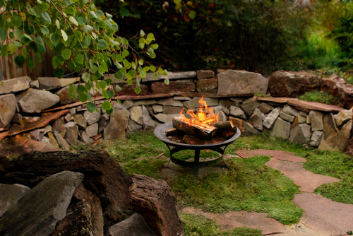
4. Wood-burning fire pits

Photo by The Garden Artist LLC

Do you love smoke blowing in your face no matter where you sit? Real wood is really awful in an outdoor fire pit. (Save the logs for indoor use.)

“I love the smell of real wood burning, but you can buy smokeless fire pits now that cut down on the fumes,” says Lambton.

Or you can have one built with vents at the bottom for better air circulation and a less smoky fire. Your lungs will thank you.

5. Large grass lawns

Photo by Clawson Architects, LLC 

A big expanse of grass is a time and money suck, not to mention all the water you’ll need to spray on to keep it looking lush and verdant.

“Huge grass lawns are so boring,” says Isara Ongwiseth, lead designer at FormLA Landscaping.

“Shrink the lawn, add curves, much more mulch, and plantings, and you’ll cut down on maintenance, cost, plus help the environment,” advises Lambton, who also notes that large lawns are not natural.

Not convinced? “Nothing will make you ditch your lawn faster than having to drag yourself out to mow while your neighbors kick back with their coffee surrounded by blooms,” adds Ongwiseth.

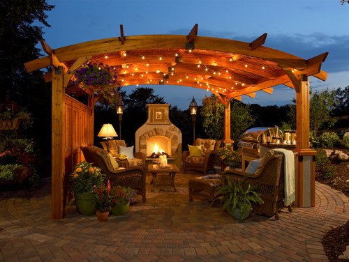
6. Tiny, year-round Christmas lights

Photo by Houzz

Twinkle lights might look nice, but they just don’t shed enough light to work if you’re out there at night. If you want to actually see your guests, spring for bigger filament bulbs instead—and you can finally save your Christmas lights for the tree.

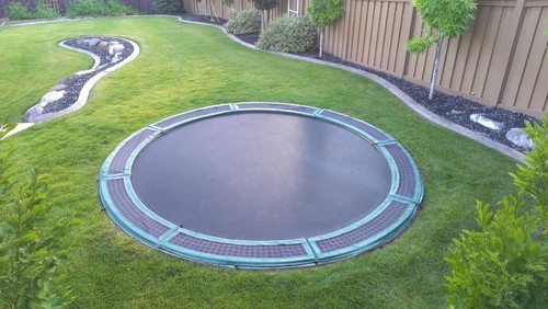
7. Trampolines

Photo by Decorative Landscaping

We get that the kids needed some entertainment, but a backyard trampoline is a broken ankle just waiting to happen. Even worse, the neighbor’s kid could break his ankle on your property, which is a whole other kind of headache.

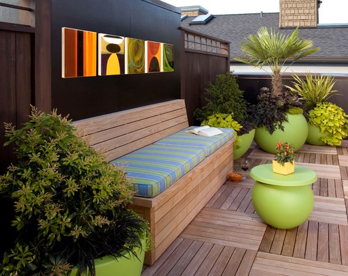
8. Outdoor storage bench

Photo by Faith Sheridan

What could be more sensible than a bench with storage underneath? Problem is, leaks can happen with many of these containers, hinges can degrade and break, leaving you to MacGyver a workaround by lining the inside with plastic bags.

Storage benches, as with rugs, are best when shielded from the elements with a roof or other structure.

9. So many planters, there’s nowhere to sit

If you can’t find a place to sit, you’ve gone too far with your container garden. While the garden pros here love the feeling of abundance and beauty that a ton of pots can offer, less can be more, especially in small spaces.

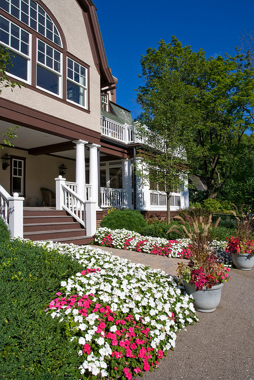
10. Tons of annuals that need to be replanted each summer

Photo by Van Zelst Inc 

If you have nice, large flower beds, make them work for you! Plant perennials once, and enjoy them for years.

“Why would anyone replant annuals, wasting time and energy, when smartly arranged natives are an option?” asks Ongwiseth.

Here’s more on the difference between annuals vs. perennials.

The post 10 Popular Yard Trends That Just Don’t Make Sense appeared first on Real Estate News & Insights | realtor.com®.
Erin and Ben Napier Reveal One Thing Every Kitchen Should Have

Home Town Takeover

HGTV

On their new show, “Home Town Takeover,” Erin and Ben Napier have made a lot of progress in their mission to make over Wetumpka, AL—but they still have a way to go.

In the episode “Say Yes to Wetumpka,” Erin and Ben fix up the Wetumpka Civic Center, turning it into a premier event venue for weddings and beyond. What’s more, they help renovate one family home that serves as a gathering place for kids after school.

These are both big projects, so Mina Starsiak-Hawk from HGTV’s “Good Bones” and Randy Fenoli from TLC’s “Say Yes to the Dress” step in to help out.

Here’s how they renovate these two spaces, which contain plenty of take-home lessons that you can apply to your own home, too.

Reface ornate columns for a more modern exterior

house
These ornate columns dated the house.

HGTV

This week, Erin and Ben decide to update Robert and Kim Rose’s family home, with the help of Starsiak-Hawk. Robert and Kim have two teenagers, but they also always have their doors open to the neighborhood kids, welcoming them over when they need a place to do their homework or just a safe spot to hang out.

“Their house is the hub for the neighborhood kids,” Ben says.

So, they want to make this home feel extra inviting, starting with the front porch.

house
These columns make the house look much more modern.

HGTV

“Adding the cedar wrap to the columns is a really quick, easy update,” Starsiak-Hawk says when she comes into town to help. “It’s going to make it look so much nicer.”

She covers the old columns in cedar, a simple solution that can make a big difference to any old home.

Separate rooms with French doors

archway
Erin and Ben Napier saw some potential in this archway.

HGTV

While kids are flocking to this family’s house all the time, the space isn’t really all that big. It has a yard for playing basketball, a living room where the kids can gather, and the dining room, where kids can do homework.

Right away, Erin and Ben see how crowded this space can get, so they come up with an idea to install French doors, for some extra separation.

French doors
These French doors give the rooms some privacy, an important feature in a house filled with teenagers.

HGTV

“We want to create a division between the living room and the dining, because the dining’s going to function more as a work area for the family, for the kids that come through doing homework,” Starsiak-Hawk explains, “whereas the living room is the fun space.”

While many families like homes with wide-open living spaces, this extra separation is functional. Now, kids don’t need to be listening to the TV in the living room when doing their homework, but with the glass doors, everyone is still visible.

Every kitchen (especially with kids) needs a snack drawer

kitchen island
This kitchen was so big, this island fit in nicely.

HGTV

Erin and Ben notice that Robert and Kim’s kitchen is pretty big. In fact, it may be too big.

“It feels like you’re missing something right here, like you need an island or something,” Erin says.

Ben decides to build an island with lots of drawers that have lots of sections perfect for storing snacks. “That way, the kids can grab something to eat while they’re working on their homework or playing basketball,” he says.

The island ends up looking great, and with the special snack drawers, it’s the perfect addition to any home with kids.

kitchen island
Ben Napier custom-made this island to serve as a snack-time oasis.

HGTV

Lighten up a room with white walls

civic center
Dark walls, ceiling, and floors make this space look dreary.

HGTV

With Kim and Robert’s home well underway, Erin and Ben head over to the Jeannette E. Barrett Civic Room. When they tour the space, they’re surprised by how dark it is. Erin points out that the floor, walls, and ceiling are all in the same brown wood.

This room needs some light paint, but instead of lighting up all the wood, Erin decides to paint only the walls.

“I wanted to lighten up by painting the walls cream, keep the original ceiling because that’s the history of this place. The same thing with the floors,” Erin says. “The floors and the ceiling sort of reflect each other.”

civic center
Erin Napier only had to paint the walls to brighten this space.

HGTV

It’s the right choice, since the white paint updates and brightens the room, but the floor and ceiling allow the space to keep some character.

It’s now a great location for events, and one local bride even decides to have her bridal shower there. To sweeten the deal, Fenoli gives her the “Say Yes to the Dress” treatment, helping her to find the perfect wedding dress.

Randy Fenoli
Randy Fenoli helps a Wetumpka bride find the perfect dress.

HGTV

Brass gives a kitchen a warm touch

kitchen
This kitchen wasn’t suited to entertaining.

HGTV

While the main space is now fit for a party, the Civic Center’s kitchen needs a lot of work.

“This is not big enough for an Alabama reception,” Ben says.

Erin wants the kitchen to feel as cozy as someone’s home, so she installs dark-green cabinets to give the space an elegant but homey feel.

The color of the cabinets isn’t the only showstopper. Before Fenoli heads back to New York, he helps hang up some brass light fixtures.

“With the color of the kitchen, that emerald, that dark emerald, this brass is going to be gorgeous,” he says.

kitchen
This civic center kitchen feels as cozy as a home kitchen.

HGTV

The post Erin and Ben Napier Reveal One Thing Every Kitchen Should Have appeared first on Real Estate News & Insights | realtor.com®.
Friday, May 28, 2021

Perk Up Your Patio on the Cheap: 6 Easy DIY Projects You Can Tackle Over the Weekend

Getty Images

So you’re a little late to the outdoor party, but now that the unofficial start of summer is here, you’re realizing that you need to deck out your patio for what will undoubtedly feel like the best summer ever. But if you’re hoping to score a bargain, after a year of shortages and unexpected expenses, you’re probably out of luck.

Rather than spending hundreds or even thousands of dollars on brand-new decor for your favorite outdoor space, why not make it yourself? We spoke with design and DIY experts from all over to uncover some pretty patio pieces you can easily—and cheaply—put together. Here are six of our favorite DIY projects that will refresh your outdoor space—all in a single weekend.

1. Outdoor sectional

DIY sectional
DIY sectional

Kinda Sorta Simple

Hoping to add more seating to your patio this season? Look no further than this easy and cheap DIY outdoor sectional from Kinda Sorta Simple. Made entirely with two-by-fours from Home Depot, this is an affordable project you can easily tackle in a weekend, and one that’s sure to get your patio feeling summer-ready.

“Outdoor sectional furniture can transform a large backyard into a beautiful and functional outdoor space,” says designer Zoe Warren of Price Your Job. “Outdoor sectional furniture sets are the centerpiece of any modern patio.”

2. Fire pit

DIY fire pit
DIY fire pit

A Beautiful Mess

Assuming you don’t live in a place with a burn ban, having a fire pit can really up the cozy factor in your outdoor space when the sun goes down.

“Adding a fire pit to your backyard is a perfect way to create a gathering place,” says designer Andra DelMonico of Trendey. “It also gives you natural light and warmth for increased usability at night. The gentle glow of the crackling fire creates an ambiance that’s perfect for socializing with friends and family.”

Create your very own backyard ambiance with this fire pit tutorial from A Beautiful Mess.

3. Bench swing

DIY bench swing
DIY bench swing

House One

We all love a good porch swing, but who wants to pay the incredibly high price for a new one? Save your funds for something else, and instead build this adorable hanging bench swing from House One.

“Bench swings provide a restful spot for your family to relax this summer,” says Warren. “These swings are a much cozier option than a standard stationary bench, and if the classic bench size is too big for your porch, you can always make single-seater swings.”

4. Picnic table with built-in cooler

DIY picnic table with built-in cooler

The Home Depot

This two-in-one piece for your patio might just become your favorite piece of furniture.

“Wouldn’t it be nice to grab another drink without getting up? A table with a cooler in the center allows you to keep your drinks cold and accessible while hosting your next get-together,” says DelMonico.

What’s even better, the little table insert can be used for a variety of other things—like a planter, or even a fire pit.

Check out this cooler-picnic table tutorial from Home Depot to get started.

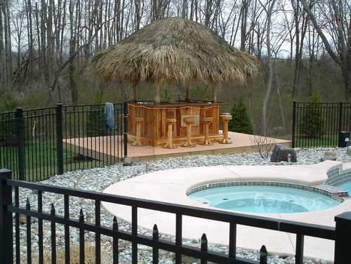
5. Backyard Tiki bar

If you mastered the at-home cocktail during quarantine, then why not show off those skills with a brand-new DIY Tiki bar in your backyard?

“Stepping in and out of a Tiki bar feels like a romanticized version of island life, so it’s no wonder we love them for outdoor spaces,” says Warren. “As well as creating an exotic aesthetic to your garden, Tiki bars function as a great way to serve beverages to your guests without the trouble of multiple trips in and out of the house.”

Consider adding a few extras to your Tiki bar—like dimmable string lights, bamboo and rattan furnishings, water features, and, of course, ludicrously named drinks. Craft your perfect tropical watering hole with this easy project from DIY Network.

6. Deck planters

DIY planter box
DIY planter box

Crazy Laura

Have ambitious gardening plans but nowhere to put your plant babies? Then why not create space with a few of these DIY deck planters?

“Adding planters to your deck gives you extra space to grow plants,” says DelMonico. “Choose flowering plants that add natural colors or tall, dense ones that will grow to be a natural privacy wall. If you live somewhere sunny, you can even add some shade to your backyard with plants that have large leaves.”

Get your patio garden started with one of these easy DIY deck planters from Crazy Laura.

The post Perk Up Your Patio on the Cheap: 6 Easy DIY Projects You Can Tackle Over the Weekend appeared first on Real Estate News & Insights | realtor.com®.
Yard Maintenance Tasks for Children of All Ages, From Youngsters to Young Adults

Getty Images

Parents, you know that summer vacation is upon us, and that means your kids will be antsy to tackle new activities. So there’s no better time to teach them a thing or two about gardening.

“Many of us turned to creating a garden as one of our quarantine hobbies in 2020,” says Bailey Carson, home expert at Angi, the home improvement recommendation site. “It’s a great time to include your kids in your garden’s revival and maintenance.”

Teaching your kids about lawn and yard maintenance can occupy hours and instill in them a sense of responsibility and accomplishment. Plus, it’s an activity the whole family can partake in.

Of course, we’re not suggesting you simply set the children loose to trample on and bust up your garden. Try out the following age-appropriate yard maintenance activities together at first, and see if your kids take a liking to them. Best-case scenario? They’ll continue to help you tidy up outside!

Elementary school-age children

Children of this age require smaller jobs they can do with an adult. But experts say, let them have a chance to take the lead and feel a part of the task.

“This is an opportunity for you to teach them the very basics of gardening while also having fun,” says Carson. “Try to turn yard cleanup and maintenance tasks into fun games like how many sticks can you pick up in a minute.”

Carson says other ideas for gardening tasks include watering plants, repotting plants, digging holes with plastic shovels, helping plant a window garden, and picking outdoor flowers and turning them into indoor flower arrangements.

“Even at a young age, getting kids involved in the garden and allowing them to be part of the process from start to finish promotes creativity and a positive connection to nature,” says Dave Thompson of Seeds of Change, an organic seed and food company.

Thompson says young helpers can also assist with picking out different vegetable, herb, or flower seed varieties for the garden.

“Allowing them to pick out their favorite produce and watching the plants grow will make them more excited to eat the vegetables when it’s time to harvest,” he says.

Middle school-age children

Children in middle school can often handle more independent tasks, including those that require low-risk tools like rakes and pruning shears to help bag leaves or prune plants.

Thompson says to teach kids at this age about the different gardening tools, and encourage them to take responsibility for a specific section or area of the garden.

“You can also teach middle school-age children about the importance of pollinators, and even plant a butterfly garden to attract beautiful and helpful pollinators to your backyard,” says Thompson.

“At this age, you can give kids an incentive to help you out by giving them an allowance to do yard chores,” says Ashley Renne Nsonwu, host of “Ashley Renne” on the Smart Healthy Green Living streaming service.

Composting is one way to make a nutrient-rich solution that can be used on your lawn, and it’s also a great eco-conscious project to involve middle school-age children.

“Teach your kids how to effectively use their food scraps for something useful for your yard. You can buy or build a compost bin together and show them how to layer kitchen scraps and green plant matter into the bin,” says Nsonwu. Then task your kid to regularly maintain the layers until the pile degrades into finished compost for your grass.

High school-age children

High schoolers can handle even more responsibility and can be taught how to properly use a lawn mower, weed trimmer, or hedge shears.

“Show them how the tools work and keep an eye on them the first few times, until you’re all comfortable with them doing the job on their own,” says Carson. “Teenagers can also take on some gardening jobs that require a little heavy lifting.”

High school-age kids can also handle chores that require attention to detail, such as edging the lawn. 

Thompson says kids this age can take on even more ownership in the upkeep of a backyard garden. He recommends getting them involved with building a raised garden bed. And if your high schoolers enjoy cooking, encourage them to plan out an area of the garden that has their favorite herbs and vegetables that they can tend to and then use in the kitchen.

“Teaching them to grow their own food supply not only fosters a connection to nature but also encourages them to have an appreciation for their favorite healthy foods,” says Thompson.

The post Yard Maintenance Tasks for Children of All Ages, From Youngsters to Young Adults appeared first on Real Estate News & Insights | realtor.com®.
Tarek El Moussa and Christina Haack Face a ‘Tough Critic’ in Their Own Family

flip or flop

HGTV

“Flip or Flop” stars Tarek El Moussa and Christina Haack usually stick with more of a modern coastal vibe, but in the latest episode, they try something new: modern Southwestern.

In the Season 11 episode “Prickly Flip,” El Moussa and Haack buy a house in Lakewood, CA, for $455,000. The place is simply a wreck, with an ugly exterior, gutted kitchen, and a leaking water bed nearly ruining the floors.

Although they work miracles turning this house around, they face some scathing criticism on their design choices—from a family member no less. Here’s what happens, and plenty of take-home lessons you might be inspired to apply, too.

Stucco works best for a Southwest style

house
This house had zero curb appeal.

HGTV

When Haack and El Moussa first tour this house, they’re worried about the exterior: The lawn is ugly, the siding is in bad shape, and the whole thing is an eyesore.

“It looks like a barn,” El Moussa says.

However, Haack is inspired by the cactus in front of the house and decides to give the exterior a modern Southwestern look. The team rips out the old wood siding and, instead of replacing it with more wood, they go with simple (and less expensive) stucco.

house
This stucco gives the home a Southwestern style.

HGTV

When the house is finished, Haack is happy they ended up using the stucco. It looks clean and fresh.

“I feel like probably the siding would’ve been a little much,” she says. “This feels Southwestern.”

You can also stucco a fireplace

fireplace
This brick fireplace was the wrong style entirely.

HGTV

Haack wants to bring a bit of that Southwestern theme inside. To start, she decides to stucco the brick fireplace.

While stucco can be an inexpensive alternative to wood siding, Haack learns that doing this fireplace would cost $2,400—a high price for just one feature, especially when it would cost only a couple hundred to paint the brick.

“Save $2,000 and get a very similar look? Let’s just blast it with, like, a super bright white,” El Moussa says.

fireplace
With some stucco and paint, this fireplace is the best of both worlds.

HGTV

The two compromise, agreeing to use stucco on both the hearth and where a mantel would go, then painting the rest black. It’s a modern look that works with the Southwestern theme, it costs only $700.

Both Haack and El Moussa are happy.

“We saved money here, and we compromised, which I feel like, every time we compromise it works out really well,” says Haack.

A big island can offer more storage

kitchen
This kitchen was a total wreck!

HGTV

After taking down the wall separating the kitchen from the living room, Haack and El Moussa realize that the kitchen doesn’t have much cabinet space. Their solution: Add a giant 9-foot island with plenty of storage.

“We don’t have a lot of storage in this kitchen,” Haack explains. “Like, we need to utilize everything we can.”

kitchen
This big island will give the new homeowners lots of storage and more workspace.

HGTV

Once the island is built, the kitchen seems much more functional. While there may not be a lot of storage on the back wall of this kitchen, the island provides lots of cabinets and ample counter space. It’s a great solution to the space problem and a good reminder that when it comes to kitchen islands, often bigger is better.

Choose a backsplash that works with the theme

Taylor El Moussa
10-year-old Taylor El Moussa isn’t so sure about this backsplash.

HGTV

Especially after the fireplace debacle, it’s clear El Moussa and Haack don’t agree on every design feature right away, but they defy the odds when they both say they love one particular backsplash.

The tile is modern with a bit of Southwestern flair—plus, it’s black and white, which complements the dark cabinets. It seems like the perfect choice for this kitchen.

However, when El Moussa and Haack bring their 10-year-old daughter, Taylor, to the house, she points out that the match isn’t perfect.

kitchen
This backsplash still looks great.

HGTV

“Do you see how the color of this cabinet and the color of the backsplash matches?” El Moussa asks.

“This is more of a brown though,” Taylor says, touching a cabinet.

Haack is taken aback. “You’re a tough critic,” she says.

While the colors may not match perfectly, the backsplash is still a great choice, and at just $3 per tile, it helps Haack and El Moussa stay on budget.

Even a small fire feature can amp up a backyard

backyard
This small fire feature makes a big difference.

HGTV

After Haack and El Moussa renovate the home’s interior, they don’t have much to spend on landscaping. Still, Haack wants the space to feel special.

“I actually did see this really cool, like, fire feature that has an adobe look to it, that has sort of like a chimney on top,” Haack says.

They can put a few tree stump seats around it and it’ll cost only $500, she says. While most homeowners assume a fire feature will cost a lot, Haack’s idea gives the backyard a unique upgrade for a small price.

Is this a flip or flop?

After paying $455,000 for the house, Haack and El Moussa pour $125,000 into the renovation. They decide to list the home for $799,999. They get multiple offers and end up selling the house for $842,000.

After closing costs and commission, these flippers net $231,200. With results like that, even perfectionist Taylor has to be impressed!

The post Tarek El Moussa and Christina Haack Face a ‘Tough Critic’ in Their Own Family appeared first on Real Estate News & Insights | realtor.com®.
How To Pick a Paint Color You Won’t Regret—Inside and Out

paint

Getty Images

Two years ago, we painted a major living area in our home—a large, open-concept space that contains our family room and kitchen, with high ceilings and lots of natural light. We took it from a garish mustard yellow to white. The room now looks so light, so bright, so green.

How could this be? It turns out, our home is surrounded by trees, and during the day, the light flooding through the windows carries a green tint, which shows up on our white walls. We hadn’t considered this possibility when we’d picked what we thought was the perfect shade of white. Oops.

The fact is, as simple as it may seem to pick a paint color, there’s a host of factors to consider beyond the colors you like. Even when you narrow it down, for each color there are literally hundreds of shades and sheens, and each will look a bit different depending on where it’s painted.

So how do you choose the right one? Here are some factors experts say you should consider to find a color you won’t regret.

Determine what mood you want the space to convey

Before you determine how you want to paint your space, you want to consider why you’re painting it. Paint has the power to significantly change a room, but it’s important to determine the goal for that change.

Erika Woelfel, vice president of color and creative services at Behr Paint, says an important consideration is mood.

“When people are looking at a painting project, they’re usually looking for a transformation to happen, and mood is a big part of that,” Woelfel says. “So how you want the room to feel is often a good way to help determine the right color. For example, a brighter room is more energetic, while neutrals are calmer.”

Are you looking for a bright and peppy perk-up, or are you craving a tranquil escape? Asking yourself these kinds of questions can help you at least determine a starting point on the color spectrum.

Keep tabs on what colors are in the room already

Woelfel says people also often forget to consider an entire space when choosing a color. Inside, that means coordinating colors with things like the cabinetry, flooring, and hardware. The same idea holds true outside.

“In the excitement of selecting paint colors for the exterior of a home, you can forget to consider the colors of the architectural details you aren’t painting or changing,” says Jessica Barr, national trainer and paint application expert for Behr Paint. “Make sure the colors of the shingles, brick, stonework, and light fixtures complement the exterior paint colors you choose.”

Pick a paint sheen, too

Once you choose the color, you’re not done—you must also consider a paint’s finish, which cannot be accurately evaluated through an app. In general, the choices fall into three categories: flat or matte, satin, and semigloss or gloss. They determine how reflective a paint is and can significantly affect how a particular paint color looks on your walls.

“People very often forget to consider the sheen of a paint,” Woelfel says. “The higher the sheen, the deeper the color looks. When it’s flat or matte, the light gets absorbed, but when it’s glossy, the color looks deeper, because there’s a shine to that surface.”

You must also consider where you’re applying that paint. For example, higher-gloss paints tend to be easier to clean, so they’re better for high-traffic areas, although they do highlight imperfections. Matte paints are more difficult to clean, but they’re better at hiding imperfections and may be good for ceilings and hallways. Satin finishes fall somewhere in the middle, and are a popular choice for bedrooms, living rooms, and playrooms.

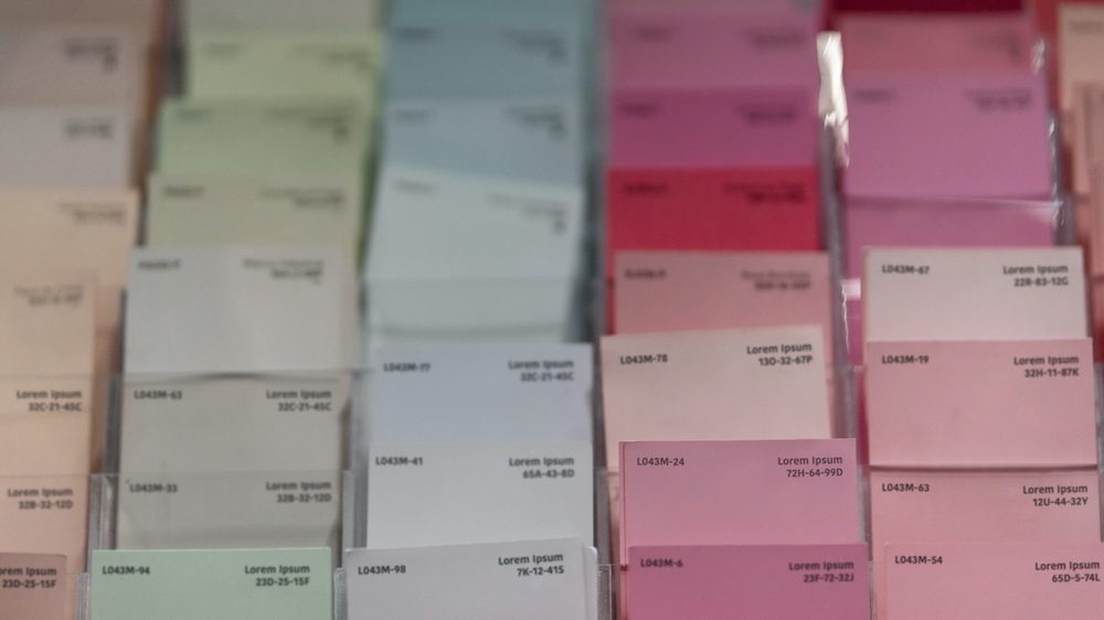
For more information on choosing the best paint sheen, Home Depot offers the following video:

Use paint color apps to test it out

Once you have a general idea of the color or colors you like, it’s time to start narrowing things down further. The good news is there are online tools to help you make the right paint choices and set that mood, many of which don’t even require you to leave your couch.

For example, Home Depot’s ProjectColor app lets you snap pictures of various areas of your home, then try out different paints on them. It will make suggestions and help you find versions that coordinate with furniture or other items in the spaces.

Similar functionality can be found with the Sherwin-Williams Color Snap Visualizer and Behr’s Paint Your Place technology.

But don’t depend on these apps entirely. One variable that can’t be accurately reflected in pictures is the light in the space you want to paint.

“The type of light you have in a room really determines how that color looks,” says Barr.

What a color looks like in one room may be different in another, and what looks just fine at one time of the day may look not so fine (in my case, green) at other times.

Try a paint swatch first

The only way to truly see how a paint will look on your walls, considering all these elements, is to actually put some on your walls, also known as swatching. Most brands sell small containers of their paints for this purpose, so you don’t have to buy an entire gallon just to test out a color.

Paint a swatch as large as possible, then observe it at various times throughout the day to see how it changes with the light. Painting various spots throughout the room and observing them in different types of weather is helpful, too.

If it leaves you less than enthused, then it’s time to try something new.

The post How To Pick a Paint Color You Won’t Regret—Inside and Out appeared first on Real Estate News & Insights | realtor.com®.
Thursday, May 27, 2021

The Property Brothers Are Back! Here’s What They’ve Been Up To

HGTV

Drew and Jonathan Scott are back: After a brief hiatus, Season 5 of their show “Property Brothers: Forever Home” has resumed, and in the latest episode they help high school sweethearts turn their home into a place where they’d be happy to grow old together. Isn’t that sweet?

In “The Future Looks Bright,” the brothers help parents of two Jen and Alex renovate their 1940s home in Los Angeles. It’s up to Drew and Jonathan to add some style to this midcentury home, with a max budget of $130,000.

Here’s how they pull it off.

Keep the old, but make it feel new

living room
The clients love this classic fireplace, but it needs some updating.

HGTV

There are a lot of things in this old home that Jen and Alex adore. For example, they love the brick fireplace and the old mantel, and Drew and Jonathan like them as well.

“We can keep the surround on the mantel,” Jonathan says. “We can clean up the brick, and I think it’ll be a beautiful feature.”

They clean up the brick fireplace to make it look fresher. They also repaint the inside of the firebox black to make the black look more crisp.

fireplace
These red bricks now look less dingy.

HGTV

With the old fireplace looking new, the brothers also polish the front door’s 80-year-old doorbell to make it sparkle.

“I love antiques, and when you have a doorbell like this that’s, like, 80 years old, I want to make sure that we make it look like it was the day it was installed,” Drew says.

Between the fireplace and the doorbell, Drew and Jonathan prove that sometimes older features just need to be refreshed. Rehabbing rather than replacing these items saves money and lets this old home keep some valuable character.

doorbell
After cleaning off this doorbell, it looks brand-new!

HGTV

Never paint wood floors

flooring
Drew Scott says to never paint your floors.

HGTV

One of the biggest problems with this house is the flooring. A previous owner painted the wood floors black, and since then, the paint has started to chip.

“When we moved in, they looked OK, but it was just a shoddy paint job on top of the wood,” Jen says.

Drew has some helpful advice for all homeowners: “Don’t paint your floors and don’t paint bathtubs, because they will always slough off.”

flooring
This flooring is light, with a Scandinavian aesthetic.

HGTV

But it’s too late for these floors, so the brothers decide that it’s probably best to rip up the flooring and start over. They pick a light, wide-plank wood that has a nice Scandinavian aesthetic while still providing the warmth of wood. It’s a good mix of the midcentury style that’s already in the home and the clean look this couple loves.

From chipped, black paint to bright hardwood, this flooring is a major upgrade.

Two-tone cabinets are trendy today

kitchen
These cabinets are a perfect mix of Scandinavian and midcentury.

HGTV

From the beginning of the renovation, Alex and Jen are conflicted: They like clean, Scandinavian design, but they also love the midcentury feel that their old home already has.

So when it comes time to choose cabinets, Jonathan isn’t sure which style to pick. He points out that a lot of Scandinavian designs have slab-style, high-gloss cabinets, but Drew explains that Jen and Alex are leaning toward a more natural look.

“Because they were really gravitating toward the earth tones, the wood tones, no gloss,” Drew says.

Jonathan splits the difference, using wood cabinets for most of the kitchen but including some glossy white upper cabinets. Once the cabinets are installed, it’s clear that Jonathan made the right choice.

The white cabinets brighten the space while the wood gives off a midcentury look without feeling dated. These two-tone cabinets combine Jen and Alex’s favorite styles perfectly.

Don’t be afraid to shrink a window

kitchen window
Natural light is great, but not if it comes at a high price.

HGTV

When the brothers first tour this home, they find an oversized kitchen window hidden behind a dated fan and bulky shutters.

“What’s the point of even having a window if you’re going to cover it up with shutters and then put a monstrous fan in the way?” Jonathan asks. “Natural light is so important, so I definitely want it uncovered for the new kitchen.”

However, uncovering this window isn’t the only change that needs to be made. The brothers realize that this window is much bigger than the other ones in the kitchen, and it’s blocking off an area that could be valuable counter space. So the brothers reduce the size of this window and run cabinetry and counters along the wall, even putting a sink under the window.

window
Making this window smaller made room for more counter space and this sink.

HGTV

“That corner wasn’t being used for anything, Drew says. “It was meant to be a kitchen eat-in area, but instead it was a dead space. Now we’re going to utilize it.”

When the kitchen is finished, the window looks perfect. Sometimes, counter space trumps window size.

Carry the kitchen design into the laundry room

laundry room
This setup wasn’t a smart use of space.

HGTV

Since guests don’t typically see the laundry room, it can become a home’s forgotten space.

In this house, the cabinets are dated and the side-by-side washer and dryer are old. It’s not exactly an area Jen and Alex want to show off. However, their laundry room connects to the backyard, so guests are always walking through the space.

Luckily, Jonathan has an idea to make this space more stylish, by stacking the washer and dryer and then adding cabinets and a countertop that carry the kitchen’s design.

“I’ll continue the same cabinets right into the laundry room so it feels more like an extension of the kitchen,” Jonathan says. “It’ll be incredibly functional but also stylish enough so you won’t have to cringe when your family and friends pass through to your backyard.”

Now, the laundry room is more functional, and it feels stylish and updated—just like the rest of the house.

laundry room
Now, the space is more functional and the cabinets match the kitchen!

HGTV

The post The Property Brothers Are Back! Here’s What They’ve Been Up To appeared first on Real Estate News & Insights | realtor.com®.