Saturday, September 28, 2019
Friday, September 27, 2019
Get Cozy and Chill With This Week’s Top Outdoor Trends on Instagram

Aschen/iStock; realtor.com
Things may still be pretty toasty across most of the United States, but now that the sun has crossed the celestial equator, autumn’s briskness is sure to enter into full swing soon. So what better time to decorate your outdoor space for chilly nights by a fire, or cozy afternoons on the front porch?
The design world of Instagram seems to be on board with this plan, too, since this week was simply buzzing with fresh outdoor decor looks for fall.
As we do every week, we’re bringing you five of the most-liked decor posts on Instagram, to show you how you can get these amazing cozy looks in your outdoor space. So get ready for the ultimate #fallfrontporch decor inspo—just be sure to BYO pumpkin spice latte.
Comfy wicker corner chairs
View this post on InstagramA post shared by Stacy | Gardening | Home Decor (@bricksnblooms) on
There’s nothing like settling in under a cozy blanket to watch the leaves change color; and you can turn your porch into the ultimate daytime chill zone by adding a corner wicker chair like the one in this post from @bricksnblooms.
“Wicker chairs provide a little extra character on your fall-themed porch or deck—and make a great place to host family in the fall,” says Chelsea Allard, vice president of design at Case Design/Remodeling.
If you’re worried about fall’s chilly, damp weather wreaking havoc on the wicker, fear not—weatherproof options abound!
“This wicker style of seating has become really popular over the last few years,” explains Neil Partridge of NGI Design. “It’s often a really durable plastic or synthetic resin that’s been shaped to mimic a wicker, which means that you can have the style without the hassle.”
Get the look
Upgrade your space with some cozy wicker seating by shopping the chairs at Wayfair, or alternatively, opt for a full outdoor sectional from Home Depot.
Seasonal welcome mats
https://www.instagram.com/p/B2xY0xnlEaw/
Anything customized tends to be expensive, but the trend toward seasonal customized welcome mats, as seen on the front porch of @jlgarvin, is one exception.
“Custom welcome mats offer a simple way to add a personal touch to your home on the cheap,” Partridge says.
It’s also a fun way to greet your guests, and a practical essential for keeping the house tidy.
“One of the easiest ways to give guests a warm welcome is by having simple, homey touches at the front entrance,” Allard says. “A custom welcome mat can ring in the holiday season, complement a fresh coat of paint, or at its most basic level, help keep your foyer clean.”
Get the look
Find your perfect seasonal mat by shopping the options on Etsy and Hayneedle.
Perfect fall fire pit
View this post on InstagramA post shared by Emily • Home & Lifestyle (@theporcheplace) on
Kick off the chillier season and complete your outdoor space with a stylish stone fire pit, like the one featured in this recent post by @theporcheplace.
“Nothing says fall like friends around a fire pit,” Allard says. “Next time you have the urge to cook up some s’mores or cuddle up around some of your favorite company, a fire pit could be the perfect addition to your deck or backyard.”
Get the look
Create your ultimate outdoor fall haven by checking out the collections of stone fire pits at Wayfair and Home Depot.
Classy white pumpkins
View this post on InstagramA post shared by
T . W . C .
(@tiffanyswreathco) on
Orange pumpkins are great for fall, but they’re just so … predictable. Elevate your outdoor decor this season by opting instead for a collection of white pumpkins, like the ones in this repost by @tiffanyswreathco of @homehydrangea’s front porch.
“Halloween decorations don’t have to be limited to orange!” Allard exclaims. “White, green, and earth-toned pumpkins have become more popular in recent years as autumn decor pieces, and make for a friendly and stylish front entry.”
Get the look
Mix up your front porch fall decor this year by shopping for white pumpkins at your local nursery.
Victorian porch lights
View this post on InstagramA post shared by Erica Rigdon-Designer|Stylist (@style.and.grace.interiors) on
You don’t need to install actual gas lamps to add some Old World Gothic charm to your home’s exterior. Opt instead for a set of Victorian-style porch lights, like the ones in this post from @style.and.grace.interiors.
“This style of porch light is fantastic. It creates brilliant curb appeal, draws attention to the details, and evokes a sense of elegance and regal style,” Partridge says. “You’ll find that they fit in with any theme that you can think of, because it will either create a gorgeous contrast or a complementary atmosphere.”
Get the look
Find the best Victorian-style lights for your home by browsing the collections at Bellacor and BrilliantOutdoors.
The post Get Cozy and Chill With This Week’s Top Outdoor Trends on Instagram appeared first on Real Estate News & Insights | realtor.com®.
Why Can’t Tarek and Christina Sell This House? Inside Their ‘Creepiest’ Flop to Date

HGTV; realtor.com
Tarek El Moussa and Christina Anstead might be in over their heads in their most recent “Flip or Flop” episode, “Additional Problems.”
At first, flipping a house in Long Beach, CA, seems like a safe bet to this former couple. They know the area, they’ve flipped houses there before, and comps in the neighborhood look promising. But the house they buy has a strange layout, limited space, and one long room that gives Anstead the creeps.
Will this house prove to be their first serious flop of the season? Here’s what they do to fix up this house, and some lessons we can take home with us.
A two-car garage is a major perk
When El Moussa and Anstead first tour this home, they’re not sure, when they look at it, if the house has a one- or two-car garage.
At the end of the driveway, there’s a single garage door with odd paneling where the second door should be. As it turns out, the house started out with a two-car garage, but its previous owners turned one side into a bare, narrow room whose exact purpose is a mystery. Anstead calls it “the creepiest room ever.”
Anstead and El Moussa aren’t sure what to do. Should they try to work with the awkward room, or convert it back to garage space?
In the end, they decide that garage space is just too valuable to pass up.
“Obviously, it’s a two-car garage in Long Beach,” El Moussa says, “that brings value.” So, they decide to reframe the space and put in a new garage door. Goodbye, creepy room!
No room for a kitchen island? Try a kitchen peninsula
Perhaps the worst feature in Anstead and El Moussa’s latest project is the tiny kitchen.
“What is this? This is the kitchen?” Anstead says when she first sees the space. “This is the smallest kitchen I’ve ever seen in my life.”
The space is indeed very small, but these flippers know they need to work with what they’ve got. One way they do this is by choosing a peninsula over a kitchen island.
While kitchen islands may be more on trend, the space is clearly not big enough for an island and room to walk around it. So, they go with the next best thing.
In the end, the peninsula is certainly the right choice. It not only adds counter space, but helps with the kitchen’s flow.
“This looks really nice,” Anstead says when the kitchen starts to take shape. “The peninsula is cool.”
HGTV
Easy access to the backyard is a must
Anstead and El Moussa make a lot of changes to the layout of this house. They turn a living room into a large master bedroom and add a bedroom and bathroom. During renovation, though, they realize that there’s one big problem with the layout: The only way to access the backyard is through the master bedroom.
“I think we were just so busy focusing on the addition and the layout and all these different things, we completely forgot about the yard access,” El Moussa says.
Of course, convenient access to the yard is a must, and the team needs to correct the oversight. So, they add another door in the living area.
It’s an extra $750 to install the door, but the cost is well worth it. Not only does it make for a much better layout, but the window in the door also provides more light for the hallway.
In the end, Anstead and El Moussa are happy with the fix.
“I’m really glad we added this door,” El Moussa says, as he passes by.
Not all front doors need a pop of color
Speaking of doors, El Moussa and Anstead have another door-related issue during this renovation.
Together, they choose paint colors for the home’s exterior, and while Anstead wants a yellow door that will make a statement against the blue they choose for the rest of the house, El Moussa vetoes her choice and decides on a turquoise door.
But it’s soon clear that El Moussa’s pick was the wrong choice, too. The turquoise door clashes with the slate blue exterior of the house, and Anstead and El Moussa know they need to change it.
They decide to play it safe the second time—and paint the door white. Thankfully, the new door looks great with the rest of the house—and proves that not every front door has to have a bold color. Sometimes, a simple entrance is all a house can handle.
HGTV
Add expensive tile sparingly
When Anstead shows El Moussa her pick for the shower tile, he loves it. There’s just one problem. The blue tile they both like is pricey, $10 a square foot, which El Moussa says is out of their budget.
So, instead of using the blue tile all over the shower, El Moussa comes up with a compromise. They could use the expensive blue tile for shower accents, in the shampoo niche, and on just one wall, and plain white subway tile for the rest.
In the end, they do both showers like this, and both look great.
“This bathroom is spectacular, I love the accent tile,” El Moussa says when he sees the finished product.
He’s right. With the mix of the light and dark tile, these bathrooms really pop.
HGTV
Light colors make small rooms seem spacious
In choosing designs for this house, Anstead and El Moussa lean toward lighter colors, and for good reason. The house is small, with only 1,400 square feet, two tight bathrooms and a small kitchen.
So, they brighten the space with light colors that make it feel more open. They choose white cabinets and light countertops in the kitchen and bathrooms to make the house feel less cramped.
“The white definitely makes the bathroom look bigger and more open,” Anstead says when the remodel is finished.
It goes to show that simply choosing the right color can make all the difference in a house with limited square footage.
HGTV
So, is this a flip or flop?
While the asking price was $540,000 on this flip, El Moussa and Anstead end up paying $558,000. After investing $104,000 on the remodel, and calculating the closing costs, staging, and commission, El Moussa finds that their break-even point is $687,900.
They list the house at $779,000, but apparently, their price is too high. At the end of the episode, El Moussa explains that they haven’t been able to sell the house yet. One possible reason is that the house still has plenty of issues, including a small kitchen, cramped bathrooms, and a garage that isn’t connected to the house.
Although we can’t be sure when this house will sell (or if it has sold since this episode’s filming wrapped), we’d chalk this up as the season’s first and most serious flop. Hey, there can’t always be a happy ending, right?
The post Why Can’t Tarek and Christina Sell This House? Inside Their ‘Creepiest’ Flop to Date appeared first on Real Estate News & Insights | realtor.com®.
Pets Can Take a Big Bite Out of Your Home’s Resale Value

Blake Gordon for The Wall Street Journal
In case you’re wondering, tomato juice won’t stop the stink from three skunked dogs.
Just ask Lexi Methvin, whose pups—Samson, Wesley and Suki—pounced on a skunk’s den near her home on 3 acres outside Carbondale, Colo. Giving them a long shower in a mixture of Dawn, hydrogen peroxide and baking soda solved her problem—one of many stirred up by these rambunctious pets.
After some doors had been scratched and chewed to pieces, Ms. Methvin, the chief executive of a family office in Basalt, Colo., spent $1,000 to replace the damaged wood with powder-coated metal. Another $1,000 was spent to replace door levers with doorknobs because the pups were sneaking into guest rooms and gobbling up things like vitamins and dirty baby diapers. Built-in baby gates avert further mischief, such as jumping up on kitchen counters to eat bananas, grapes and avocados—which leads to tummy troubles and diarrhea. During a recent dinner party, Suki, who hunts mice and voles, traipsed into the house covered in animal blood, says Ms. Methvin.
Since purchasing her 4,000-square-foot mountain home for $1.25 million three years ago, Ms. Methvin, 50, estimates she has spent between $25,000 and $30,000 on dog-related home repairs, carpet cleaning and preventive measures.
“They’re expensive,” she says. “Seriously, I have taken these dogs to the animal ER three times in the past 12 months.”
Anyone who has seen a puppy suffer separation anxiety knows that dogs can take a costly toll on real estate. These expenses typically far exceed the cost of owning the dog itself, estimated by the American Society for the Prevention of Cruelty to Animals at between $737 and $1,040 a year for the basics.
And standard homeowners-insurance policies won’t cover damage to your house or personal property caused by your pet, says Scott Holeman, a spokesman for the Insurance Information Institute, a New York-based trade group. So when Hercules breaks a window or tears up the carpet, the money for repairs comes out of the homeowner’s pocket.
Blake Gordon for The Wall Street Journal
Furniture seems to be a magnet for muddy paws and serious slobbering. And while this type of damage isn’t covered by homeowners insurance, protection plans, a type of insurance acquired when buying furniture, can cover some losses. The price of a protection plan is usually a small percentage of the cost of the item itself and may not be worth the extra money in some households. But people with messy or mischievous pets might want coverage for stains, chips, rips, scratches, water marks and other accidental damage.
Pet damage is the second-leading cause (behind product failure) of furniture claims filed with Safeware, one of the largest companies that provides protection plans in the U.S. However, claims related to pet damage are the costliest to repair, according to Mike Cole, spokesman for the Dublin, Ohio-based company.
Recently, a homeowner in Wisconsin filed a claim after his puppy somehow got a hold of a bottle of red food coloring, Mr. Cole says. Before he could be restrained, the dog had chewed and spewed red stains on a $2,000 sofa and love seat set. Safeware dispatched a professional cleaning crew to attack the fabric stains, and the company had the cushion cores replaced to prevent the dye from bleeding back onto the covers, Mr. Cole says.
Retailers typically select the company offering the protection plan—and terms can vary. Be sure to read the fine print to know what’s not covered, such as continuing pet damage that ruins a piece over time.
Playful pups are one thing, but homeowners with an aggressive dog may face challenges when buying homeowners insurance. Some companies charge higher premiums to homeowners with certain breeds, such as pit bulls, says Mr. Holeman. To limit their exposure to losses, an insurer may ask the homeowner to sign a waiver for dog bites—or opt not to sell a policy at all.
Happily, Ms. Methvin says her dogs are merely “enthusiastic,” not aggressive. “I’m looking at Samson right now,” she says. “He’s the most cuddly, lovable dog.”
Blake Gordon for The Wall Street Journal
Finally, dogs can have a big impact on home values when it comes time to sell. Home appraiser Susan Martins-Phipps has visited homes before they’re listed and found chewed furniture, scratched floors and stinky carpets. “I’ve had to step over dog accidents,” says Ms. Martins-Phipps, who’s based in East Greenwich, R.I. “That doesn’t necessarily affect the value, but it sends a message about how the homeowner is taking care of the house.”
When the damage is significant, however, a home could appraise at 2% to 5% less, she estimates. “If a buyer has to repair all the woodwork or the dog has been chewing up the shrubbery—landscaping is expensive—the amount can exceed that.”
Her advice to sellers: “Make sure you clean up.” And if homeowners don’t—or they’re not even aware there’s a problem, “I think there’s a conversation the agent selling the house needs to have with the homeowner.”
STOP DOGGONE CHEWING
Bored dogs tend look for ways to entertain themselves, and chewing is one option. Chewing can also occur when a dog is stressed or frustrated. Here are some tips from the American Society for the Prevention of Cruelty to Animals to help minimize destructive chewing.
- Provide your dog with plenty of toys, raw bones and other chew treats recommended by your veterinarian. Avoid cooked bones and bones that could be bitten into chunks and become a choking hazard.
- Introduce something new or rotate your dog’s chew toys every couple of days so that he doesn’t get bored with the same old toys.
- Identify times of the day when your dog is most likely to chew and give him a puzzle toy filled with something delicious. You can include some of your dog’s daily ration of food in the toy.
- Discourage chewing inappropriate items by spraying them with chewing deterrents. Reapply the deterrent every day for two to four weeks.
- If you see your dog licking or chewing an item that he shouldn’t, say “Uh-oh,” remove the item from your dog’s mouth, and insert something that he CAN chew. Then praise him.
- When you can’t supervise your dog, such as during the workday, you can leave your dog at home in a confinement area for up to six hours. Include a variety of appropriate toys and chew things to enjoy.
- Ensure that your dog gets ample physical exercise (playtime with you and with other dogs) and mental stimulation (training, social visits, etc.).
The post Pets Can Take a Big Bite Out of Your Home’s Resale Value appeared first on Real Estate News & Insights | realtor.com®.
Thursday, September 26, 2019
What Is a Bathroom Vanity? Adding Style (and Storage Space) to Powder Rooms

mikulas1/iStock
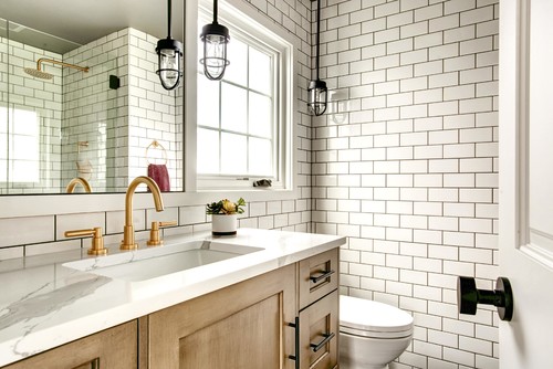
If you’re in the midst of a master bath or powder room remodel, a bathroom vanity is a great option to consider. The beauty of this cabinet, which holds the sink, is that it can provide storage for all, or most, of the everyday products, accessories, and cleaning supplies you need in the bathroom. It’s much more functional than, say, a pedestal sink that offers zero shelf space.
“The extra storage from the built-in drawers and shelving is one of the key benefits of a bathroom vanity—and the fact that it’s a piece of furniture that can dress up your bathroom’s look,” explains Amy Bly, a home expert with Great Impressions Home Staging/Interiors in Montville, NJ.
While the rest of your bathroom decor might be streamlined, the powder room is the place to take a design risk. That could easily start with a statement-making bathroom vanity, with updated faucets and a dazzling sink finish.
Here’s what you need to know about bathroom vanities, including sizing, price, and the wide range of styles.
How much space do you need for a bathroom vanity?
The general rule when it comes to sizing for a bathroom vanity is to allow 36 inches per sink.
“Anything less than this, and you won’t have much space around the bathroom sink and countertop edges for toiletries,” explains Sara Chiarilli, an interior designer with Artful Conceptions in Tampa, FL.
If you are dealing with almost zero space, narrow or corner vanities are available, like the especially slim one installed by decorator Darla DeMorrow of HeartWork Organizing in Wayne, PA.
“It’s just 15 inches wide, but it still offers storage,” she says. As to whether your vanity’s countertops should extend from wall to wall, the answer varies.
“They don’t have to reach each side of the bathroom, but I like a look that maximizes counter space and has no gaps for things to fall into,” says Bly.
Assess your vanity and sink style
The style of bathroom vanity you choose should match the overall aesthetic of your home, but don’t be afraid to shake it up and go for a more faddish look, especially in a guest bathroom. So what’s all the rage these days?
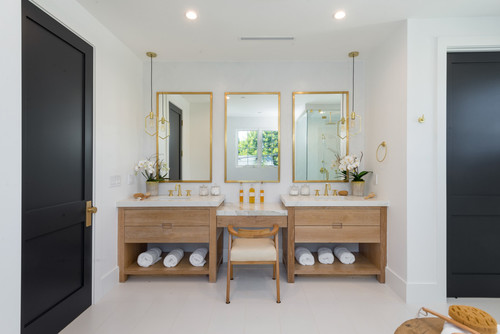
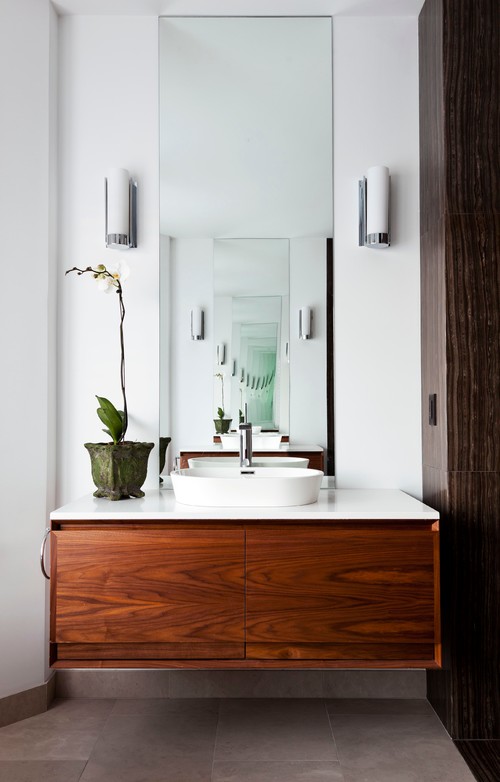
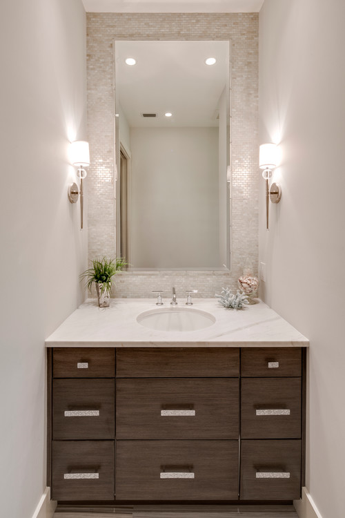
“The trends seem to be leaning toward clean lines, mid- or dark-toned rustic wood vanity cabinets, or a one-piece integrated acrylic or ceramic sink and countertop,” Bly says. White marble and quartz counters are also still popular, she adds.
“Soft gold or bronze, or brushed gold hardware, is starting to replace the ubiquitous chrome faucets that have been popular for many years now,” she says.
If you are committed to keeping a more consistent vibe in your home, bathroom vanities come in many different styles. You can stick with a standard painted wooden vanity with cabinet doors (like the ones you’ll find at your local home improvement store) or go for a more modern bathroom vanity, with a high-gloss countertop and pullout drawers.
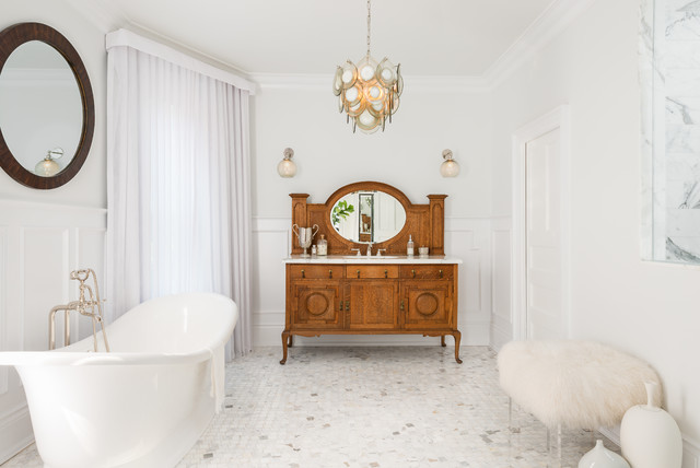
A great way to incorporate vintage decor is to find a custom vanity built from an old dresser (like the one below). You may also want your sink and faucet finish to match those of the shower.
Cost of a bathroom vanity
As with most built-in bathroom cabinets and furniture, you get what you pay for—the more customized the vanity, the more expensive it will be. You can pay as little as $100 for a 24-inch-wide vanity and up to $3,000 for a 60-inch one from a home improvement store like Lowe’s. But the average cost of a mass-produced single-sink bathroom vanity is between $200 to $800, with most custom-made vanities running between $500 and $2,800, according to costhelper.com.
Although you may be tempted to go the bargain route with your bathroom vanity, you’ll want to watch out for cheap materials, says Chiarilli. Skip any vanity made from particle board or laminate instead of solid wood.
“Over time, the finish will peel off the cabinet,” she says.
When it comes to cabinet installation, it costs around $100 to $300 for a handyman or contractor to install a stock vanity. Semicustom or custom vanities can cost anywhere from $200 to $1,000 or more to install, depending on the complexity of the project, according to costhelper.com.
Fancy sinks, pricey faucets, updated cabinet pulls, or a new bathroom counter surround will also up the price of your new vanity. And if you have to reconfigure your shower or tub to accommodate a new vanity, add another zero to the price.
Vanities are stylish, but pricier than pedestal sinks
Photo by Designs of the Interior
Most designers love a bathroom vanity for the storage it offers, but the convenience of added storage will cost you. If installing a bathroom vanity in every loo is beyond your reach, put your money in the master bathroom.
“It’s super important to have a great-looking, functional bathroom vanity in this space, both for everyday living and for resale value,” says Chiarilli.
It’s fine to put a pedestal sink in a half bathroom or other bathroom that’s not used for getting ready in the morning or sees little traffic.
Cabinet details make the difference in a vanity
Bathroom vanities offer many opportunities for customization, to suit your style or personal needs (you might want double sinks or an unusual faucet in yours).
“Some master vanities might include a sit-down area at the sink for applying makeup,” says Jamie Gold, a San Diego–based certified kitchen designer.
You might also see vanities with towers, tall cabinets, or rollout drawers for additional storage. Other amenities can include a built-in hamper, a charging station for phones, cubbies for rolled towels, and a pullout step stool.
The post What Is a Bathroom Vanity? Adding Style (and Storage Space) to Powder Rooms appeared first on Real Estate News & Insights | realtor.com®.
The Property Brothers Remove One Home Feature, and Wow, What a Difference!

HGTV; realtor.com
What do “Property Brothers” stars Drew and Jonathan Scott do when they have a ton of reno money to spend? The most recent episode of their HGTV show reveals all!
In the latest episode, titled “Fit to Reno,” we meet a couple, Terin and Bryan. They’ve moved around a lot, but now they’re finally ready to settle into their dream home—and they have an all-in budget of $1.4 million to make that happen. Terin, though, keeps coming back to Jonathan with new (and expensive) requests for the house, and it becomes clear that $1.4 million might not be enough!
Can the Scott brothers make this picky couple happy, while staying within their budget? Read on to find out how they turn an outdated house into a stunning oasis, and some lessons we can take home with us.
Ditch the drapes to brighten up a space
Terin knows she wants plenty of light in her new home, so when she and Bryan walk into the house they’ll eventually call home, she’s disappointed to see nothing but dark rooms. One room in particular, the sitting room, seems extra dingy and dark, and the heavy curtains left by previous owners don’t help.
“I like the tall ceilings,” Terin says, “but those draperies could make one heck of an ’80s ballgown.”
Luckily, the Scotts know just what to do. They take out the curtains that hide the tall, beautiful windows, then brighten up the space with off-white paint and put in light-colored furniture. It’s amazing how effortlessly this space went from dark and scary to light and airy.
HGTV
Add collapsing doors to a California room
From the very beginning, Terin and Bryan have their hearts set on a California room—an outdoor space on a deck that can serve as a traditional living room. Jonathan puts in some gorgeous outdoor furniture and even a TV, but he knows this California room wouldn’t be the same without collapsing doors that lead out from the kitchen.
These doors make the glamorous space seem even more open and inviting, creating great flow from inside the house to outside. Plus, they look great.
“That is amazing,” Terin says, as Jonathan opens the doors. “I’ve never seen anything like that.”
HGTV
Include greenery, for added ambiance
Terin and Bryan are excited about creating great flow from inside to outside, so the Scotts are sure to emphasize this effect with the decor. They take a corner of the kitchen and liven it up with some great plants. This simple and inexpensive detail really adds to the space. Not only does it smooth the transition from inside to outside, but it also decorates an otherwise underutilized corner of the room.
“I love what you did in the corner there,” Terin says when she sees the finished product. “That’s perfect.”
HGTV
Get a clean look with integrated appliances
Bryan has told the Scotts that he likes spaces that are clean and uncluttered. So the brothers gave the kitchen an upgrade, with appliances that are tucked away and out of sight.
Behind one cabinet door is a smoothie station, behind another, a coffee bar. A refrigerator even pulls out from the island.
“What’s nice is everything has its place,” Bryan says, looking around the kitchen.
And he’s right. The integrated appliances prove to be an amazing use of space, and leave the kitchen looking clean and sleek.
HGTV
Make room for an eat-in kitchen
This couple were excited to get a large kitchen island, but even the biggest island in the world couldn’t replace the charm of a dedicated spot for meals. So of course, Jonathan includes a perfect table with built-in bench seating in the nook overlooking the backyard.
A fantastic spot for enjoying casual meals, with plenty of seating, it provides lots of room for guests. It’s the perfect addition to a great kitchen.
HGTV
Sometimes a house needs a classic fireplace
From the beginning, Bryan and Terin make it clear that they don’t want their house to be too modern. In fact, they say, they wouldn’t mind a few classic touches. So, the Scotts take out the hearth that came with the house and replace it with a more classical-looking one.
“The fireplace is amazing,” Terin says once it’s installed. “I love how it’s more of a traditional shape now.”
In the end, the new fireplace proves a great choice. The clean white color brightens the room, and the simple, clean design adds elegance to the living room.
HGTV
Do the Scott brothers deliver?
After some expensive upgrades and a few unexpected costs, the renovation ends up going $7,500 over budget—but the extra cost is well worth it. Terin and Bryan are thrilled with their finished home.
“This is beautiful,” Terin says when she first steps into her new house.
Bryan couldn’t agree more, adding, “Resort living at home—it’s amazing.”
The post The Property Brothers Remove One Home Feature, and Wow, What a Difference! appeared first on Real Estate News & Insights | realtor.com®.
Wednesday, September 25, 2019
7 Crucial Things You Need to Clarify Before Hiring Painters

gemphotography/iStock
It doesn’t matter if you’re tackling one room or your entire home—painting is a big job. That’s why many people choose to forgo painting their house with their own two hands and hire professional painters.
But assigning this task to a pro doesn’t guarantee that things will go off without a hitch. There can be breakdowns in communication that result in mistakes—very expensive mistakes.
Before you let anyone take a paintbrush or roller to your walls, make sure you’re 100% clear on the following details.
1. The paint company’s work history and reputation
When hiring a painter, it’s your money and your home, so you have the right to ask as many questions as necessary to make sure they have a reputable work history.
“Ask the painter how many years they have been in business and how large their crew is,” says Nathan Outlaw, president of Onvico, a design, engineering, and construction company in Thomasville, GA. “It will help determine if this is a fly-by-night painter or someone who is planning on working for years to come.”
Also ask for references. The painters should be able to provide a list of references, but Matt Kunz, president of Five Star Painting, recommends checking online for reviews and social media comments to get a sense of the contractor’s standings.
“If there have been previous complaints or issues, they will likely be listed online,” he says.
2. If the cost of paint is included in the estimate
Your estimate might sound good—too good, in fact. The likely reason? The quote doesn’t include the cost of the paint.
“It’s important for homeowners to know whether they’ll be expected to pay for the paint separately, or if it’s included in the quote they receive for the paint job,” says Mike Mundwiller, field development manager at Benjamin Moore.
3. What type of paint the contractor plans on using
Another reason that an estimate might sound too good to be true: The contractor plans on using a cheap paint.
However, cost isn’t the only reason you should ask what type of paint is being used. You need to be sure the contractor is using a paint specifically designed for the surface being painted.
“Paint suitable for high-moisture spaces is completely different than what a contractor would use in a dining room,” Mundwiller says.
For example, high-gloss paints don’t absorb moisture and are easy to wipe down, so they are often used in bathrooms and kitchens. But few people like the look of shiny walls in more public parts of the house, so high-gloss paint is rarely used in living rooms or bedrooms.
4. How much your painter knows about paint
Your painter should be able to answer your painting questions knowledgeably, easily, and confidently.
“A reputable painter will be able to explain the different paint types and answer any questions you may have about painting the exterior or interior of your home,” Kunz says.
For example, the pro should be able to recall the types of paint sheens (flat, eggshell, satin, semigloss, and high-gloss) and where each of these sheens should be used.
He should also be able to explain washability and how to maintain the color, Kunz adds.
5. How many coats will be applied
This may seem like far too specific a question to ask, but failing to inquire about the number of coats could lead to problems with your paint job down the road. This could be an area where a shady painting contractor might try to pull a fast one.
“Some painters may submit a quote that doesn’t include the cost of more than one coat of paint,” says Jody Costello, founder of the website Contractors From Hell. After the first coat has been applied, the contractor may try to charge you more for additional coats.
If you’re repainting a wall in the same color, you need only one coat of paint. But if you’re changing color or painting a brand-new wall, experts recommend you apply one coat of primer and two coats of paint.
6. How long the job is expected to take
A quality paint job takes time. However, you need to know in advance how much time you should allot to this project.
“You want to plan to avoid the areas being painted both during painting and while the paint is drying,” Mundwiller says.
Depending on the number of rooms being painted, you may need to leave the home for a few hours—or a few days.
7. The payment process
One of the biggest red flags homeowners encounter is painters asking for payment upfront.
“A company that is secure and confident in its abilities will not ask for a full payment until the final job is complete and up to your full satisfaction,” Kunz says.
In fact, Costello advises against ever paying more than 30% to start a project: “You should never hand over a large amount of money at the beginning, because the contractor may be slow to start or finish the painting project.”
And that’s the best-case scenario. In a worst-case scenario, she says, the contractor may take the money and run.
The post 7 Crucial Things You Need to Clarify Before Hiring Painters appeared first on Real Estate News & Insights | realtor.com®.
What Is Jute—or Abaca? Why Natural Fiber Rugs Are All the Rage
irina88w/iStock
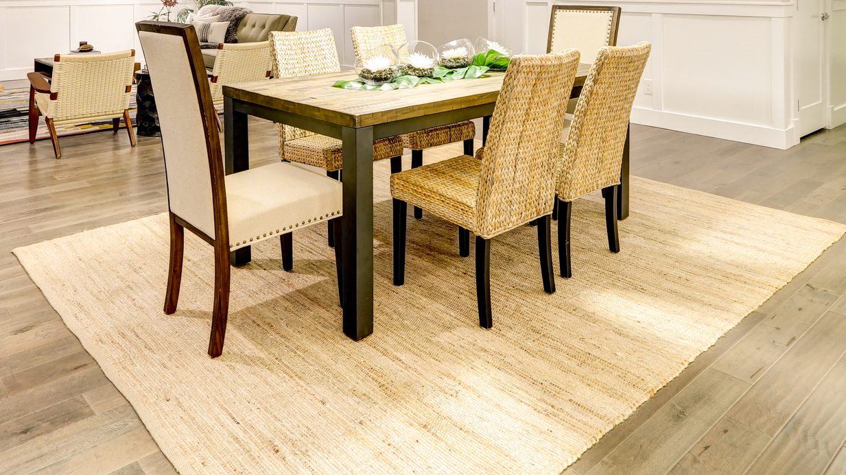
You’ve probably read that the rug you place under your furniture should tie the room together, as well as offer warmth and softness underfoot. But carpets can be costly, and if you’re trying to go green, rugs that are made from synthetics are often petroleum-based and far from eco-friendly.
The solution: natural fiber rugs, made from jute, abaca, hemp, and other plants. These rugs are only lightly processed, which means you’ll spot the character of the raw materials. And for their proponents, that translates into interior beauty.
“These looks are made from renewable fibers, which lend a beautifully textural weave and a relaxed feeling to any room,” notes Karen Gray-Plaisted of Design Solutions KGP.
While these rugs are lovely in their natural state and make an ideal neutral foundation in most rooms, they can also be dyed.
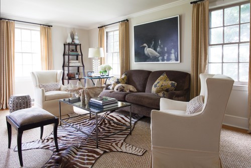
“And a big trend is to layer an animal hide over a plant fiber rug, which is cost-effective if you have a large space to cover,” Gray-Plaisted notes. We show an example below with a seagrass rug.
Here’s more about natural fiber rug types, as well as how to care for them and where to use them in the home.
Abaca
Merida
Abaca is produced from the trunk of a tree that’s very similar to the banana tree.
“The outer layer of the trunk produces a darker fiber, and the inner layer gives a bright, pearl-like color,” explains Zairo Cheibub, director of research and development at Merida.
While this natural fiber rug is very durable, it’s best reserved for low-traffic areas, because the construction is not as tight, he adds.
Skip dining rooms, as the back-and-forth motion of your dining chairs will soon leave marks.
Jute
Jute, cultivated mostly in India and Bangladesh, comes from the stalk of the plant, rather than the leaf, so it’s softer to the touch.
“The plant is soaked in water to soften and separate the fibers,” Cheibub explains.
Jute gets a bad rap, since it is mostly known as the raw material for burlap and twine, which are much rougher. It’s much less harsh to the touch, and its comfy qualities make it a great pick for bedrooms and hallways.
Jute is easy to clean, very affordable, and neutral in color, making it a good pick for any room, even those that see high traffic, says Drew Henry of Design Dudes.
Sisal
Sisal fibers come from the agave, the same cactuslike plant that brings us tequila. Sweet!
“It’s originally from Mexico, but the best sisal today is produced in Africa,” Cheibub reports.
Rope and twine are also sometimes made from sisal, so it’s quite tough and durable. Its coarse texture means that it’s not as comfy underfoot, but its durability allows it to take a beating in busy areas, says Gray-Plaisted.
Sisal is a malleable fiber, and can be used to produce exquisite patterns, and it’s more tightly woven than jute and abaca, so it can be used in stairways and dining rooms, notes Cheibub.
Just be careful with the red wine, the pros warn, as these fibers are absorbent and can stain.
Seagrass
Seagrass, on the other hand, is water-resistant and will repel most stains.
“The fiber comes from grasses that grow in saltwater marshes,” says Gray-Plaisted. It’s also softer than sisal, so it’s a good choice in a bathroom, bedroom, or the kitchen.
You’ll mostly find seagrass rugs in neutral colors, as they don’t absorb dyes, though some may have a border around them that comes in various shades.
The beauty of these basic background rugs is that you can accessorize seasonally, swapping out smaller topper rugs and pillows to complement these beige-brown fibers.
Hemp
Photo by GRADY-O-GRADY Construction & Development, Inc.
Hemp is the elder statesman in this bunch, with centuries of history in the United States.
“When the settlers came to America, England insisted that Colonists dedicate an acre of hemp for every 60 acres of their farmland, because it was a rather valued crop and could be used to pay taxes,” notes Gray-Plaisted.
Although hemp isn’t as soft as jute, the fibers will relax over time and become easier on your feet.
“A hemp rug is durable, mildew-resistant, and can be dyed,” she adds.
Caring for natural fiber rugs
Photo by Andrew Howard Interior Design
Regular vacuuming is essential to pick up dirt and grime that can become embedded in the fibers of your natural carpeting. But because these rugs don’t hold up well to lots of moisture, traditional stain-removing cleansers and agents aren’t recommended.
Instead, try a gentle DIY solution of a teaspoon of detergent with one teaspoon of distilled white vinegar, mixed with 2 quarts of warm water.
Dampen a rag and carefully blot the stain; dry thoroughly by rolling the rug up with a large bath towel and squeezing gently.
The post What Is Jute—or Abaca? Why Natural Fiber Rugs Are All the Rage appeared first on Real Estate News & Insights | realtor.com®.


 . Welcome to the 27th weekly feature of #HomeandGardenIG. We love all things home: decor, DIY, gardening, cooking, baking, & reading. Our hashtag is a way to share our passion and meet inspiring accounts like YOU! . THANK YOU to last week’s co-host: Darcie @houseonwooster
 . Want to be featured on HGIG? .
 : Rochelle @rochelleraedesign (formally @turquoise_lifestyle) .
 #seasonaldecor #bhghome #bhgstylemaker #cozyhomes #cozyhouse #pumpkindecor #simplecozynest #cottagedecor #wickerfurniture #cottagestyledecor
 What could be better?! Not in Atlanta?! No problem! @live.outer has showrooms in people’s backyards across the country- just head to their site to find one close to you! . I’ve also had a lot of people asking where our amazing neutral herringbone outdoor rug is from- it’s from @boutiquerugs! I’ll link the exact one in my profile…y’all it’s so affordable and code PORCHE55 will get you 55% off
  . . . #liveouter #atlanta #barbecue #getoutside #backyarddesign #backyardliving #golfcourselife #outdoorfurniture #outdoordecor #firetable #outdoorrugs #outdoorbar #farmhouse #farmhousestyle #farmhouseinspo #houseandhome #whitefarmhouse #farmhousechic #southernstyle #farmhouseliving #housebeautiful #modernfarmhouse #fixerupper #homereno #homerenovation #homedecor #homedecor #homesweethome #southernhome #modernfarmhousestyle