
Drew and Jonathan Scott have seen plenty of weird houses, but in the latest “Property Brothers: Forever Home,” they encounter an all-too-common design problem that can completely undermine a home’s ambiance.
In the Season 5 episode “Bringing the Dream to Life,” the brothers head to Boulder City, NV, to meet up with homeowner Debbie. While Debbie has four kids, her youngest, Christina, is the only one still living at home. So Debbie wants to make this home feel special for her daughter, with a bedroom makeover and a new kitchen where Christina can flex her love of baking.
The brothers have a $140,000 budget to turn this house into the perfect blend of Christina’s youthful flair and Debbie’s traditional style. Here’s how they pull it off, with plenty of lessons you might be inspired to try in your own abode.
Sunken seating is too ’70s to work today
HGTV
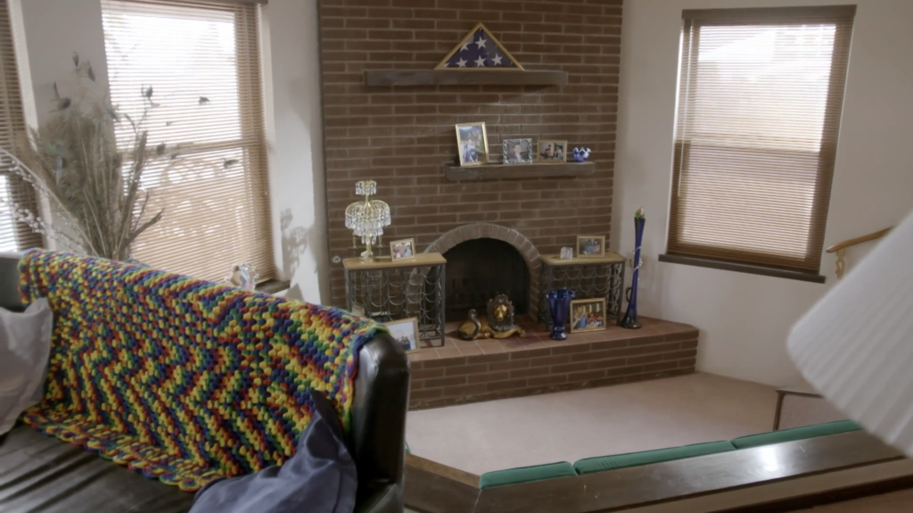
In the living room, the brothers quickly see a throwback from the 1970s: a sunken seating space—aka a conversation pit.
Drew and Jonathan are so horrified, they decide to fill in this pit and pretend it never happened. In doing so, they create a level floor that’s far easier to navigate.
Now, all this living space needs is a more modern fireplace, rather than the brick, wood-burning monstrosity in one corner. They move the fireplace to a feature wall, and make it electric so that these homeowners can easily “build” a fire with the flick of a switch.
“They didn’t need that old wood-burning fireplace,” Jonathan explains. “It was really dark and heavy and, being tucked off in the corner, didn’t work, either. Now, giving them a feature wall with a beautiful electric fireplace, this is going to be a statement.”

HGTV
This new fireplace is a big upgrade, but the best part just might be the mantel. Jonathan helps sand, torch, and finish this mantel so it’s a truly one-of-a-kind piece.
While this fireplace is much more modern than the old one, the mantel has that old-fashioned look Debbie wants.
“This is that bit of rustic feel, that traditional feel that I know Debbie’s going to love,” Jonathan explains

HGTV
Vinyl flooring can look just like wood, but is more durable

HGTV
Debbie plans to have lots of company, including her other kids and two grandchildren. So, while she likes the look of traditional wood flooring, the brothers suggest a luxury vinyl flooring instead.
“We can definitely do something with the floors that feels very natural,” Drew says. “Something that’s more durable than an actual hardwood. We could do a luxury vinyl, but we can do it in natural wood tones.”
Debbie likes the idea, and the brothers choose a medium-tone vinyl flooring that has the traditional look Debbie likes. It has a hardwood appearance, but is much more kid-friendly.
“These are going to be great for high traffic,” Jonathan explains. “So if you do have people coming and visiting or anything, you’re not going to scuff them or scratch them.”
A low ceiling can destroy the mood

HGTV
This house has a big living area but a modest kitchen. The space feels even smaller with the low, 7-foot ceiling.
“When you have a space that’s a little bit tighter, having a low ceiling kills the mood,” Jonathan explains.
So the Scott brothers open up the ceiling and add white cabinets all the way up. This, in turn, draws the eye upward and makes the kitchen feel bigger; plus it provides lots of extra storage.

HGTV
“We wanted to also squeeze in as much extra storage as possible,” Jonathan says when the work is done. “So, yes, you’ll need a little step stool to get up to the upper cabinets, but that’s the stuff that you’re going to store to only bring out a few times a year.”
These cabinets, combined with a new white backsplash and quartz counters, make the kitchen look lighter, brighter, and much more modern.
The right lighting makes a huge difference

HGTV
While Christina has a youthful style and Debbie usually wants the home to have a traditional feel, the brothers are happy Debbie is not necessarily interested in a traditional chandelier for the dining room, or old-fashioned lights in the kitchen.
“There’s so many great options for pendant lights, and I really love that Debbie is willing to play a bit with that,” Drew says.
They end up installing beautiful pendant lights over the kitchen peninsula and a chic chandelier made of circles. These lights make a huge difference in the space, adding a modern, contemporary aesthetic.
A painted mural is an easy way to add personality

HGTV
While the bulk of the renovation takes place in the living room, Debbie wants to make sure Christina feels comfortable in her bedroom. Since Christina loves marine life (and works at an aquarium), the brothers decide to give this room an ocean theme, complete with a beach mural.
“Murals are a great option,” Jonathan says. “Just like wallpaper as well, it depends on the space, but I can get beautiful aesthetics.”
Paired with light, water-inspired colors for the decor and soft textures, this bedroom is an oasis!

HGTV
The post The Property Brothers Reveal an All-Too-Common Design Flaw That ‘Kills the Mood’ appeared first on Real Estate News & Insights | realtor.com®.
No comments:
Post a Comment