HGTV
On “50K Three Ways,” Tiffany Brooks loves going big and bold with her designs. But on the latest episode, she has to change her tune for clients who prefer a pared-down aesthetic.
In the episode “Time Warp Reno,” she meets with Stuart and Michelle, a Chicago couple who are tired of their dated-looking 1984 home. They have a strict budget of $50,000 to fix up only one part of the house, so Brooks offers up plans to update the main living area, the basement, or the main bedroom.
Stuart and Michelle decide to renovate their bedroom, hoping for understated furnishings and subtle colors—the exact opposite of what Brooks tends to do.
“Stuart and Michelle are neutral minimalists,” Brooks explains. “I am a maximalist who plays with color. So I had to use a ton of restraint when designing this space.”
It turns out there are ways to add excitement to minimalist decor. Check out what may be Brooks’ most challenging makeover to date, which could inspire a few changes around your own abode, too.
Make minimalism pop—with texture rather than color

HGTV
In designing the bedroom, Brooks decides to remove the dated TV stand and mirrored headboard wall. She then adds light, soothing furnishings, and elegant, sheer curtains. Most of the decor is creamy beige, but Brooks explains that even without bold colors, she can keep it interesting in an entirely different way.

HGTV
“Because the space is so neutral, we had to experiment with different textures,” Brooks says. “We have the cabling, the leathers, the metals, the glasses, and different area rugs that we have framed. So there’s a lot of texture play happening in this room.”
It turns out that adding texture is key to achieving a chic, minimalist look without tons of color. So simple, yet it works!
Liven up a plain floor with a herringbone pattern

HGTV
Brooks brings in minimalist furniture and decor, and to add style to this spare design, she decides to go all out, with new flooring in the bedroom and bathroom.
She picks luxury vinyl flooring in a modern gray tone that will keep the suite feeing muted but welcoming. And to make it feel special, she lays the flooring in a unique way.
“We’re doing it in a herringbone pattern, for visual interest,” she explains.
This way, the bedroom and bathroom can have a plain, soothing feel, but they won’t end up feeling flat. With the herringbone floor drawing the eye, the rest of the room can stay clean and simple.

HGTV
Add glam with a hint of gold

HGTV
While many of Brooks’ color choices are clean whites and muted beiges, she decides to inject some personality with the gold accents in the bathroom. She chooses brushed-gold hardware, as well as tile with gold highlights.
“I chose a stunning hexagon tile with flecks of gold for the shower and vanity area,” Brooks explains. “It’ll contrast beautifully with the gold hardware.”
This gold-and-white tile is a little pricey, at $3,650, but it’s well worth the cost, adding a hint of glitz that’s not too showy.

HGTV
A free-standing tub updates a bathroom fast

HGTV
One fast way Brooks updates the bathroom is by replacing the bulky built-in tub with a more modern, free-standing model. She explains that this tub style is really a new take on an old look.
“They take me back to when tubs were claw-foot and precious, and it was a thing—but now they’ve modernized them,” she says.
This new look comes at a steep cost—$1,132 for the tub and $1,529 for the gold faucet—but the budget is well-spent. The free-standing tub and statement hardware make this bathroom feel not only more modern, but also more luxurious.

HGTV
One big closet may be better than two smaller ones

HGTV
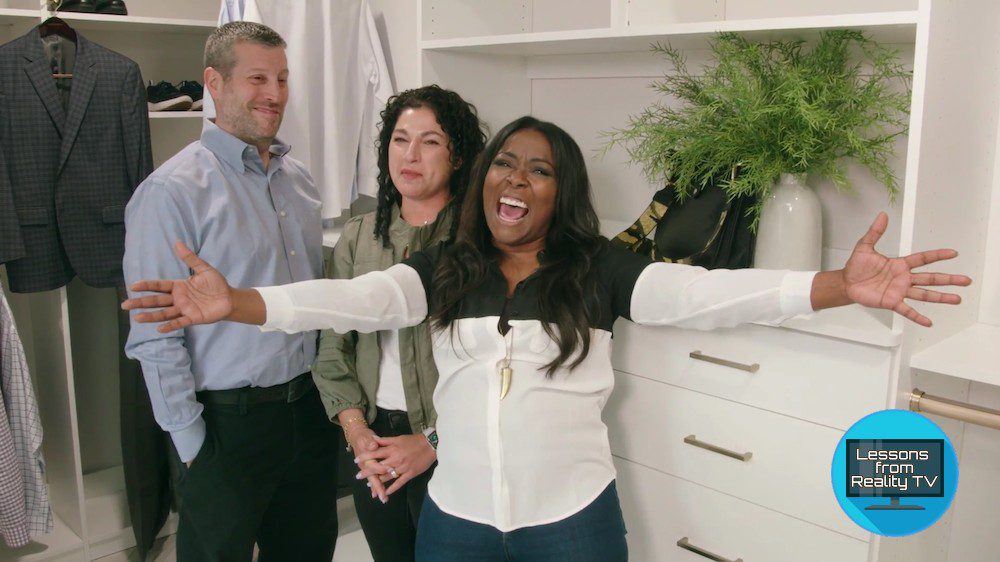
While the bedroom and bathroom are large, Michelle complains that her closet is pretty tight.
This suite includes two closets next to each other, his-and-her style, but Brooks says there would be more space if they knocked down the dividing wall and turned it into one big closet.
“The new layout means Michelle and Stuart will have double the storage space,” Brooks explains.
The new closet has gold accents that match the bathroom, as well as plenty of storage. Not only does it look great, but it will also help Michelle and Stuart stay organized.
The post ’50K Three Ways’ Reveals the Key to Making Minimalist Design Feel Lively and Fun appeared first on Real Estate News & Insights | realtor.com®.
No comments:
Post a Comment