
Magnolia Network
At long last, the Magnolia Network has launched! Now available on Discovery+ and the Magnolia app, this new channel features a slew of new shows all hand-picked by Chip and Joanna Gaines. But by far the most anticipated is the “Fixer Upper” redux the renovating duo star in themselves: “Fixer Upper: Welcome Home.”
In the premiere episode, “Mediterranean Money Pit,” Chip and Joanna help their clients, David and Christina, fix up their 1976 home. This house is huge—with four bedrooms, three bathrooms, and two half-baths on a 10-acre lot—and it truly is a serious fixer-upper.
Everything about this house is “hard and a little bit wrong,” Joanna says.
Still, the Gaineses manage to transform this eyesore into an elegant home—and rather than stick to their usual modern farmhouse style, they unveil a whole new look that’s a bit more exotic, dreamy, and sure to catch on.
Here’s how Chip and Joanna kick off their return to reality TV, including tons of fresh design ideas sure to make “Fixer Upper” fans swoon.
Copper lanterns add light, curb appeal, and character
Magnolia Network
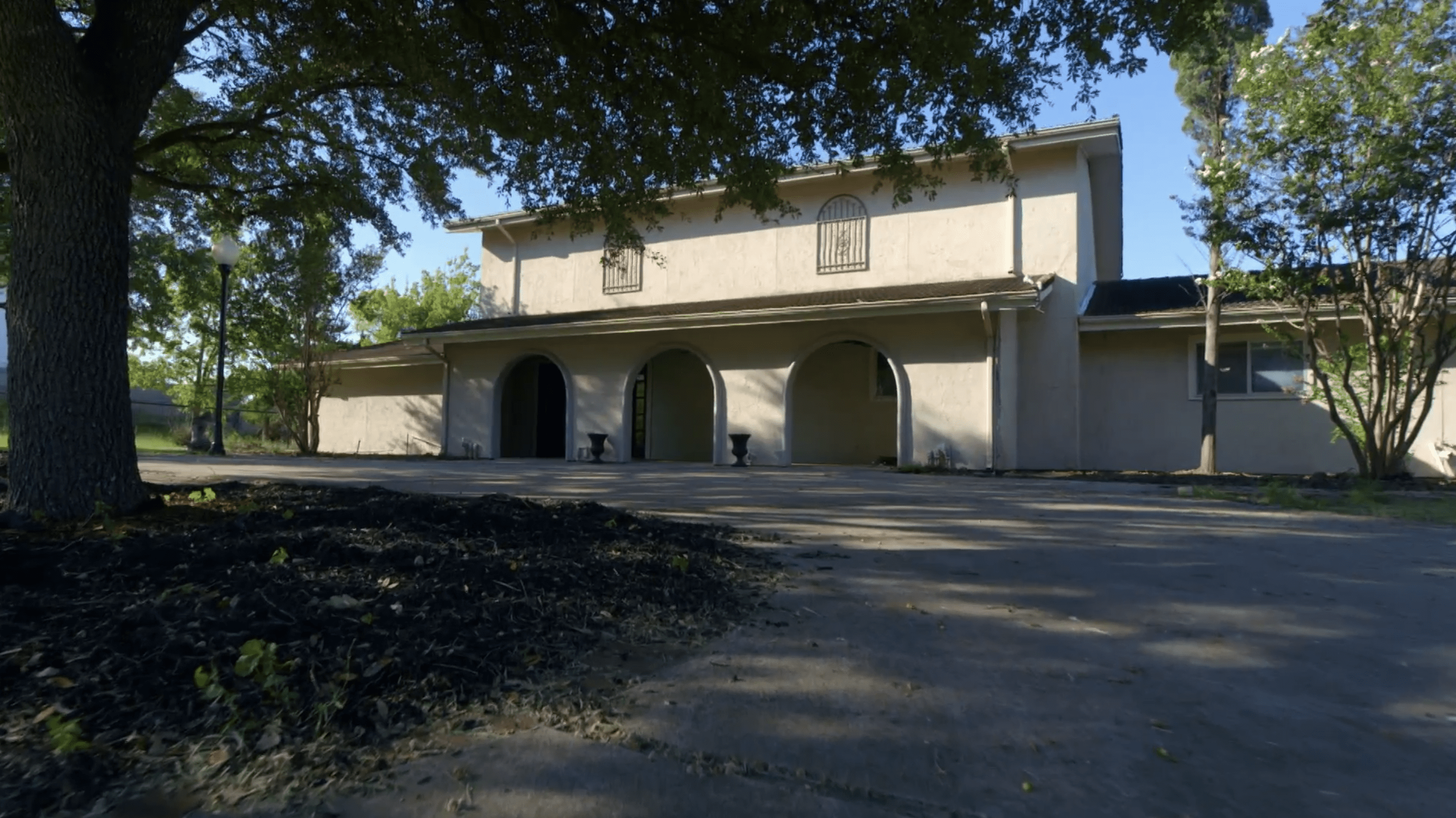
From the beginning, Chip and Joanna are impressed with this home’s clean white exterior. However, with the faux upstairs windows and the lack of greenery, they know the house could use a lot of work.
“It’s a great template,” Joanna says. However, “it needs a few more things to bring it back to life.”
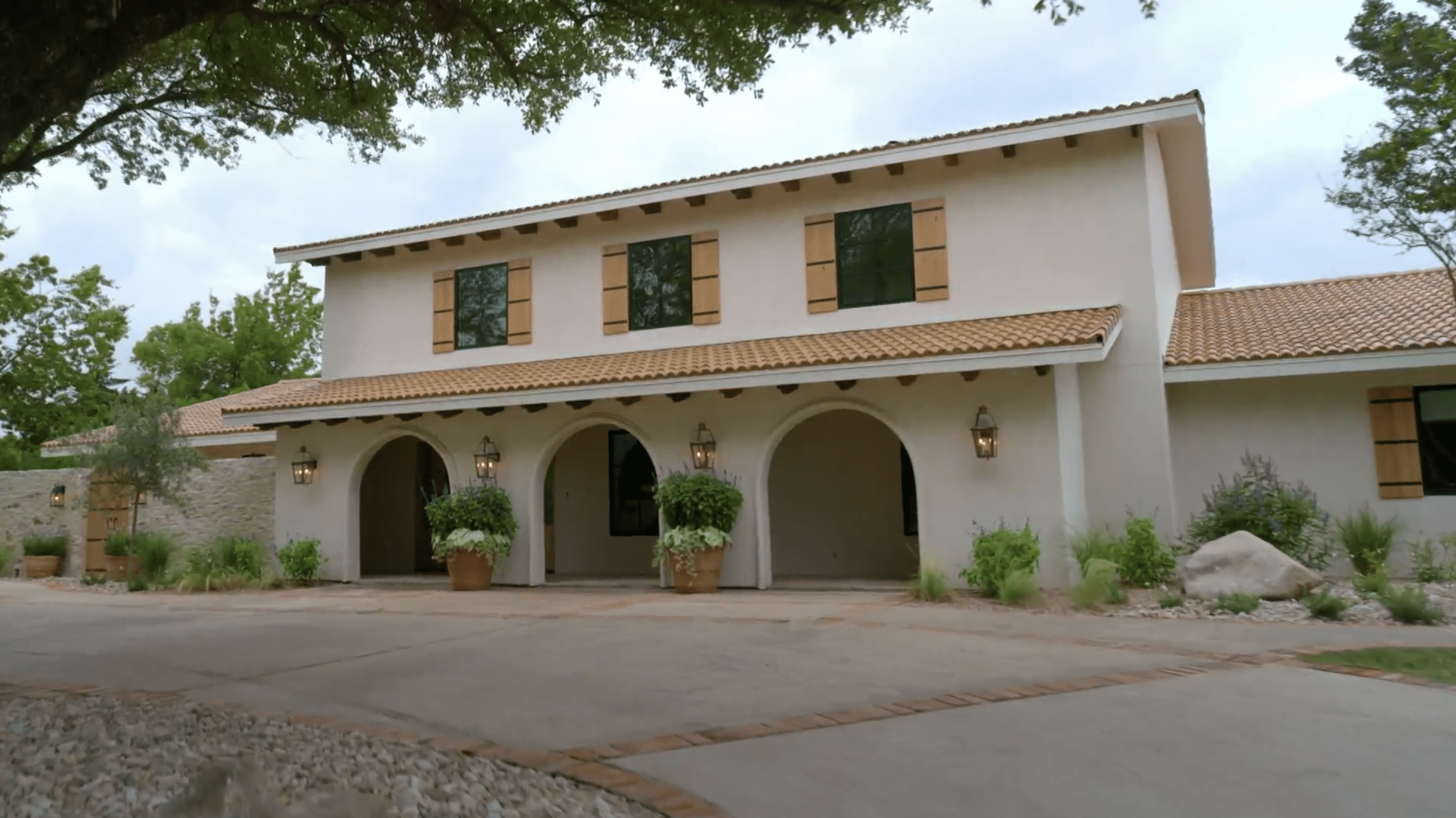
They install big (real) windows with wood shutters upstairs, replace the roof, and add some greenery to make the entryway feel more welcoming.
To finish the exterior, they include four oversized copper lanterns. These lanterns will provide some much needed light in the evenings, plus they add a little extra hint of character to this very classic exterior.
“I didn’t want anything to stand out too much,” Joanna tells David and Christina when the work is done. “So I think the copper is just a nice addition, but it’s not too harsh.”
Magnolia Network
Add stucco over brick for a cleaner look

Magnolia Network
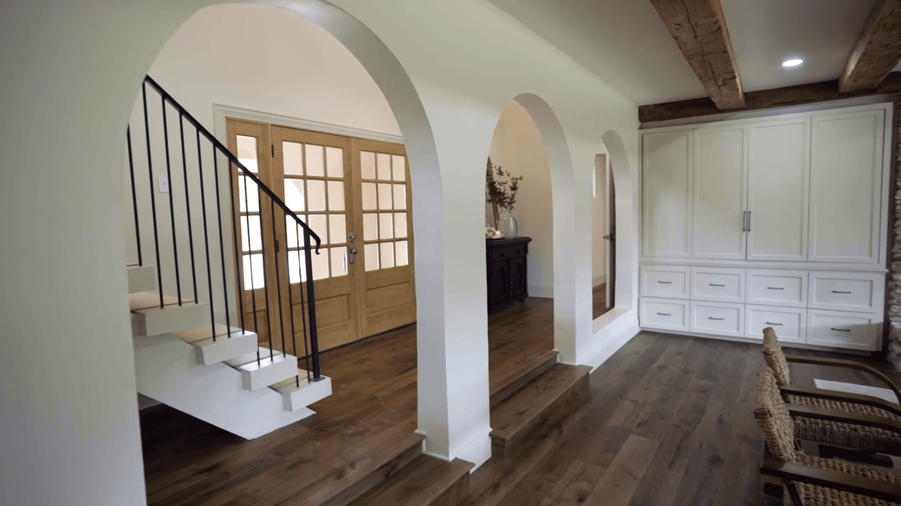
This home has a unique architectural feature right inside the front door: a wall of arches. Christina isn’t quite sure if she likes or hates this look, adding that she might prefer a more open space. However, Joanna thinks these arches may have potential.
“You could play off the architecture of this style home, but just clean it up and eliminate the brick,” Joanna says.
Magnolia Network
They decide to keep the arches and stucco the entire wall, giving the arches a nice smooth look. Now, the home gets to keep the character of the arches, but the feature looks much cleaner.
Make sure new tile matches the old—or else start fresh

Magnolia Network
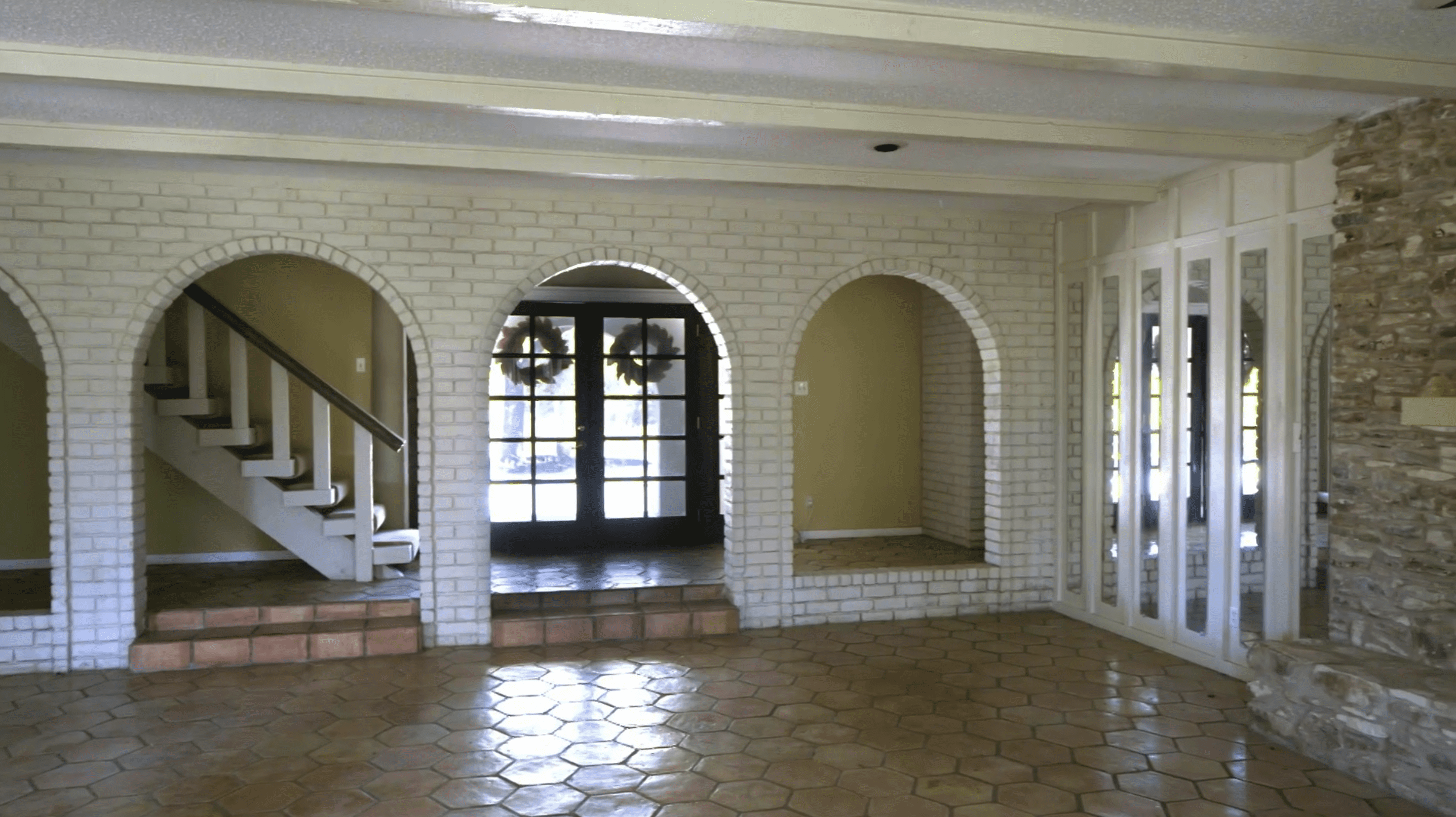
When Chip and Joanna walk into the home, they’re immediately impressed with the Saltillo tile floors. This clay tile gives the space character and charm, but unfortunately, they need to be replaced. There are too many pieces that are cracked or broken, and Joanna notes it would be hard to match this old tile.
“We can’t find this exact color and age and look and feel,” she says.

Magnolia Network
They decide to replace the tile with new, medium-tone wood flooring. It adds old-world charm, but Jo notes, “it’s cleaner and more fresh.”
Reclaimed beams are worth the extra cost
Magnolia Network
While this house has so much going for it, the wood beams in the living room are a bit underwhelming. Christina says she’d rather have a natural wood look, but these beams are structural, so they can’t simply be pulled down and replaced.
Joanna decides that they’ll need to cap the real beams with hand-hewn beams from an old barn. However, it’s a pricy and labor-intensive upgrade, with each beam costing $1,000, or $6,000 in total.

Magnolia Network
Still, once the beams are installed, they add a lot of character and history to the home.
“These beams are almost 200 years old,” Joanna explains. “So the fact that we get to repurpose them from a deconstructed barn, that’s exciting.”

Magnolia Network
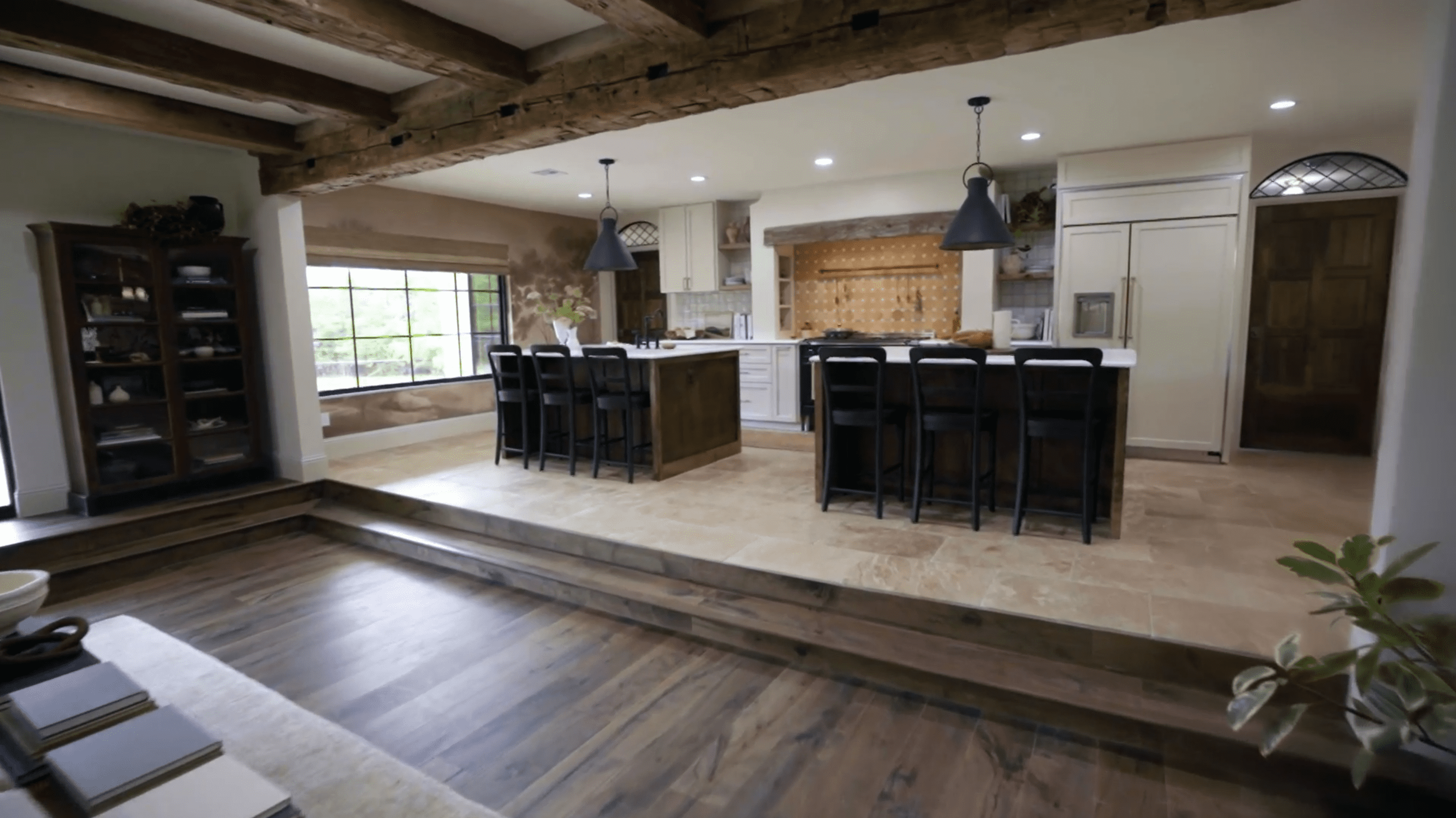
Two islands can help fill a large kitchen

Magnolia Network
The living room in this house is large—and so is the kitchen! Once Chip and Joanna remove the dark old cabinets, the space feels big. Maybe too big.
The kitchen is much wider than it is deep, so Joanna needs to get creative designing a rectangular kitchen. Luckily, she has the great idea to build two islands, side by side.
“Because it is so wide, I think it’s nice to have, like, your prep side. But, also if you’re entertaining, you can set out your food,” Joanna says.
In the end, the double islands fill the square footage in a smart way so the space doesn’t feel too big. Plus, now Christina and David have lots of space for cooking and entertaining!
Magnolia Network
Wallpaper can even be a painted mural

Magnolia Network
To finish the kitchen, Joanna wants to put up wallpaper on either end of the space, but this isn’t just any wallpaper!
She commissions a landscape painting from Chelsea Fly, an artist in Memphis, TN. The elegant mural will bookend the kitchen.
“The look that I am thinking of is definitely not loud; it doesn’t have a ton of color,” Joanna says. “And that’s what I’m really needing, ’cause it’s off the kitchen and I want it to tie into it, but not steal the show.”
Sure enough, Fly’s painting is simple with minimal colors, but it makes a big impact in this kitchen. This design proves just how versatile wallpaper can be.
The post Chip and Joanna Are Back! ‘Fixer Upper: Welcome Home’ Premiere Unveils a New Style That’ll Blow Your Mind appeared first on Real Estate News & Insights | realtor.com®.
No comments:
Post a Comment