realtor.com
It doesn’t matter how perfect your home is—if your listing photos don’t stand out, potential buyers won’t come by to take a look. In our series “Lessons From Listing Photos,” we dissect the smart updates sellers have made to their homes, and how their listing pictures highlight the home’s best assets.
There is no perfect time to sell a house—anyone who’s ever put a property on the market will tell you that. Sure, tradition tells us that selling in spring might be ideal. But at the end of summer? During a pandemic?
These extra obstacles didn’t stop the owners of a cute family home in Houston from putting up a “For Sale” sign. Perhaps their confidence came from knowing they’d made home improvements that would appeal to buyers. Regardless of their motivation, this sale was a success: The three-bedroom, two-bathroom home went on the market in August 2020, and was sold just one month later.
So what interior and exterior enhancements did the owners do to make sure their home sold in a hurry? We went to real estate and design experts to discuss the changes made to this house—and how you can pull off a similar transformation in your own space.
Front exterior
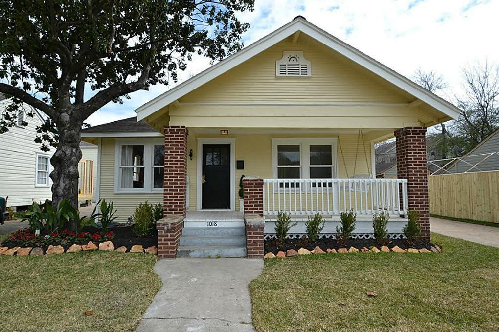
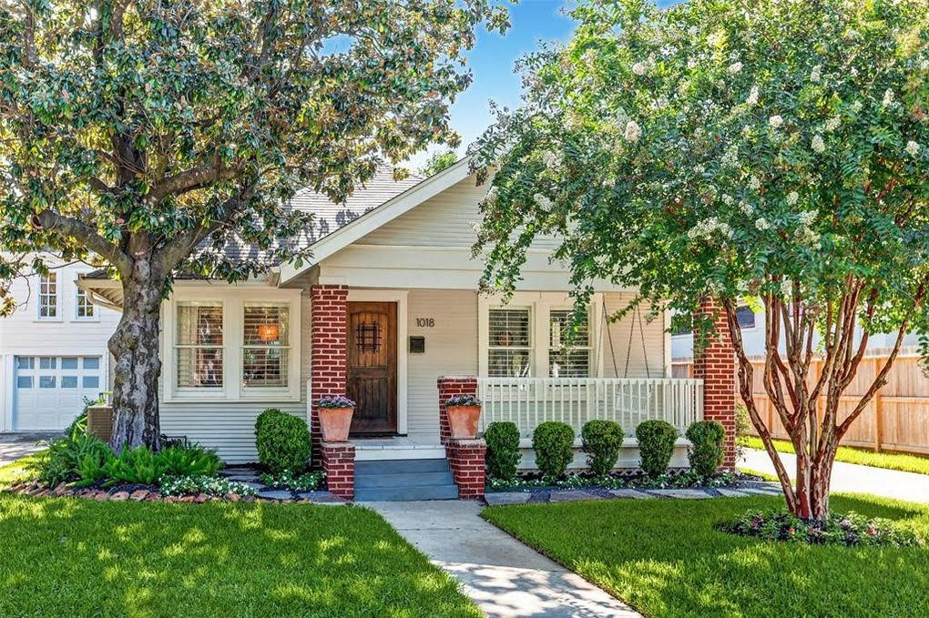
The front of the house looks dramatically better after just a few simple changes, supplying a first impression that buyers won’t forget.
“Curb appeal sells homes,” says real estate broker Bruno Fernandez, of Imagine Reality. “By simply upgrading the landscape, adding a luxurious accent door, and a fresh coat of paint that allows the original brick to pop, this home went from ordinary to eye-catching.”
Interior designer Lanna Ali-Hassan, co-owner of Beyond the Box Interiors, explains further. “The exterior of your home will either make or break whether a potential home buyer even steps foot through the front door,” she says. “The aesthetic of your home’s exterior should tell the story of what is occurring inside—and it’s your goal to get potential buyers to the next chapter.”
Ali-Hassan says that’s exactly what they’ve done here, by making the exterior of the home look clean, bright, and welcoming.
Living room
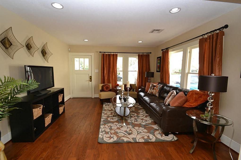

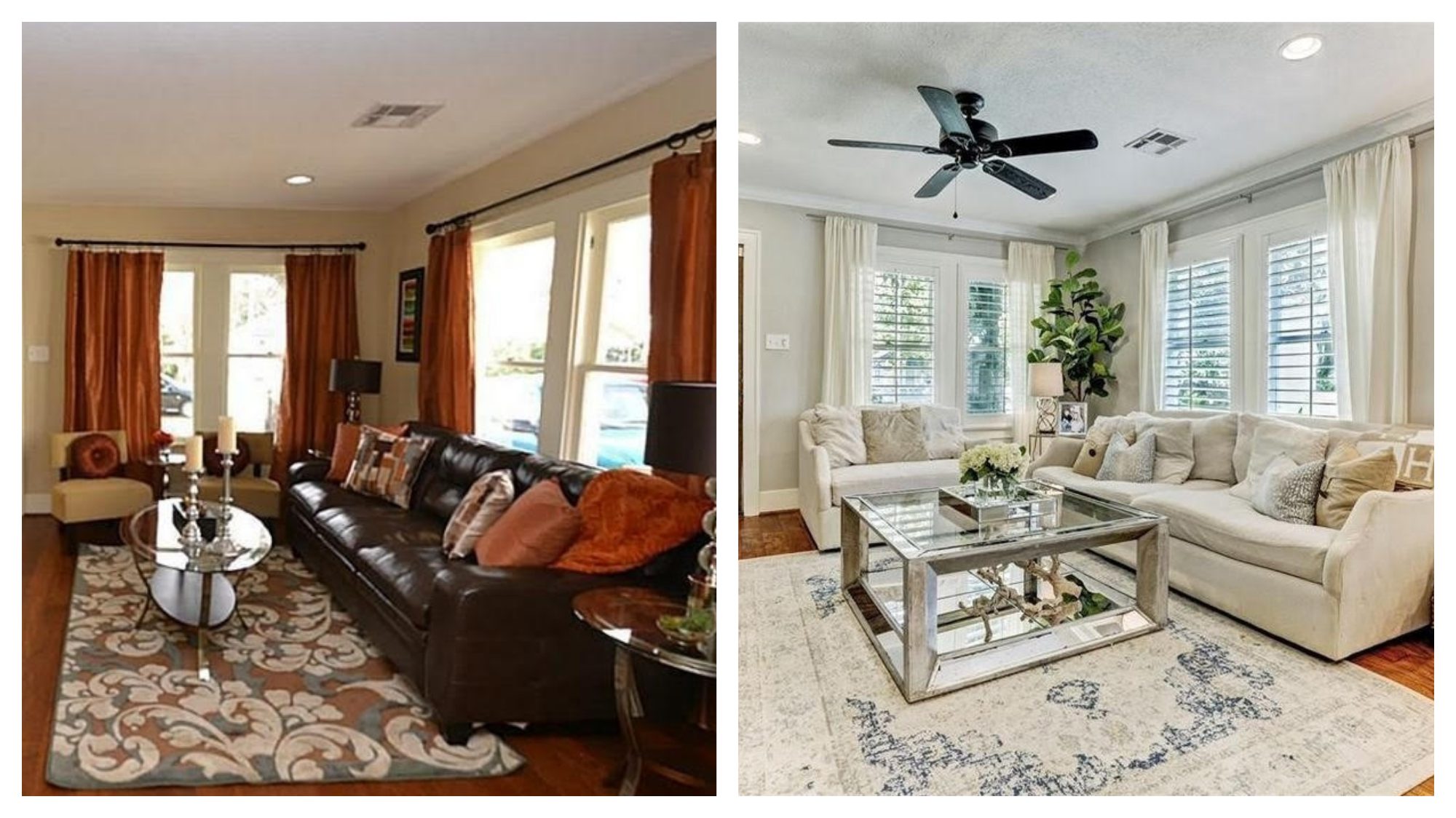
There was nothing exactly wrong with the living room before, other than the fact that it felt a little cramped. But that’s a major negative for buyers and can drive them away.
“If your living room is on the smaller side, the goal is to make it appear larger by tricking the eye,” says Ali-Hassan. That was easily accomplished in this space by using a few basic tricks, such as “incorporating lighter-colored furniture and neutral bright walls, accentuating the vertical by placing your window treatments up higher, and installing either a decorative light or ceiling fan.”
“The change is night and day,” adds New York City real estate agent Judy Liebman. “Dark furniture, drapes, floors, and accessories are replaced with more modern and light pieces. The addition of blinds allows light in but still provides privacy.”
Kitchen
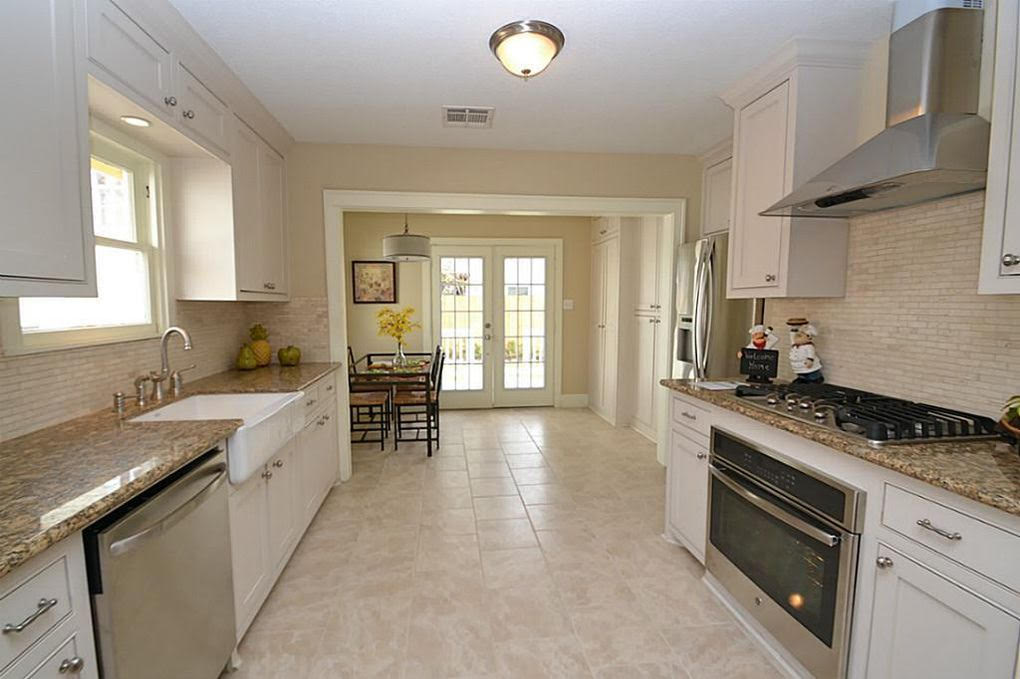
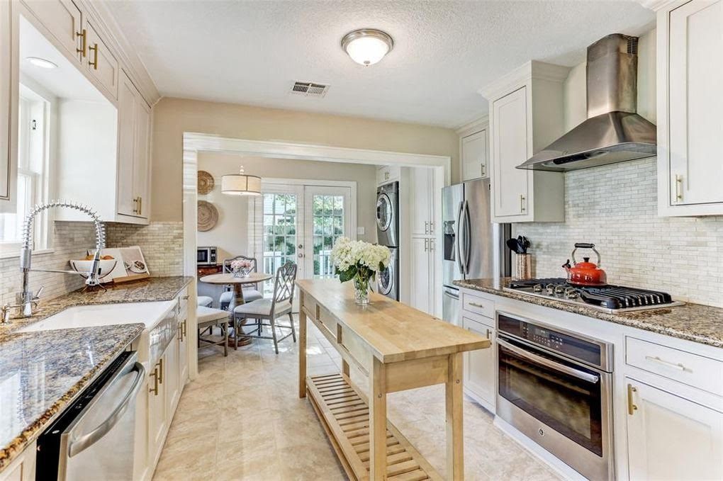
Talk about tiny changes! This is virtually the same space, but it looks like it got a major upgrade.
“It is amazing how a small change like a center island can give an old kitchen new life,” says Brad Pauly, broker and owner of Pauly Presely Realty.
While the island—which is nothing but a simple piece of movable furniture—may be the biggest change, it’s not the only one.
Fernandez picked up on a few other subtle differences that make a huge impact.
“On-trend cabinet handles, a fancy new faucet, and some strategic staging (including the mandatory cookbook and teapot) are all you need to show potential buyers that this is an upscale chef’s kitchen,” he says.
Dining room

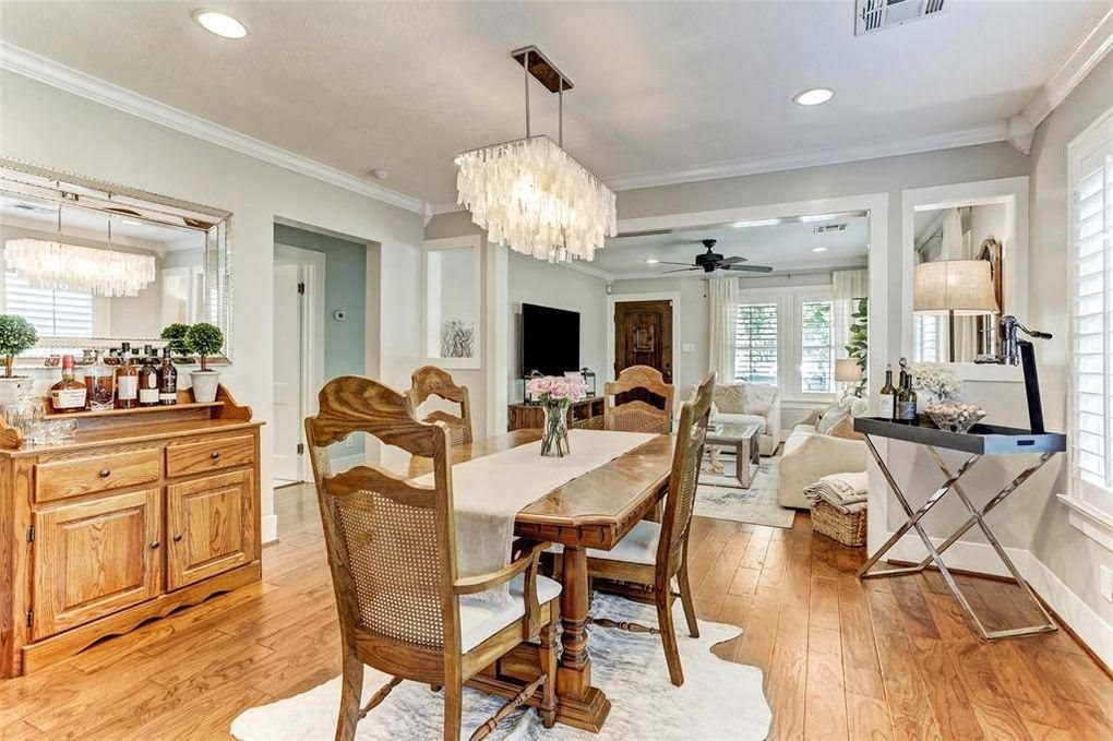
“The new chandelier, window treatments, dining set, paint, and refinished floors all help to make the space feel brighter and larger,” says Liebman. She also points out how the new decor connects the living and dining rooms, making it feel like an open floor plan.
If you’re looking to make your home feel bigger, try matching your decor to achieve this same flow.
Another positive change in this room is the scale of the new furniture. Although it may seem contradictory, the bigger furniture goes a long way toward making this room feel like a bigger space.
“Use your square footage wisely by placing furniture in a room that is the proper scale to help appropriately define and fill the space,” says Ali-Hassan.
Backyard
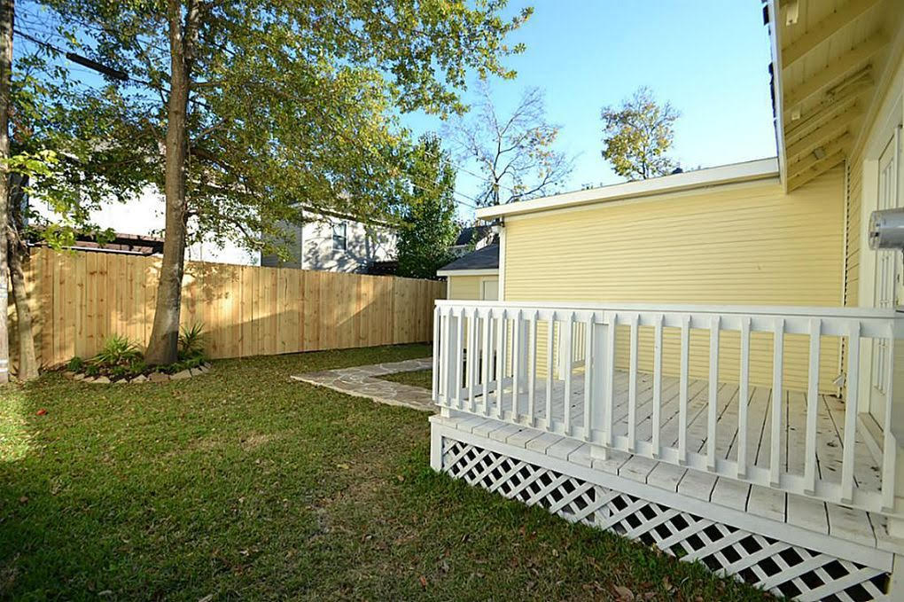
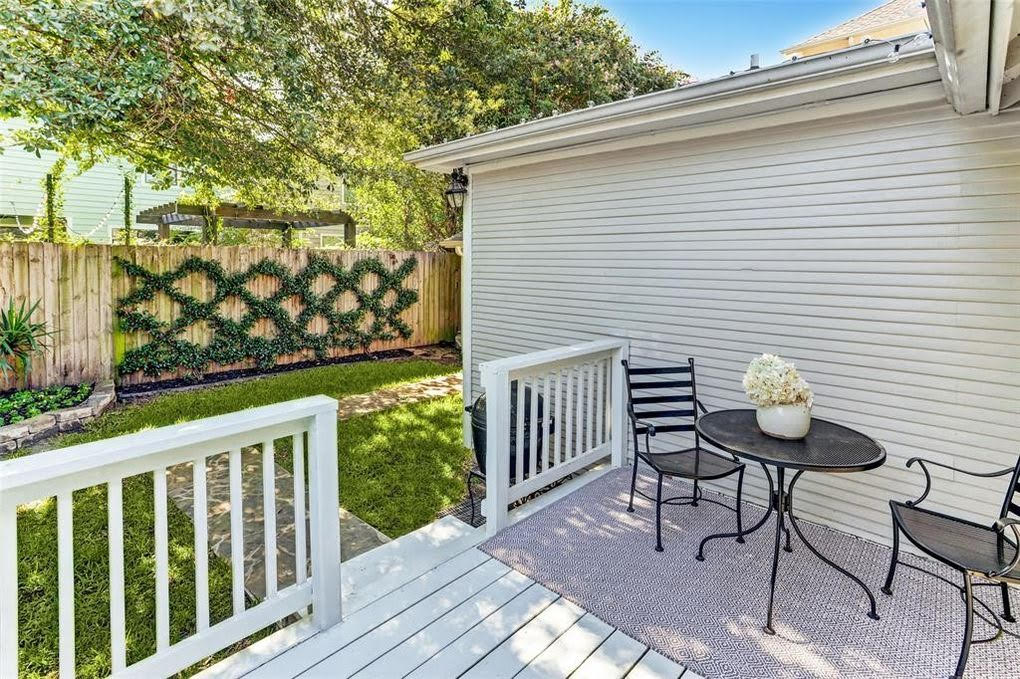
If you’re lucky enough to have a backyard, it should be decked out and made for entertaining. Before the sellers got their hands on the property, the backyard left much to be desired. But after they worked their magic, the backyard became a quaint area any buyer would love to spend time in.
“Changing the house color from outdated yellow to white is a huge improvement,” says Pauly. “Also, the addition of the patio furniture shows how the space can be used.”
“By adding both foliage and furniture, they have created two additional usable spaces: deck and yard,” says Liebman. “This adds value to the home and evokes feelings of family, fun, and entertainment. #homegoals for sure.”
The post Lessons From Listings Photos: How This House Sold in a Month During a Pandemic appeared first on Real Estate News & Insights | realtor.com®.
No comments:
Post a Comment