
realtor.com
It doesn’t matter how perfect your home is—if your listing photos don’t stand out, potential buyers won’t come by to take a look. In our series “Lessons From Listing Photos,” we dissect the smart updates sellers have made to their homes, and how their listing pictures highlight the home’s best assets.
Valley Village is a Los Angeles neighborhood with ties to old Hollywood. The earliest homes there—including this four-bedroom, two-bathroom ranch—were built in the 1920s and ’30s by workers at nearby motion picture studios.
But while most of the houses in Valley Village changed with the times, this one was stuck in a bit of rut. Built in 1927, it still had a vintage vibe, but not in a good way. It was in desperate need of a face-lift, and the previous owners knew how to make it shine. Now, boasting a boho-Scandinavian vibe, it’s the star of the block.
These owners purchased the house in October 2019 and got right to work. Less than a year later, the refurbished home was sold for $1,740,000—about $600,000 more than what they paid for it.
So what did they do to help modernize this outdated ranch? And how can you be just as successful in your own home renovations?
We asked our experts what changes made the biggest difference, and here’s what they had to say.
Backyard
The original backyard boasted a nice green lawn, but sellers are looking for a lot more oomph in their outdoor spaces these days.
New York City designer Joe Human says adding the pool was the right move.
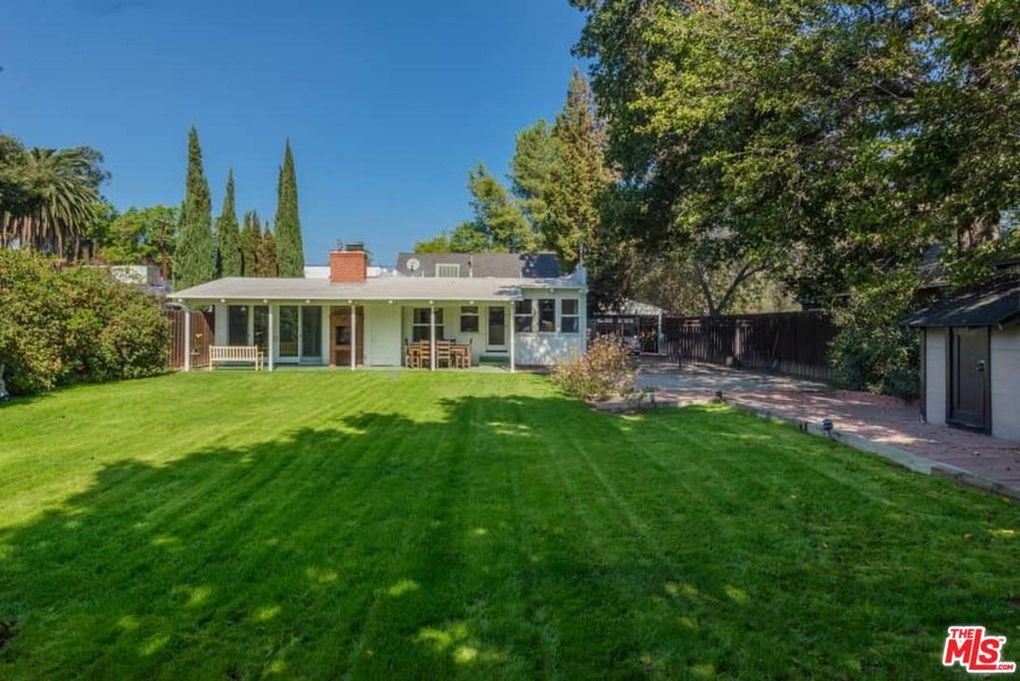
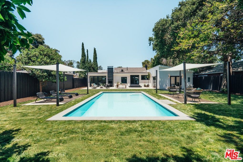
“Outdoor living space, especially nowadays, is such an important feature to create,” he says. “Here, they added value with the pool and the multiple seating areas for lounging and eating.”
He adds that the two new canopies create two separate outdoor rooms while still leaving usable grass space.
San Diego designer Michelle Harrison-McAllister of Michelle Harrison Design agrees.
“Nothing adds more value (next to a kitchen upgrade) than a pool,” she says. “This simple design shows how you can transform an old ranch-style home into a Palm Springs–style pad.”
Living room


From the fireplace to the crown molding, this house is filled with appealing architectural features, but they don’t get their due because of all the giant furniture seen in the before photo.
Interior designer Janet Lorusso of JRL Design says she was glad to see the space had been“completely revamped to a new Scandinavian-influenced vibe.” Gone are the heavy drapes and massive furniture crammed into every available inch.
“By streamlining the furniture, using a neutral color palette with plenty of texture, and leaving the windows uncovered, the room now feels open and inviting,” says interior designer Julie Arnold of J. Raine Design.
Bedroom

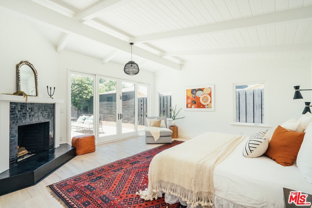
There aren’t a lot of changes to the bedroom space, yet the before and after photos feel a million miles apart.
The original space felt dark and heavy, largely due to the brown wall-to-wall carpet.
“Adding the wood floors and changing the fireplace really helps show off the architectural features that were existing,” explains Human. “I like the traditional rug, which really helps create a nice pop of color and adds more interest and contrast from the stark white.”
These simple changes go a long way when putting a house on the market.
“It’s amazing how far a couple of light fixtures, a new bedspread, and a new coat of paint can change the entire dynamic of the room,” says Kyle Long, real estate agent with Sue Long Realty Group in Oregon.
These changes “will broaden the appeal for a wider range of buyers,” he adds.
Kitchen

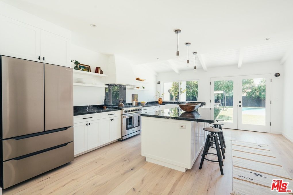
Harrison-McAllister says the best investment for a home renovation is the kitchen, which is why we’re so glad that this one got a whole new look.
The original cabinets and white tiles were adorable but dated, and the space was more of a hallway than a functional area for cooking. Now, the renovated space is a home cook’s dream, and our experts say it may have been the key to getting maximum profit when the house was sold.
“Highly functional white cabinetry, a kitchen island, stainless appliances, and stone or quartz counters remain at the top of every buyer’s wish list,” says Lorusso. “Open shelving, while not for everyone, keeps it light and bright, and the new island provides both seating and fabulous workspace that complements the gourmet appliances.”
Dining room
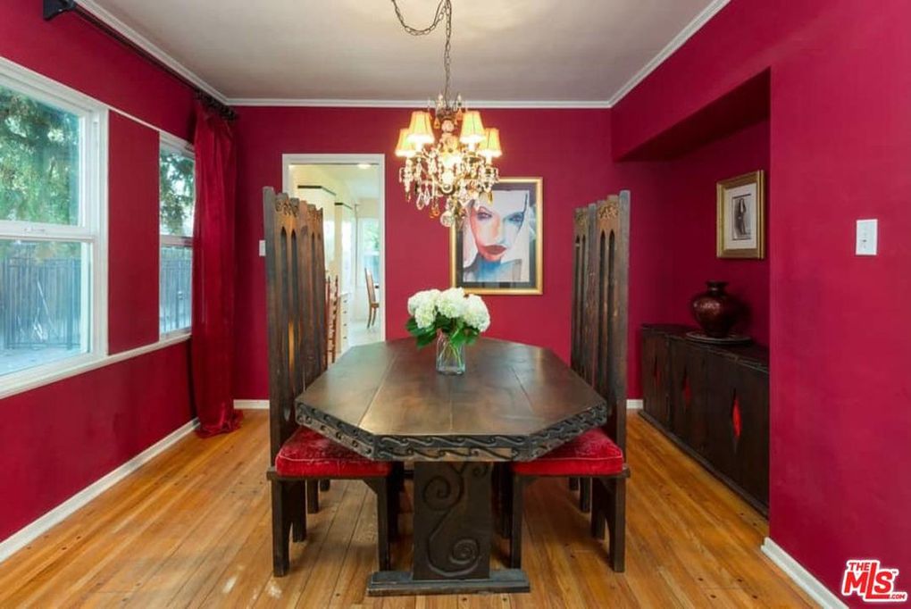
The pre-renovation dining room, with red walls and a shabby-chic chandelier, felt hopelessly stuck in the ’90s.
“It lacked warmth and personality,” says interior designer Amy Peltier. “The dated, bulky, dark wood furniture, red paint, and chandelier make this dining room dingy.”
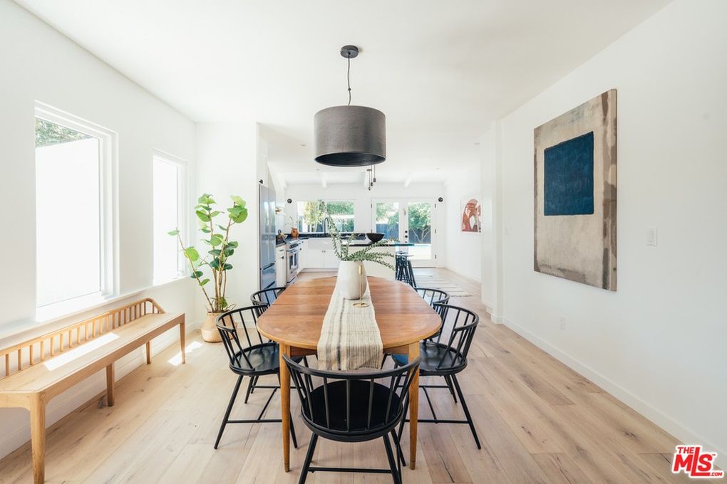
The previous owners created a new, airy space by brightening the paint on the walls and subbing out the heavy furniture for something more streamlined.
This new look “invites guests to gather around the minimalist-style wood dining table at the center of the room,” Peltier says.
Another design decision that vastly improved the floor plan? Removing the wall dividing the dining room and the kitchen.
“This allows the eye to travel further, makes the space feel much larger, and improves the overall flow,” she says.
The post Lessons From Listing Photos: This Renovated Boho-Scandinavian Home Is a Breath of Fresh Air appeared first on Real Estate News & Insights | realtor.com®.
No comments:
Post a Comment