realtor.com; HGTV
Drew and Jonathan Scott love bringing their favorite designs into their clients’ homes. But in the most recent episode of their show “Property Brothers: Forever Home,” Jonathan may have gone overboard.
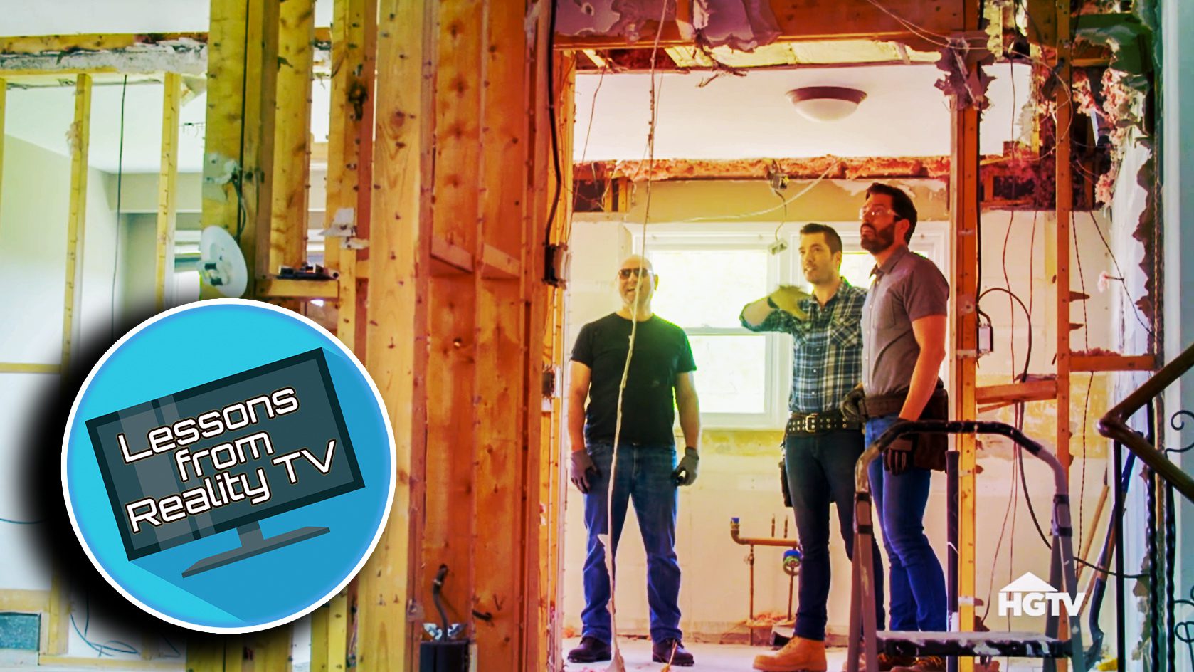
On the “Starter House to Dream Home” episode, the Scott brothers meet high school sweethearts (and parents of two young kids) Sean and Tanya. These two enjoy having extended family over for get-togethers, but while they’ve made wonderful memories in their home over the years, it is a bit too 1970s for their tastes. So it’s time for a big refresh.
Can the Scotts help make this family home a little more modern? Read on to learn how they update this old home (and how you can do some refreshing of your own).
The entryway establishes an important first impression

HGTV
Jonathan has been known to rock his signature plaid shirts, but during this home renovation, he’s ready to incorporate his fashion sense into the home design.
He points out that a lot of people overlook renovating the entryway of a home. And that’s a huge mistake, because this area can make or break people’s first impression of your house.
So to help this entryway stand out, he chooses a plaid design for the tile floor, explaining that he’s trying to do something interesting with a space that, he says, “a lot of people just forget about.”
And weirdly, it works.
“This is the first impression,” he says, “and now, from the second people walk into your home, it feels so inviting.”
Give a dated fireplace a face-lift

HGTV
When Sean and Tanya first welcome the Scotts into their home, they don’t even try to hide their disappointment at the outdated brick fireplace. It’s big and bulky, and as the Scott brothers point out, it looks futuristic—or at least, it looks like what people thought the future would look like.
Drew and Jonathan know that they need to replace this eyesore, so they take out the bricks and replace them with clean lines and gorgeous white marble. The look is simple and elegant, perfect for a fireplace in the 21st century.
Sometimes, windows should become walls

HGTV
While Tanya and Sean may have been worried about their outdated fireplace, they really should have been focusing on the dated block window in the dining room.
That frosted glass may have been popular in the ’70s and ’80s, but Sean and Tanya hate it, and the window’s prominent place in their house.
So what will the Scott brothers replace it with? Apparently nothing. That’s right, the brothers decide to cover the wall and make room for a hutch and some wall art.
While one might think that a home can use as much light as it can get, once the kitchen walls are down, this space is already light and bright. It simply doesn’t need the window, so why waste reno budget on it?
Change the shade of kitchen cabinets

HGTV
One other thing Tanya and Sean hate about their kitchen is the cabinets. And who could blame them? The cabinets may be white (which is a popular look today), but they are flat and bland. They make the whole kitchen feel cold.
Luckily, the brothers know just what to do. Rather than white, they paint the cabinets light gray to add some visual interest. Sean and Tanya are left with not only a warm, updated kitchen, but also more storage than they likely know what to do with.
Stairs to the backyard can dazzle, too

HGTV
When planning this renovation, Tanya and Sean tell the Scotts that they would love a door to the backyard. The family is tired of walking all the way around the house to get there!
The obvious solution would be to install a door in the kitchen wall. Jonathan is happy to do this, but he then surprises this family by doing them one better. The exit will require stairs down to the yard, so Jonathan designs a landing and stair railing that look amazing.
To make the landing feel bigger, he uses glass railings and modern handrails. It’s a perfect way for this family to easily access their beautiful backyard.
Do the Scott brothers deliver?
This house needed a lot of updates, but luckily the brothers had a hefty $180,000 budget. While a surprisingly large chunk of that ends up going to structural beams and an exterior door, the brothers still manage to finish right on budget.
When Drew and Jonathan are done, the home looks perfect—inside and out.
The post The Property Brothers Reveal One Area of a Home We All ‘Forget’ to Renovate appeared first on Real Estate News & Insights | realtor.com®.
No comments:
Post a Comment