HGTV; realtor.com
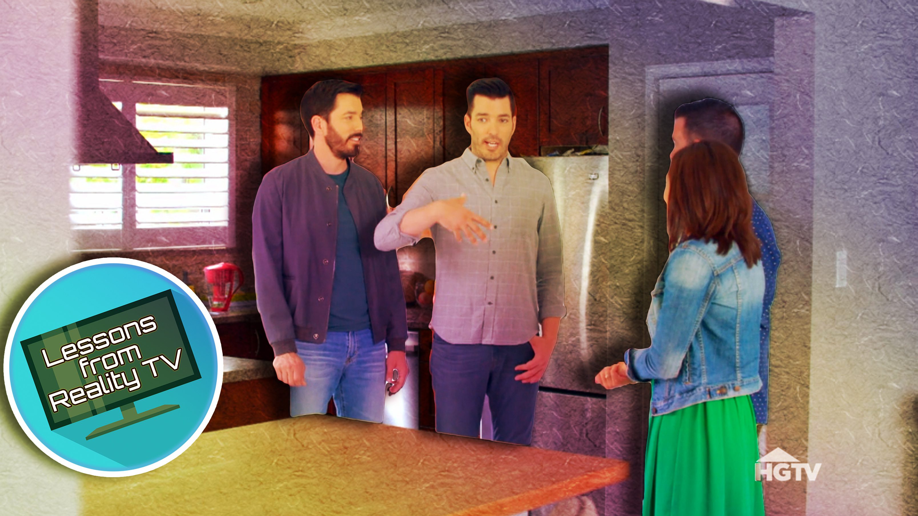
Drew and Jonathan Scott love busting down kitchen walls to make open floor plans on their show “Property Brothers: Forever Home.” But what happens when their clients ask them to put a wall up, effectively cutting the kitchen in half?
In the recent episode “Miracle House to Forever Home,” we learn that Irina and Dean had moved into a small, two-bedroom home in Toronto never expecting to have kids. Well, they did—two!—and now they’re realizing they need to lose kitchen space so their youngest child can have her own room.
Can the brothers pull off this renovation? Or will this two-turned-three-bedroom house feel too crowded when they’re done? Find out how they pull off this tough renovation, and learn their best tips for making a small home look big.
A galley kitchen doesn’t have to feel tight

HGTV
Drew and Jonathan know that there’s only one way to create a third bedroom for this growing family: take space away from the kitchen.
The brothers put a wall up in the middle of the kitchen to make room for baby Adalynn’s room, leaving the family with a small galley kitchen.
Galley kitchens have a bad reputation for being small and closed off. But Jonathan knows how to make this kitchen look spacious.
He makes the space look bigger by installing white countertops and white Shaker cabinets, paired with some gray cabinet accents for contrast. The light colors make this small kitchen look much more open, and the door Jonathan installs at the end of the kitchen brings in lots of sunlight. The bright colors, with lots of light and those new appliances, would probably make any family forget they used to have twice the space.
When the brothers finally show Irina and Dean their finished kitchen, the couple are amazed by how beautiful it looks—and how efficient the space is.
“You know, it’s funny,” Irina says, “our old kitchen, it was bigger, but it was so disjointed. This is a smaller kitchen, but it’s more functional. It actually feels like we have more room in here.”
“This just goes to show,” Drew says, “just because it was a smaller space doesn’t mean you can’t have a great functional kitchen.”
Modern meets traditional backsplash

HGTV
Irina has a classic style, while Dean loves a more modern look. Luckily, the Scotts know just how to incorporate both styles when it comes to the kitchen backsplash.
The backsplash they choose is like a traditional subway tile, but with more movement from an undulating texture. It refreshes the classic look, making it a perfect compromise between Irina and Dean’s styles.
“Regular subway tile you see a lot,” Jonathan points out. “This is way prettier.”
Fun wallpaper is perfect for kids rooms

HGTV
Drew and Jonathan want to make baby Adalynn’s new, small room feel homey for the family’s newest member, so they put up floral wallpaper on an accent wall to give the space some personality.
When Irina sees the room, she says, “I love this wallpaper. It is so perfect for her.”
But it gets better.
Of course, Drew and Jonathan know they can’t give Adalynn a new bedroom without upgrading big brother Mate’s room. For this little boy’s room, the brothers decide to put up a fun construction-themed wallpaper.
Both wallpaper designs brighten up the space, proving that wallpaper can be an easy, fun way to make kids rooms a little more special.
Less storage means more living room

HGTV
When the brothers first tour Irina and Dean’s home, they notice there’s a lot of storage space, maybe too much. There are four (that’s right—four!) hall closets in the entryway, and the brothers decide that’s one too many.
They remove one closet, creating a wider entryway and more space in the living room. Jonathan is even able to put a new dining table in the living space without it feeling too cramped.
This just proves that while storage can be incredibly important to families with kids, sometimes that storage space is used better in another way.
Shelves are a simple way to add storage

HGTV
So Irina and Dean give up some storage space when Jonathan takes out one of their hall closets, but they gain some back when he adds some shelving to their fireplace.
Jonathan knows right away that the whole fireplace needs a big overhaul, and when he starts talking about fireplace updates, Irina mentions that she’d love some shelves on the wall.
So, Jonathan redesigns the fireplace by adding soft, geometric tiles, then tops it off with lots of storage on both sides.
Not only does this fireplace look great, it’s also very functional.
So do the Scott brothers deliver?
Before renovation, Irina and Dean tell the brothers that they can’t go above $150,000 for their renovation. So, when Jonathan gives them a quote of $135,000 for a six-week renovation, these parents of two are happy to stay under budget.
They’re even happier when Drew and Jonathan end up doing everything on the family’s wish list while coming in right on target at their estimated $135,000.
Irina and Dean’s forever home is perfect, and so is the price.
The post The Property Brothers Reveal How to Make a Tiny Kitchen Look Huge appeared first on Real Estate News & Insights | realtor.com®.
No comments:
Post a Comment