
Discovery+
Drew and Jonathan Scott renovate a lot of homes in Las Vegas (after all, they have a house there), but on the latest “Property Brothers: Forever Home,” they’re given the rare opportunity to upgrade a home with true Strip-style glamour!
In the Season 5 episode “A Bit of Vegas Glam,” empty nesters Lisa and Jay ask Drew and Jonathan to take their $125,000 budget and give their home a Vegas lounge feel. This sounds fun, but the brothers know they need to be careful not to go overboard. After all, too much glam can end up looking gaudy.
In the end, the Scott brothers find a balance that makes this house perfect for both a dazzling party or a casual night in. Here’s how they bling up even the most mundane areas of this home, which might inspire a few changes around your own abode, too.
1. Frame your fireplace with molding
Discovery+
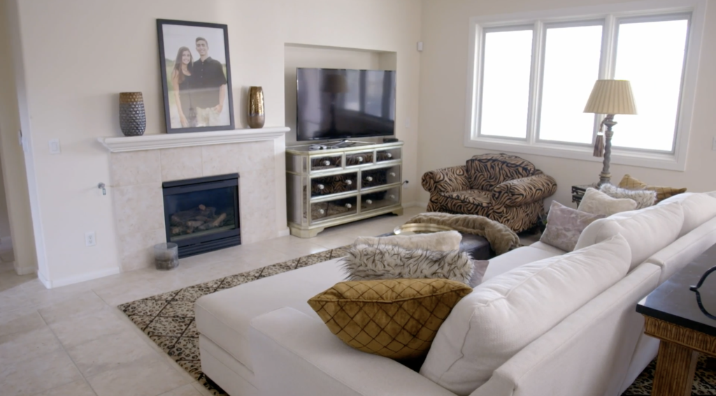
When Drew and Jonathan first see Jay and Lisa’s house, they’re unimpressed by the fireplace, which is off-center and sharing the wall with a dated TV nook. Unfortunately, the arrangement throws off the balance of the room and makes the whole living area feel uneven.
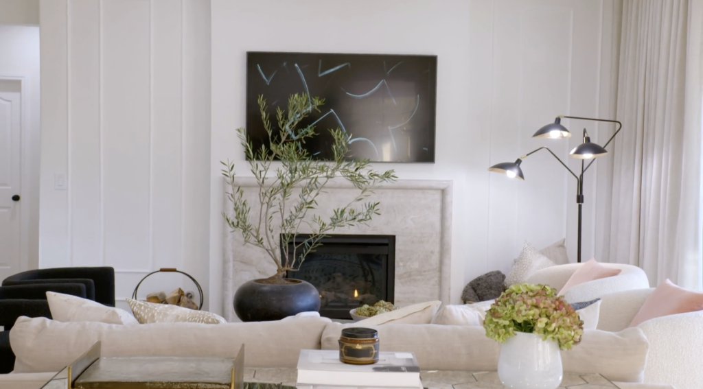
So Drew and Jonathan simplify the space by removing the TV nook, centering the fireplace, and mounting the TV. With a centered fireplace, the room already looks much improved.
Discovery+
However, the Scotts want to make this wall even more of a feature, so they add molding on either side of the new fireplace. This molding is an inexpensive but elegant way to pull more attention to this wall, adding extra style to the space.
As Drew and Jonathan install this molding, Jonathan points out how easy it is to add this feature.
“The cool thing, too, is once we caulk all the edges, fill all the corners, it’ll be perfectly seamless and—boom! All of a sudden, we’ve just widened the whole statement,” Jonathan says.
2. Add subtle animal prints

Discovery+
When the Scott brothers first meet Lisa, she tells them that she loves animal prints. In fact, she already has a collection of them in the form of a zebra-print chair and cheetah-print rug. While animal prints can give off an old Las Vegas vibe, they can also overwhelm a space.
“I did warn her that we can’t go overboard with all the wild patterns, textures, color, or bling,” Drew says. “Because if we do, then it’s just going to look overbearing. It’s not going to feel like a home.”

Discovery+
Drew and Jonathan end up using a spotted area rug to satisfy Lisa’s love for animal prints, and luckily, the rug works in the space. The spots add visual texture to the room while the subdued black and gray color keeps the room looking sophisticated.
3. Sliding doors can make a room sparkle

Discovery+
When Drew and Jonathan start the renovation, they offer to remove the windows and put in large, collapsable doors that lead out to their fabulous pool. Lisa and Jay decide to skip the folding doors (and spend their money on other parts of the renovation), but they do decide to install sliders.
Once installed, the doors end up adding lots of Vegas glam to the living room. Not only do these doors let in the sun, making sure all the living room finishes sparkle, but they also provide some fabulous indoor-outdoor living.
“They had already put so much money into their backyard, but the access to it was a little bit limited, kind of closed off,” Jonathan explains. “Now, with this beautiful big slider, you’ve got more light, you’ve got more flow, and you can actually see that beautiful yard and all the work that they did.”
4. Add mirrors in an unexpected place
Discovery+
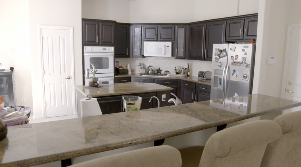
Drew and Jonathan want to add lots of chic style to the kitchen, but they still want to be careful not to go overboard with shiny finishes or bright colors. Luckily, Jonathan comes up with the idea to use mirrored panels.
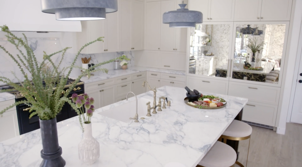
“What if we do, like, some panels? We could do it on, like, the pantry, or we could do it on the fridge,” Jonathan tells Drew as they look at design samples. “Aged glass panels [will feel] like some of these really beautiful lounge makeovers that you’re seeing in a lot of the really nice resorts in Vegas.”
Discovery+
Drew knows that Lisa will love this look, so they install aged mirrors with gold veining on the fridge doors.
It’s a unique choice, but the panels end up looking beautiful. It brings that fun Vegas look into the kitchen without taking attention away from the elegant white cabinets or the brass hardware.
5. Use brass to make a space shine
Discovery+
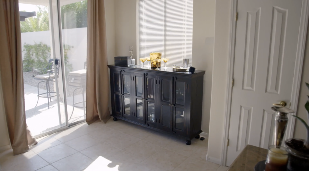
When the Scotts first tour this kitchen, they realize one corner of the room is underused. Lisa and Jay have placed a cabinet in the corner by the window, but Drew and Jonathan know this space could have more functionality.
“Keep in mind, too, this is going to be a statement kitchen,” Jonathan tells Drew during a design meeting. “So why don’t we do brass shelving over the top of the window here? And I do think we need to go brass ’cause then we can match it up with the hardware.”
Sure enough, they add brass hanging shelves that really pull the kitchen’s design together.

Discovery+
The post The Property Brothers Reveal 5 Fun Ways To Bling Up a Ho-Hum Home appeared first on Real Estate News & Insights | realtor.com®.
empty cleaning
ReplyDelete