
asbe/iStock; realtor.com
Think designers don’t make mistakes when primping their own homes? On the contrary, even the pros get it wrong sometimes—particularly when it comes to paint.
“With most items in design, fashion, or food, you can see the finished product before purchase, but with paint you only view a small portion of the color before committing to the time and money of putting it up,” says Justin Riordan, founder of Spade and Archer Design Agency.
Trial and error aside, another thing that makes paint tricky is the sheer number of colors to choose from.
“There are so many choices available, which can make it tough to come to a decision, even for experts,” says Dee Schlotter, senior color marketing manager at the paint brand PPG. Different shades, tones, and finishes all affect your final choice, as can the lighting and reactions to neighboring colors in the room.
To help homeowners smooth over future paint woes, here are five tales from the pros of colors gone wrong and how they addressed each mess.
1. Chartreuse accent wall

Photo by NOA Architecture Planning Interiors
Schlotter’s 95-year-old home needed a little spunk, so she chose Chartreuse for an accent wall in her family room. Hoping to pair it with true beige on the walls and ceiling, the result was simply too much glow. (Think Shrek, and that’s about right.)
The fix: “I repainted it with PPG Palmetto, which is a green with a hint of blue. It wasn’t as clean and sharp, but it still brought up the energy in the room and made it beautiful without being so glaring,” Schlotter says.
Repainting may seem onerous, but it’s mostly a time suck rather than an investment.
“If you make a big color change, wait at least two weeks to let it settle with the rest of your decor—and if you still don’t like it, redo it,” she says.
2. Black living room

Photo by Richard Massa Architect
Riordan was fixated on painting his living room with Benjamin Moore Black.
“I had seen it done in picture after picture and absolutely loved it—and I had even painted the dining room in our previous house black. I was certain it would work here,” he says.
Alas, the other black spaces all had white trim, but his current one did not. The color made the room feel very small, even though it had a high ceiling and huge windows.
“I could not believe how bad it was—the Douglas fir trim looked Halloween orange against the black, and it felt like a terrible Disney version of a haunted house,” he laments.
The fix: Riordan repainted with a clear, flat primer to ease the high-gloss sheen of the first coat, and then moved in more furniture to help diminish the black.
“Suddenly the room looked bigger,” he says.
3. Red guest room

Debra Kling, a certified color consultant, knew she wanted a chili pepper red in her guest bedroom.
“I thought it could work because it’s a small space that’s used occasionally, and it’s a good conversation piece, visible from the kitchen and other well-used parts of the house,” she explains.
The problem was not the paint color, but the finish, which was high gloss. Placed on the room’s stucco walls, every irregularity on the wall surface became all the more noticeable.
“It was the wrong finish—too shiny for stucco—and it allowed for every imperfection in the 100-year-old walls to shine through,” she says.
The fix: Camouflage.
“We had French landscapes on the wall, a large tapestry, and a massive antique headboard, which were handy for hiding the flaws,” she says.
4. Purple bathroom

Photo by New England Design & Construction
“Small rooms can often take rich color, especially baths and entry halls,” notes Michael Boodro, chairman of editorial and strategic initiatives at Dering Hall. His plan was to paint the little loo in his first apartment a deep, glossy eggplant.
“I thought it would be mysterious and glamorous, but unfortunately it looked like cheap purple lipstick and made everyone’s skin look sickly,” Boodro says.
The fix: Boodro says he repainted it an off-white.
“No one should live with color that makes them unhappy or reminds them of a mistake—and fortunately, paint itself is rather inexpensive,” he says. And if choosing another color is too daunting, wallpaper is an alternative.
5. Yellow living room
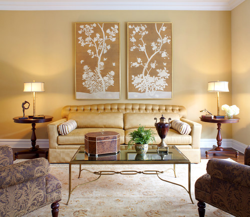
Photo by Deborah Martin Designs
Jamie Novak, author of “Keep This Toss That,” picked a golden-yellow paint for her living room.
“But instead of a warm yellow that felt like a hug, it was an awful yellow-green,” she says.
The fix: “After almost coming to tears in the paint department, I met a contractor there who suggested I head to the lighting aisle to pick up new bulbs that didn’t cast a yellow glow,” she says.
Once she swapped out her old bulbs, the yellow on the walls became the perfect shade.
The post 5 Horrific Painting Fails Done by Designers—in Their Own Homes appeared first on Real Estate News & Insights | realtor.com®.
No comments:
Post a Comment