
HGTV
Season 2 of “Rock the Block” is in full swing, and in this week’s episode, these four teams of designers prove that a living room can mean so many things.
In “Rock the Living Rooms,” host Ty Pennington gives each team $225,000 to make over the living area in four identical homes, while Page Turner from “Flip or Flop: Nashville” serves as guest judge.
Here’s how these designers reimagine these spaces in totally unique ways—which might inspire you to see your own living room’s potential in a whole new light.
Add glass doors to let in more light
HGTV
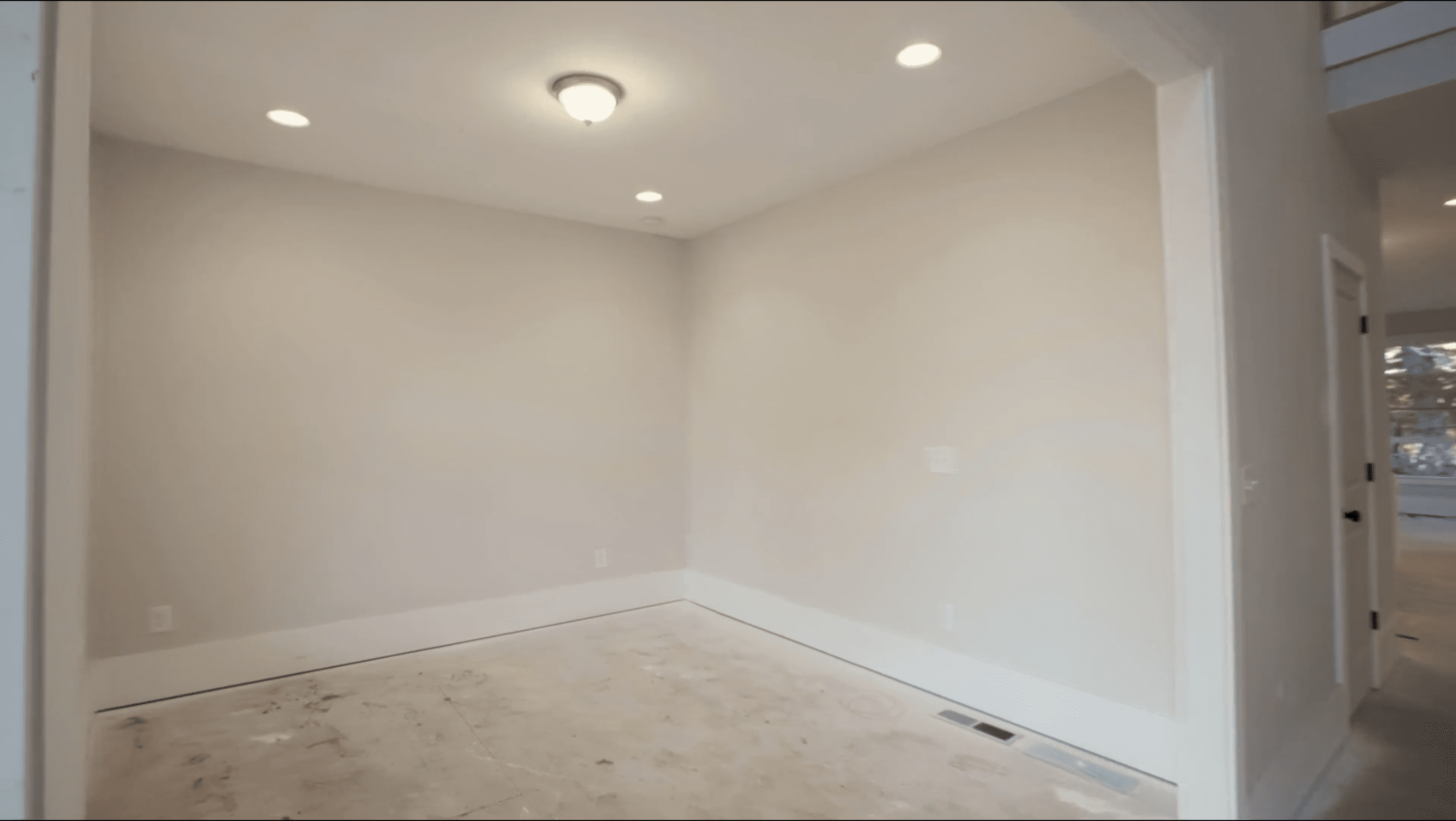
Competitors Nate Berkus and Jeremiah Brent of “Nate and Jeremiah: Save My House” know that they’ve got a lot to work with when it comes to the large, main living space. But they’re puzzled by the smaller bonus space right off the front door.
They decide to open up this space by installing two French doors that lead to the wraparound front porch, and bust down the wall to the butler’s pantry in order to open it up to the kitchen.
“This’ll be open,” Brent says, “that’ll be usable. It’s going to be beautiful.”

HGTV
The two designers decide on an elevated look with a checkerboard floor and dark walls with light paneling.
Once the work is done, this dull room is transformed into a unique sitting room filled with light. The space is perfect for welcoming guests into the home, and with access to the kitchen, it seamlessly flows into the rest of the house, making it great for parties.
“The combination of these ideas took this room from ‘Who cares?’ to ‘I want to be in the front of the house,’” Berkus says.
Arched bookshelves make for a stylish addition
HGTV
While Berkus and Brent open up their bonus space by adding French doors, Alison Victoria from “Windy City Rehab” and Mike Holmes from “Holmes on Homes” focus on storage.
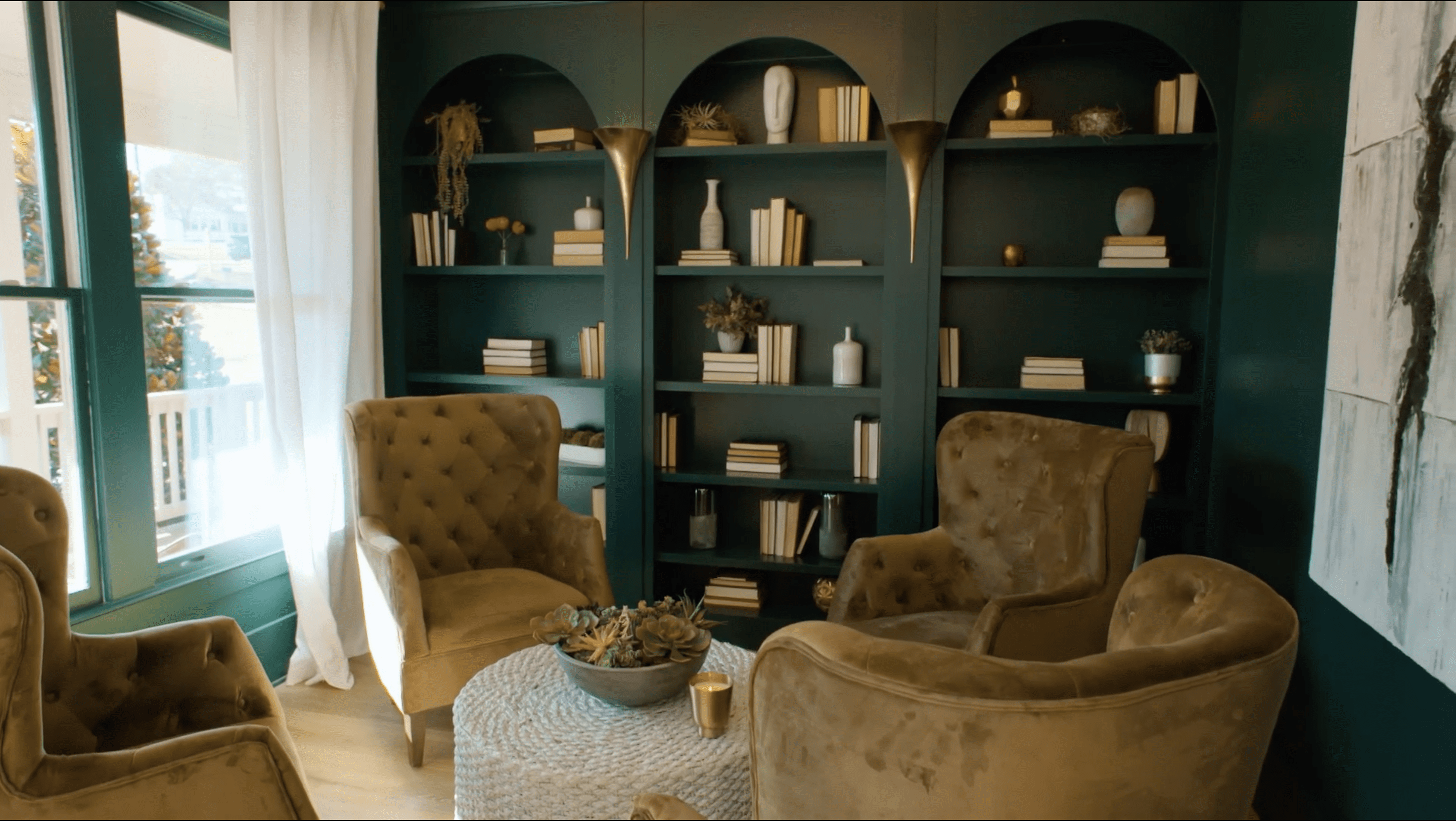
“This is going to be our bourbon room,” Victoria says when planning the design. “I do these whole back wall built-ins, and I love arches.”
So Victoria and Holmes agree to install beautiful built-ins to the back wall. However, they don’t see eye to eye on color. While Victoria is excited to paint the shelves dark forest green, Holmes thinks it’ll be too much, saying that the dark green is more of an accent color.
In the end, they decide to go with Victoria’s plan, and while the forest green does seem a bit bold, it gives the house some needed edginess.
And, no matter the paint color, the built-ins are a memorable feature that buyers will love.
“This is what enhances the value of the house, and that’s our goal,” Holmes says.
Don’t let faux beams make your space feel smaller
HGTV
Over in their main living room, Brian and Mika Kleinschmidt from “100 Day Dream Home” want their space to feel unique, so Brian suggests they use a ceiling design the other designers wouldn’t think to do.
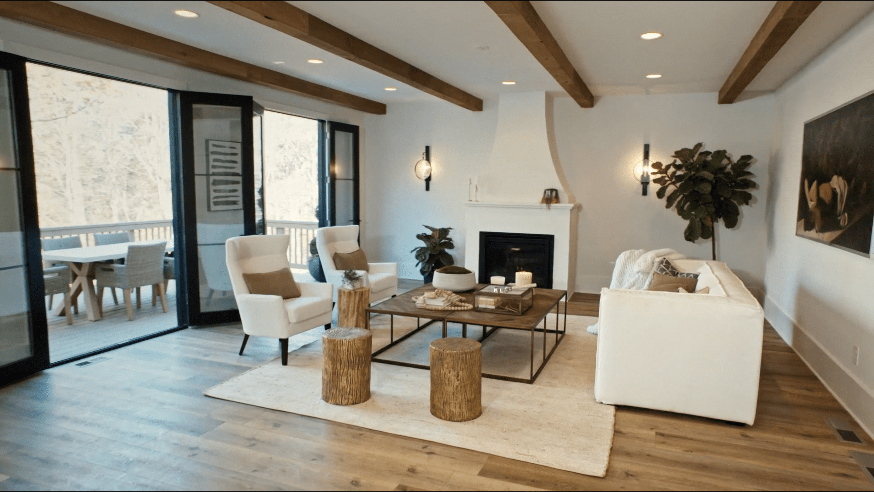
“I have a feeling other teams are going to do, like, faux beams that drop down,” Brian says, when looking at the space. “The ceilings here are only 9 feet tall, so once you drop a beam down, I mean, I am 6-foot-4. I feel like I’m ducking through.”

HGTV
They decide on paneling, which includes a wood herringbone detail. The design highlights the sophisticated chandelier and makes the room feel classic and elegant.
As it turns out, Brian was right, because all three of the other teams install faux beams, making Brian and Mika’s home stand out.
When the work is done, Mika’s proud of their design: “I do like that we decided to do something a little bit more simple on the ceiling.”

HGTV
Don’t go overboard with bold colors

HGTV
Over in the living room being designed by David Bromstad of “My Lottery Dream Home” and Tiffany Brooks from “50K Three Ways,” Bromstad wants to create a wow-worthy entryway that will help them stand out from the competition.
“A lot of people are just going to paint this, put up some art and maybe a nice chandelier, and call it done,” Bromstad says. So he comes up with a design that incorporates bold wallpaper on one wall, black paint on the other, and an ombre staircase that transitions from dark to light green.
It’s a brave design, but Bromstad is sure it’s the right choice.
“We want to have fun, we want to make an impact and show people what they can do with wallpaper and color,” Bromstad says.
However, Turner isn’t impressed by the look. While she likes the wallpaper, she thinks the black paint may be too much.
“It’s a lot to take in,” she says.
Brooks and Bromstad provide a good reminder to go bold—just not too bold.
Another bedroom can add value
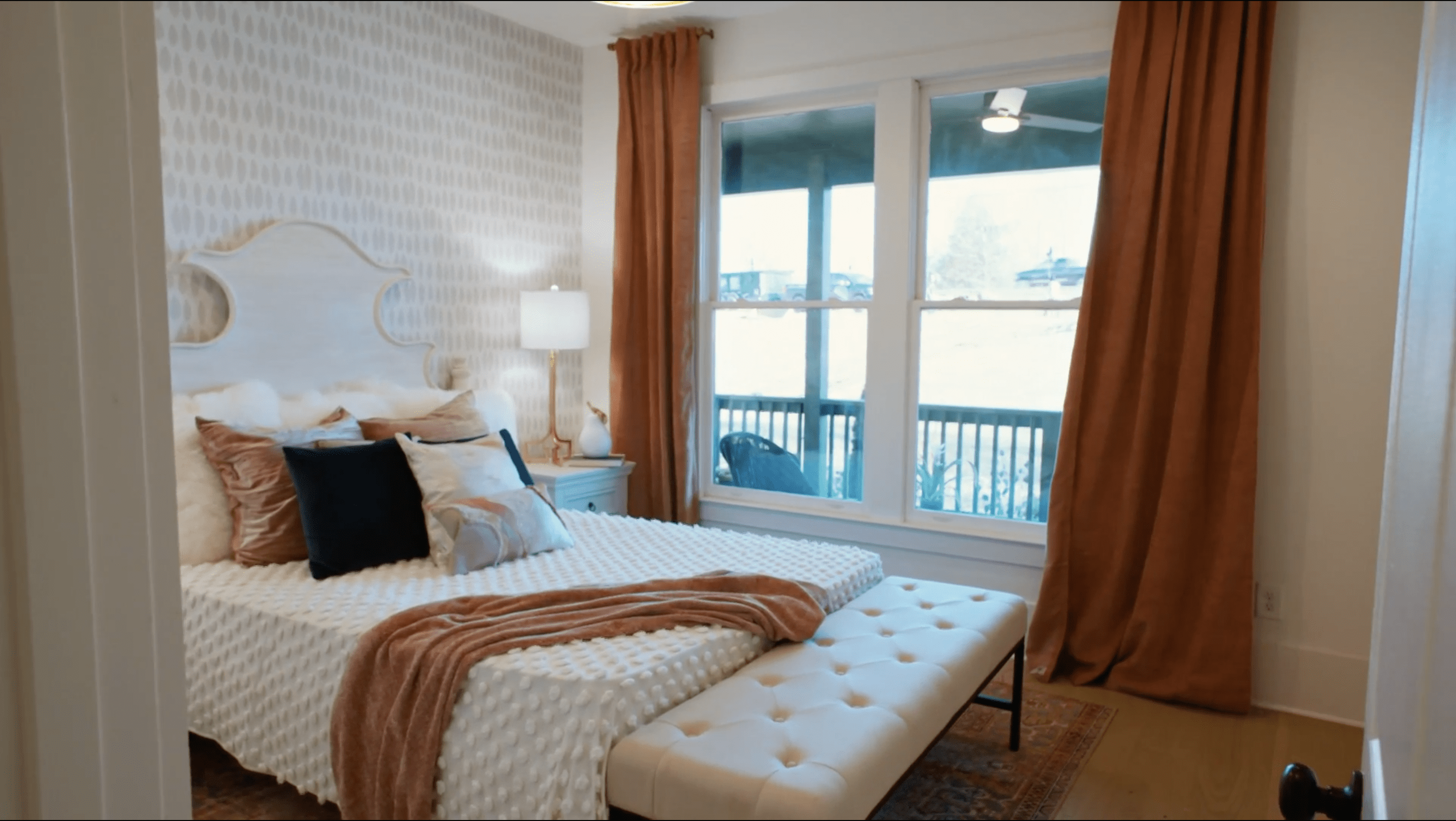
While Bromstad and Brooks may have missed a bit on the entryway, they more than make up for it by turning the bonus space into a gorgeous in-law suite.
They close up the large entryway to the bonus room and add a new entry to the bathroom so that it can be easily accessed by this new bedroom. Then they sneak a shower into that half-bath, making this space a perfect guest suite.
“Doing the mother-in-law suite, hands-down, is going to be our biggest cost for this week’s challenge,” Brooks says. “But to me, it is a no-brainer to add a full bedroom and a full bath. That is going to definitely bring home the W.”
HGTV
But is this suite good enough to bring Brooks and Bromstad the win? As it turns out, yes!
Turner announces these two as the winner. While their entryway was a little overwhelming for Turner, she’s impressed by the clever arrangement of the in-law suite.
Brooks and Bromstad earn major bragging rights—and prove that keeping your in-law in mind is always a good idea.
The post ‘Rock the Block’ Reveals What To Do With Your Living Room Right Now appeared first on Real Estate News & Insights | realtor.com®.
No comments:
Post a Comment