Discovery+
With so many people working from home right now, many are racking their brains on how to fit a nice home office into the mix—and some smart do’s and don’ts abound in the latest “Design Star: Next Gen,” the Discovery+ reboot of HGTV’s hugely popular “Design Star.”
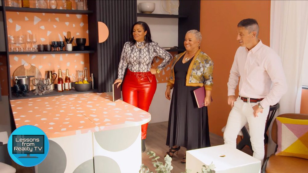
On the “Transformers!” episode, the seven remaining contestants are working hard on workspaces, while host Allison Hocker Boss and guest judge Kim Myles (the winner of Season 2 of the original “Design Star”) chime in with colorful commentary.
The designers are each instructed to create a multifunctional room that can pass as both a home office and a hip party place—plus they need to build a modular piece of furniture that can help change the function of their room. While the contestants put a lot of thought into their individual designs, only one will win—and one will be cut from the competition entirely.
Here are the best—and worst—home office designs these competitors pull off, which might inspire a few changes around your own abode, too.
Save space with foldaway furniture

Discovery+
Right away, Denver designer Eli Hariton impresses the judges with his workspace design. With bold black and orange colors, two large desks, and lots of shelf space, it’s stylish as well as functional.
Then, Hariton opens the cupboard to reveal a bar and swivels the desks out into the middle of the room. By doing so, he creates a dining space perfect for dinner parties. To add to the fun, he builds gray and white blocks that transform from stylish art pieces into part of the table!
Of course, the judges love the look. Even fellow contestant Carmeon Hamilton (from Memphis, TN) applauds the smart design.
“Can you imagine this in, like, a New York apartment?” Hamilton asks.

Discovery+
But the space isn’t perfect.
“Your accessories, it’s, like, awkward,” says head judge Jonathan Adler of Hariton’s decor. “Really drags me down.” However, he’s impressed by the creativity of Hariton’s table, which proves that even the tiniest apartments can have a sizable dining space if you move things around.
Never underestimate the power of paint

Discovery+
While Hariton’s design is delightful, Arianna Danielson of Colorado Springs, CO, creates a wow-worthy office space with desks that collapse into beautiful pieces of wall art. But this space isn’t only about function. Danielson gives her room a sophisticated art deco design, with a smart use of colors, which gets lots of compliments from the judges.

Discovery+
“It’s really cohesive,” Myles says. “It feels really chic. I also want to commend you, just so much gets accomplished with paint.”
Add storage with secret compartments

desk space
Meanwhile, Hamilton has designed a workspace with her young son, who likes to play video games. The room has a large table, which is perfect for homework; but it has two hidden compartments that pop up to reveal video game storage on one side and drink storage on the other.

HGTV
The judges love the clever table, especially the push-to-open panels, which makes opening them extra easy.
“Your attention to detail is really sophisticated and superb,” judge Lauren Makk says.
Home office fail No. 1: Falling short on a room’s focal point

Discovery+
Chris Goddard of Springdale, AR, has a creative concept: building a vision board that folds down into a pingpong table. However, the feature doesn’t impress Adler.
“The focal point is right here,” Adler says, looking at the mood board. “That looks like a 5-year-old did it, and that’s the whole focus of this room. Unfortunately, your focal point is a fail.”
Still, when Goddard pulls down the mood board to reveal the pingpong table, the judges love it. The table is a great feature, but it might not be enough to justify the uninteresting wall.

Discovery+
Home office fail No. 2: Too many colors and patterns

Discovery+
Another home office the judges aren’t in love with is Peti Lau’s, due to her overuse of hues and patterns.
“There is a lot goin’ on,” Myles says of the L.A. designer’s workspace. “You are not kidding with color, pattern, pattern, pattern, pattern. I’m not sure where to look first.”

Discovery+
While Lau’s design is certainly creative, with a white board that folds open into a dance floor, Adler isn’t impressed.
“It’s a bit tween,” he says.
Of course, Adler is right. With light-up wall decor, a colorful rug, and crazy wallpaper to top it off, Lau’s room feels busy and immature. Her design proves that whether you’re working or dancing the night away, sometimes too much is simply too much.
Who wins this round of ‘Design Star: Next Gen’?
In the end, Hariton’s hidden bar and hide-a-way table get top marks, and the judges name him this week’s winner.
Meanwhile, Lau’s dance floor proves to be insufficient for these judges, and she’s eliminated from the competition. Still, Lau is proud of her work and accepts that her designs might not be for everyone.
“The judges weren’t really getting my designs,” Lau says.
With only six designers left in the competition, they will have to work harder than ever next week to stay in the game.
The post ‘Design Star: Next Gen’ Reveals 2 Horrid Home Office Fails To Never Do appeared first on Real Estate News & Insights | realtor.com®.
No comments:
Post a Comment