HGTV; realtor.com
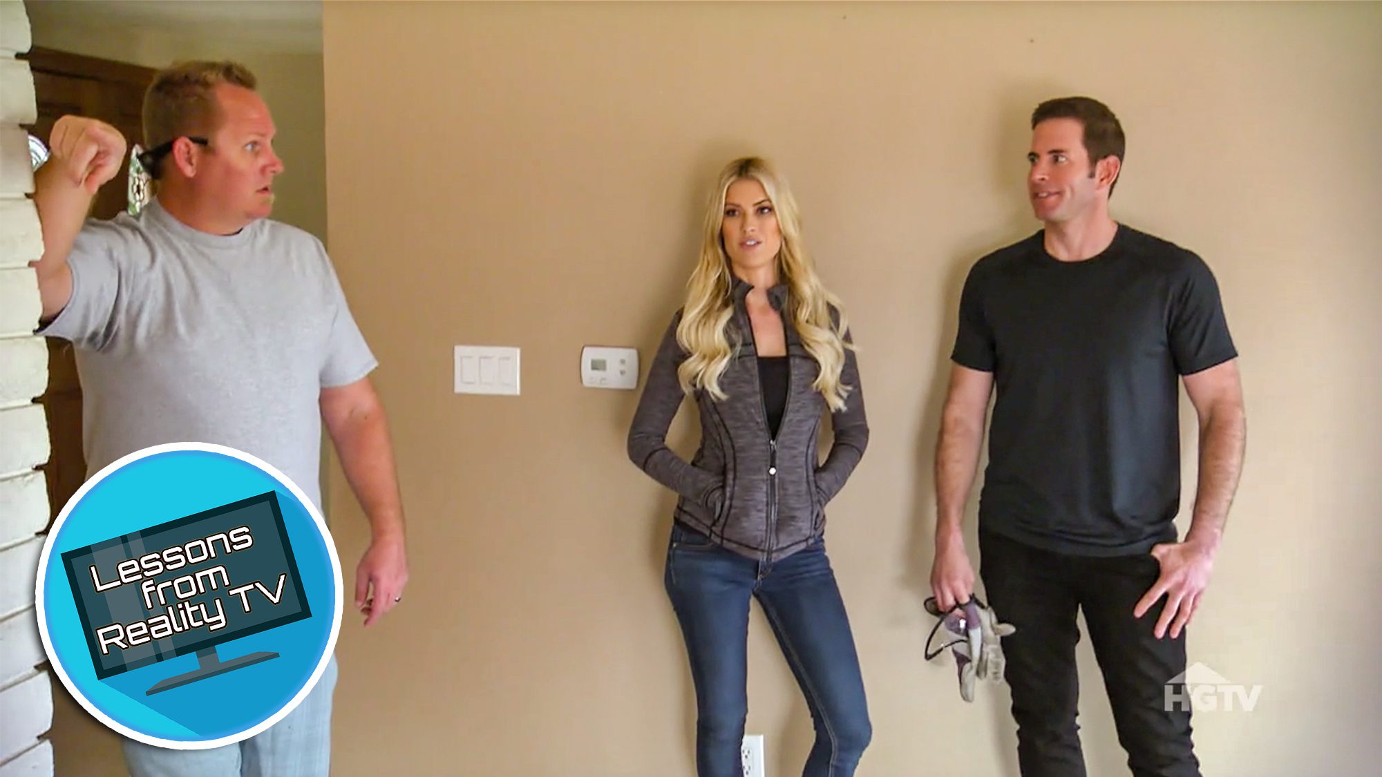
“Flip or Flop” stars Tarek El Moussa and Christina Anstead have flipped a ton of run-down houses in their day. But in the latest episode, “Buyer’s Remorse,” they buy a house that doesn’t even really need to be flipped!
Sure, maybe the house could use a little updating, but overall, the property they buy in Yorba Linda, CA, already looks pretty move-in ready. That’s why it’s so surprising when Anstead and El Moussa decide to change the house completely, ripping out perfectly good cabinets and making other changes, just because the style doesn’t seem quite right.
Read on to find out the method in Anstead and El Moussa’s madness: both why they think this house needs such a big change, and some take-home lessons that might apply to your own home.
When in doubt, do a modern kitchen
Anstead and El Moussa have two favorite styles: modern and contemporary. If they think a house may go to a hip, young family, they usually like to stick to the edgier, modern look.
If the house could go to an older buyer, they usually play it a little safer, with the contemporary look. But they know that this particular house could go to any kind of buyer, so at first, El Moussa and Anstead aren’t sure what to do.
In the end, they let personal preference act as the deciding factor. Christina prefers the black-and-white modern look, so they agree that this design will work better. They install a black-and-white patterned backsplash that totally works for this space.

HGTV
A modern deck shouldn’t look like wood
This house comes with one amazing feature: a massive back porch that looks over a gorgeous green landscape. But there’s also one big problem: It’s the wrong color. The wood is red, which, as El Moussa and Anstead note, give it a “woodsy” feel, which doesn’t fit the modern style they picked for the interior.
“You can’t have a modern inside and then have a redwood deck,” Anstead points out.
They know they’ve already spent a lot of money on the house, so they don’t want to spend more to paint or stain the deck, but in the end, they realize it has to be done. So, they spend an extra $5,000 to paint the deck gray.

HGTV
There’s no need to tile every bathroom wall
El Moussa and Anstead have been known to bring their chic tile style into the bathroom, but this time, Anstead wants to try something new.
Instead of doing tile on the floor then extending up all walls, as El Moussa originally suggests, Anstead argues that they’ve done the look too many times. Instead, they tile just one wall, then paint the others.
In the end, the bathroom still reflects El Moussa and Anstead’s signature style, but the different choice serves to freshen it up.

HGTV
A makeup station adds elegance
When it comes to the master bathroom, buyers usually know what to expect: one or two sinks, a toilet, a shower and/or bath, and hopefully some neat fixtures.
But Anstead and El Moussa have the idea to give this bathroom a little something extra: a makeup station. It’s definitely not a requirement for a master bathroom, but the addition gives the space an air of elegance.
The vanity, with white drawers and dark hardware, fit right into the modern bathroom. Plus, it gives the master an added “wow factor.”

HGTV
Get creative with the fireplace
Anstead and El Moussa know that fireplaces can be a big asset to almost any home, but the fireplace that comes with this flip is an outdated eyesore. They want to change it up, and luckily, Anstead is up for the challenge.
She has an idea to give the fireplace a unique look, by laying black and white tile in a pyramid pattern. The look is different from fireplaces they’ve done before, but it’s the originality of the look that makes it stand out.
In the end, the fireplace has the modern look this duo is going for, and when paired with the black-and-white tile in the bathroom and kitchen, this fireplace fits in perfectly.

HGTV
Don’t forget the view
Perhaps one of the hardest decisions El Moussa and Anstead have to make is whether to spend $10,000 to remove a kitchen wall.
When they buy this house, they’re both amazed by the beautiful views from the living room. The only problem is that one large brick wall cuts the kitchen off from the rest of the house, and obscures the view.
On one hand, $10,000 is a big price tag, but on the other hand, these veteran flippers know that buyers will want an open layout, so they can enjoy the beautiful landscape. In the end, El Moussa decides that spending the money to highlight the view is worth it.
“In all the years flipping houses, we’ve never had a house like this, up on a hill with views like this,” El Moussa says. “It’s really, really unique.”
So, is this a flip or flop?
After getting the price down from the $850,000 asking price to just $740,000, El Moussa and Anstead’s flip starts off well. But, when their contractor gives them a rehab estimate of $88,000, they know they’re going to be spending a lot of money on this flip.
El Moussa and Anstead end up investing a total of $850,600 (after closing costs and commission and staging). But, the hefty price tag is definitely worth it. The house looks modern, fresh, and move-in ready. They end up listing the house for $1,039,000 and getting a full-price offer.
That means Anstead and El Moussa stand to make a profit of $163,400. What a flip!
The post Watch Tarek and Christina Flip Their Most Surprising House Yet appeared first on Real Estate News & Insights | realtor.com®.
No comments:
Post a Comment