
HGTV
Drew and Jonathan Scott know how important family is, so in the latest episode of “Property Brothers: Forever Home,” they’re thrilled to help a client make her home a comfortable and accessible place for all her relatives.
In the Season 5 episode “Heart of the Family,” the brothers meet Josefina, a mother of two who wants to make her home the ultimate family gathering spot. She not only hopes her two grown daughters will have enough space for frequent visits, she also wants her sister, Sophia, to be able to get around the house easily in her wheelchair.
With a budget of $180,000, the Scott brothers manage to turn this dated Los Angeles home into an adorable and accessible abode. Here’s how they pull it off.
When renovating, it’s fine to stick with the old look
HGTV
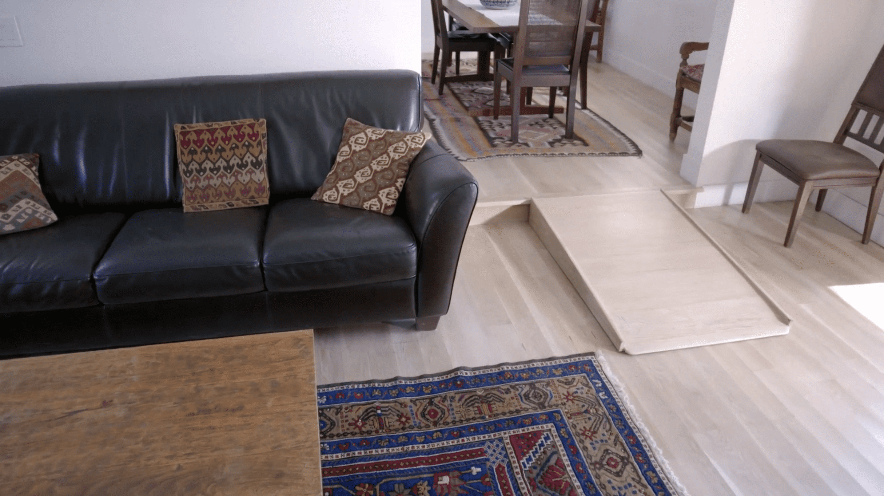
One of Josefina’s biggest concerns is making sure Sophia is able to get around easily because as the floors are now, wheelchair navigation is a challenge.
Not only does the house have multiple levels (which means Sophia needs a ramp to go into different rooms), but the Scott brothers notice also that the light wood flooring is buckling, hinting at some water damage in the house. Drew and Jonathan know right away these floors will need to be replaced.
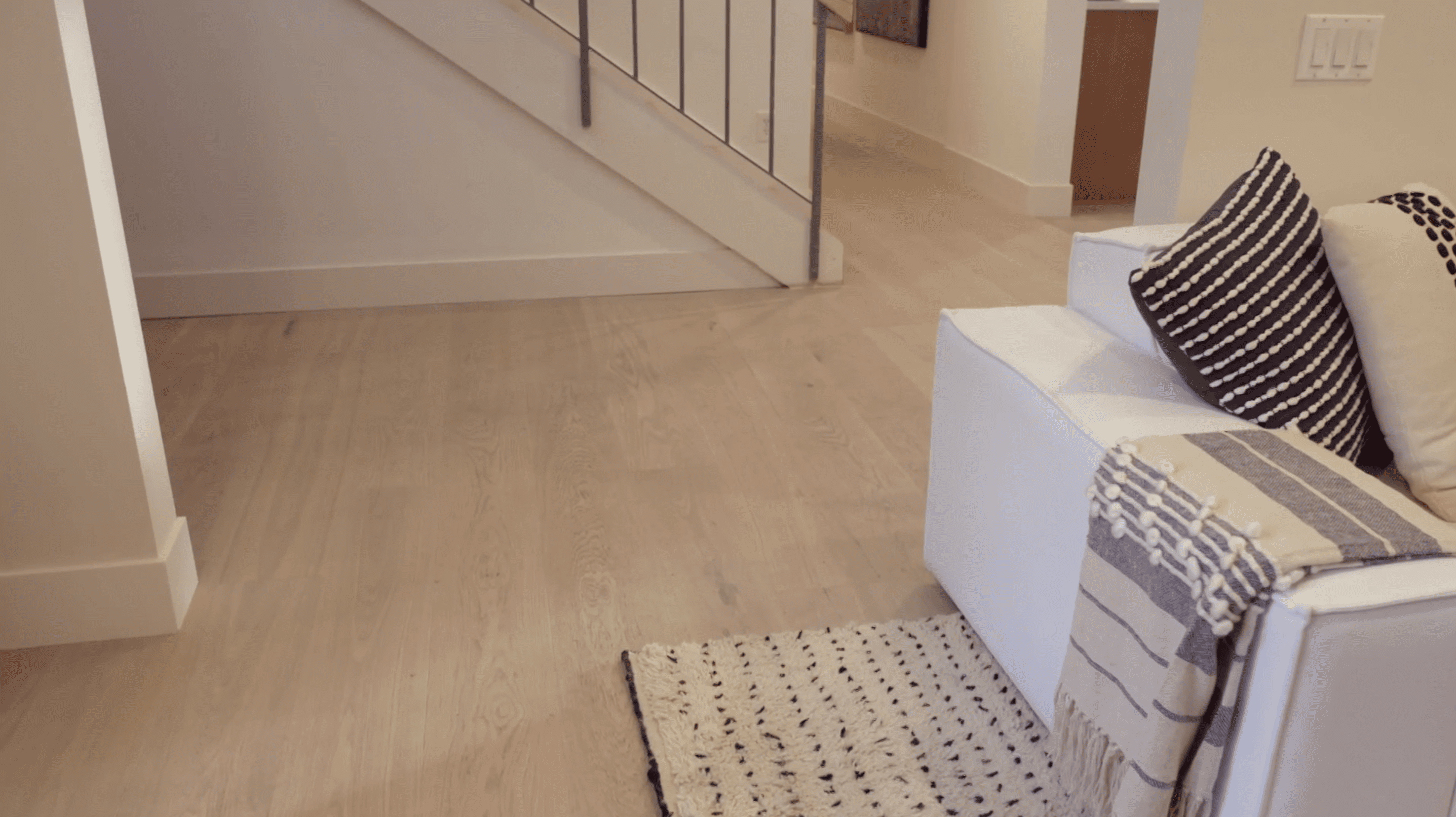
When it comes time to pick out new flooring, Josefina has plenty of options, but she has her heart set on one look.
HGTV
“She wanted to keep the floors kind of similar to the floor she had before they got damaged,” Jonathan says. “She loved the color, she loved it light.”
The brothers raise the floors so the home is all one level, and replace the water-damaged wood with new flooring in the same color. It’s a good lesson that, even if you’re renovating and have the chance to try something new, sometime it’s worth sticking with what’s tried and true.
A TV over the fireplace is controversial, but it often just makes sense
HGTV
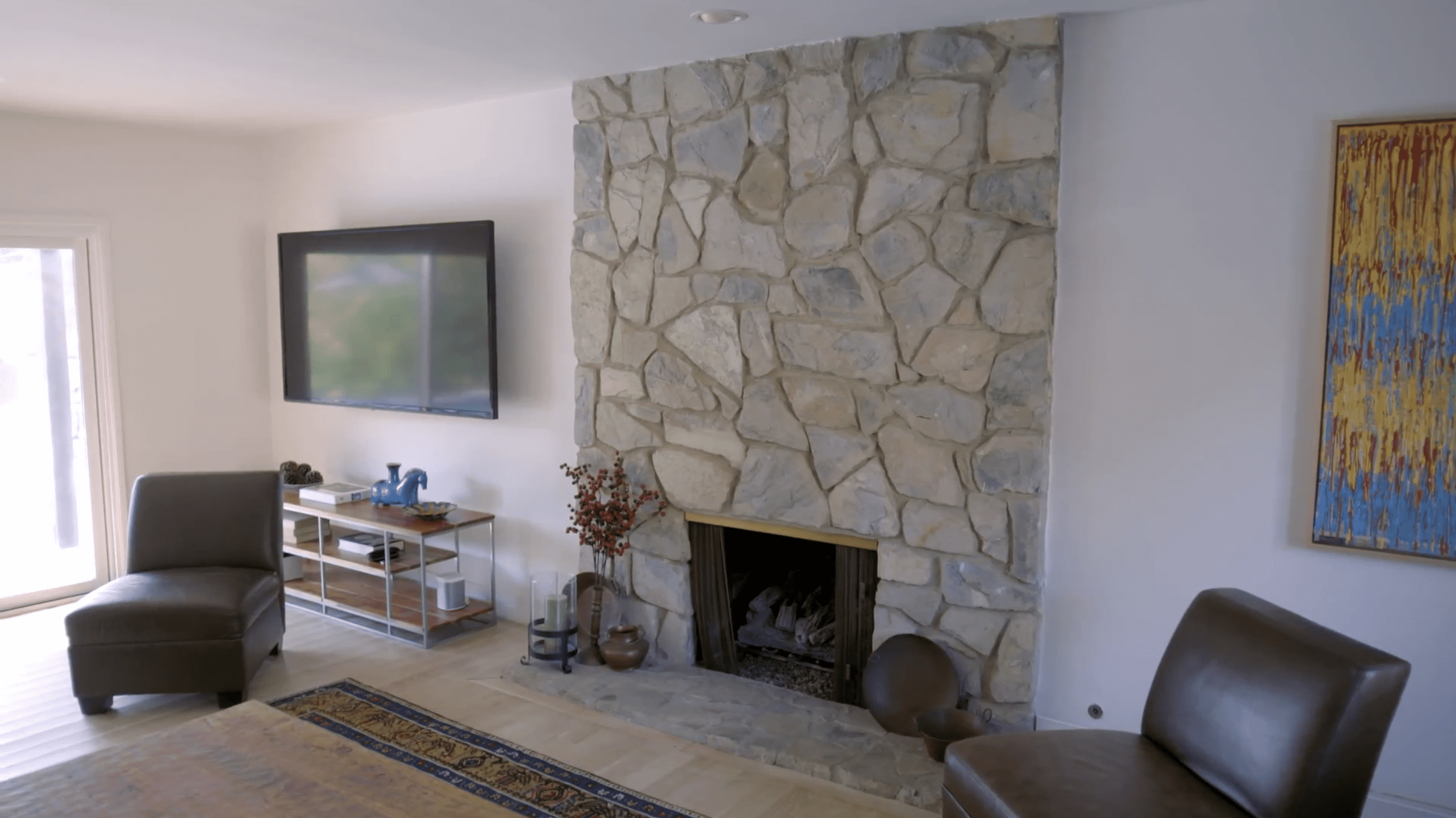
When the brothers first tour Josefina’s house, they ask about the dated stone fireplace. Apparently, Josefina’s not a fan of rock. Not only does she hate the look, but she’s also unable to mount the TV on the stone, and is forced to exile the screen to the corner of the room.
Granted, hanging a TV over the fireplace is a controversial move that many designers recommend avoiding. But in this case, it makes sense based on the layout of the room.
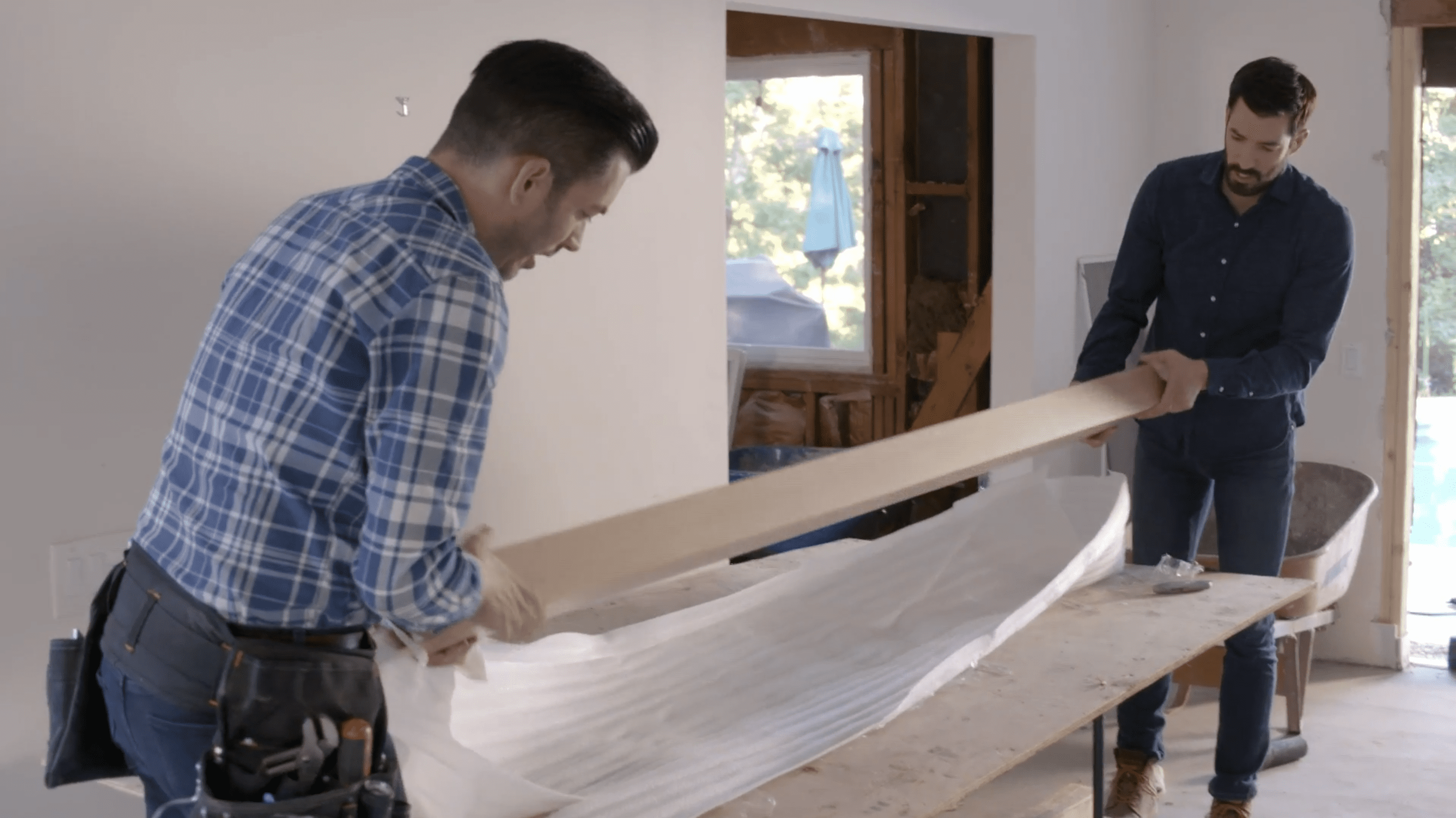
To finish the look, the brothers order a modern mantel that’s made of light wood, perfectly complementing the light hardwood floors Josefina wanted so much.
HGTV
When Drew and Jonathan unwrap the new mantel, Drew is impressed with the light color.
“It’s the perfect look for what they want here,” he says.
With this new fireplace, the brothers are able to move the TV out of the corner and above the mantel. Now, the family doesn’t have to crane their necks to see the TV, and without the stone, the room looks more modern.
Storage offers visual interest, too

HGTV
While the new fireplace is a serious upgrade to this family room, Drew and Jonathan know they can do even more for this living room by adding some built-ins.
The built-ins add some storage to the space, but also fill out the room. Instead of just a plain wall, this living room now has a family-friendly feature where Josefina can display photos and mementos.
When Josefina sees the finished product, she’s overjoyed. Plus, the brothers are proud of their work.
“The statement that those built-in shelves make, and even the detail in the front of the cabinet doors, it’s stunning,” Jonathan says.
The backsplash should be the ‘art’ of the kitchen

HGTV
While Josefina’s main focus is making this house comfortable and accessible for her family, Jonathan and Drew want to make sure her space is also stylish.
The brothers redesign the kitchen with an open layout and lots of space so Sophia’s wheelchair will be able to fit around the island comfortably. But they know this kitchen can’t be all about functionality.
“I do feel like we should do a bold backsplash and make a statement,” Jonathan says.
Drew agrees, saying, the backsplash is “like the art piece in the kitchen.”
They choose a gray slab backsplash that really stands out in this light-colored kitchen. It’s a bold choice that adds visual interest in the perfect spot.
Make moving outside easy with collapsing doors
HGTV
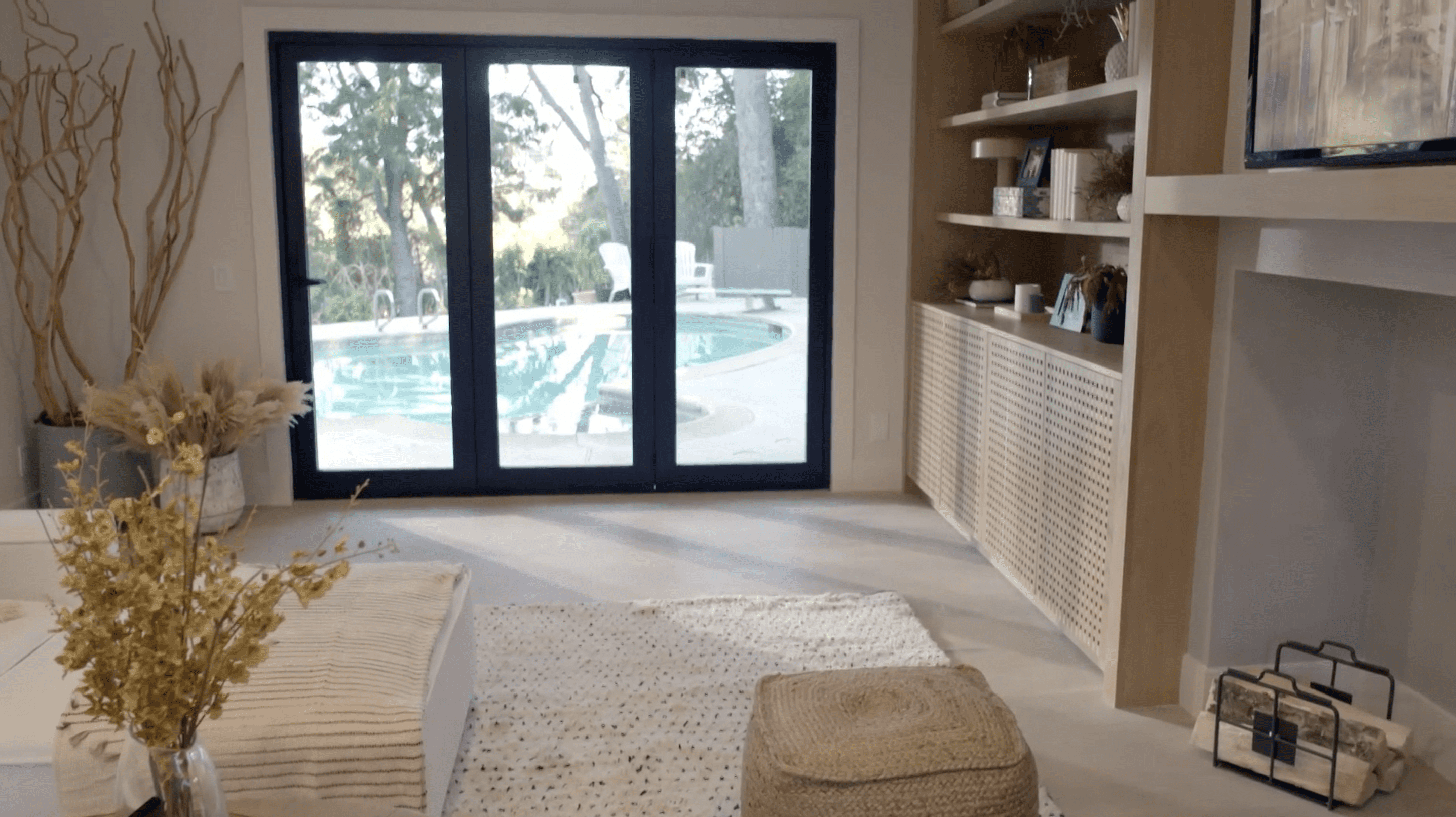
The layout of Josefina’s house has the kitchen and dining space at the back. With the backyard (and the pool) right there, it’s the perfect layout for a massive indoor-outdoor entertaining space, but Josefina isn’t taking advantage of this sweet setup.
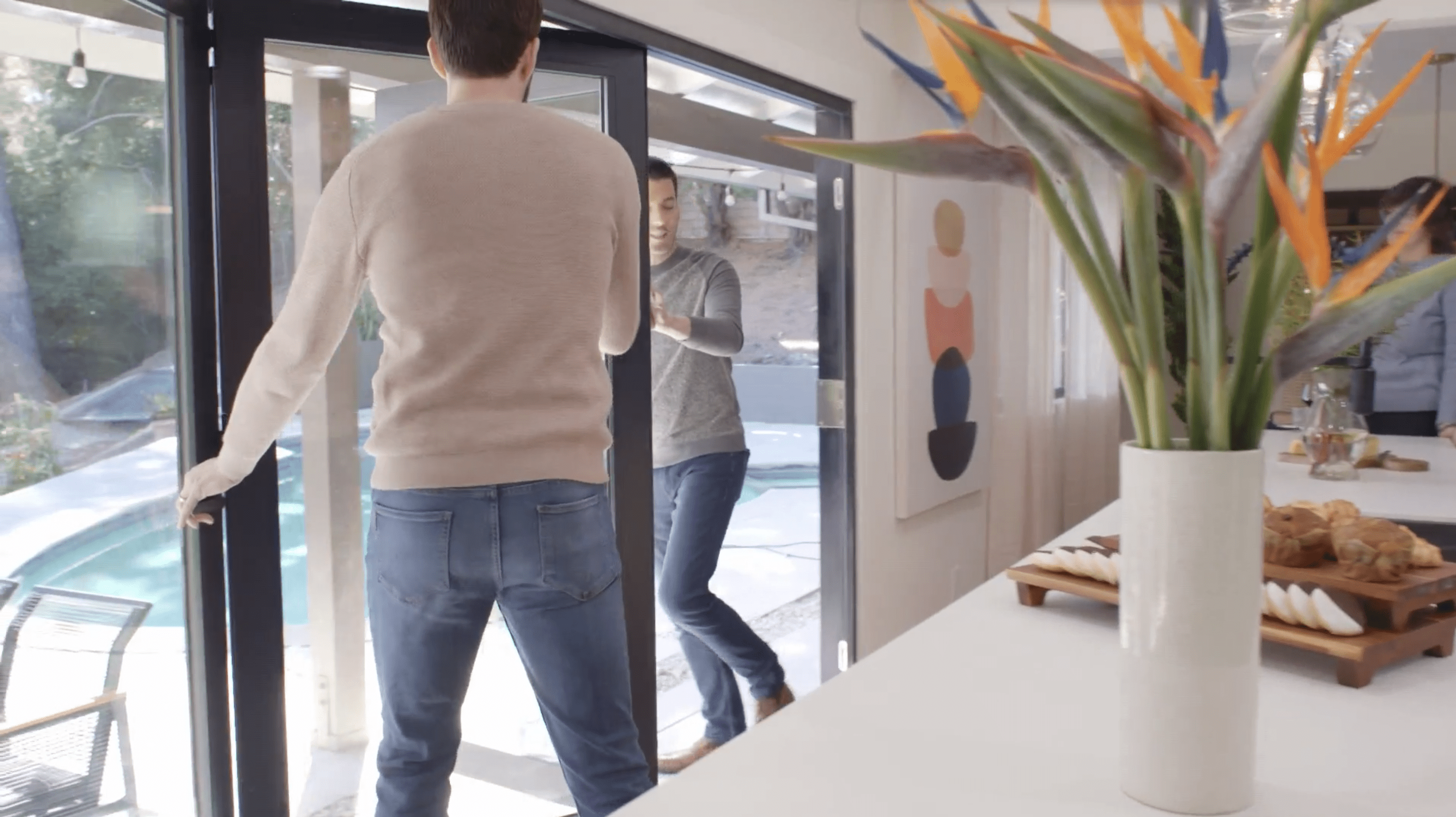
The brothers tell Josefina that they can exchange the basic sliding doors in the kitchen and living room with larger, collapsible glass walls, and she’s thrilled. She loves the idea so much that when Drew and Jonathan learn that there’s structural problems that’ll cost an extra $10,000, Josefina still isn’t willing to sacrifice her glass walls.
HGTV
“This is the one thing as well that Josefina, even with all the extra expenses, she did not want to give up this collapsible glass wall,” Jonathan explains.
When the new doors are installed, Drew admits that it’s even better than he imagined. The doors make the house feel so much bigger, and they create great indoor-outdoor flow for family gatherings. It looks like Josefina is ready for a party!
Think beyond white walls
HGTV
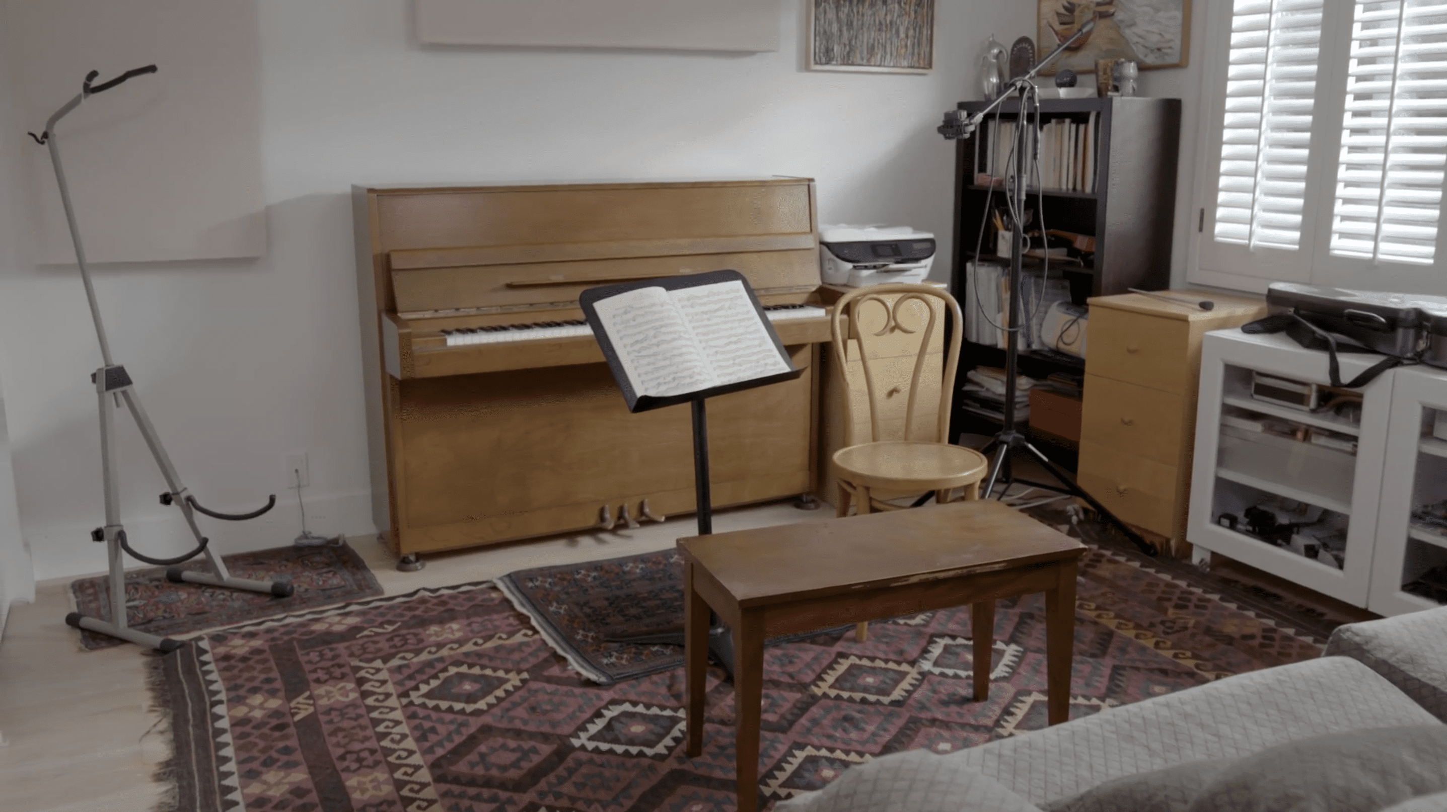
While Josefina wants to make sure her kitchen and family room are perfect for her daughters and Sophia, there’s one room that’s just for her: the music room. Josefina is a professional musician, and she needs a space to practice.
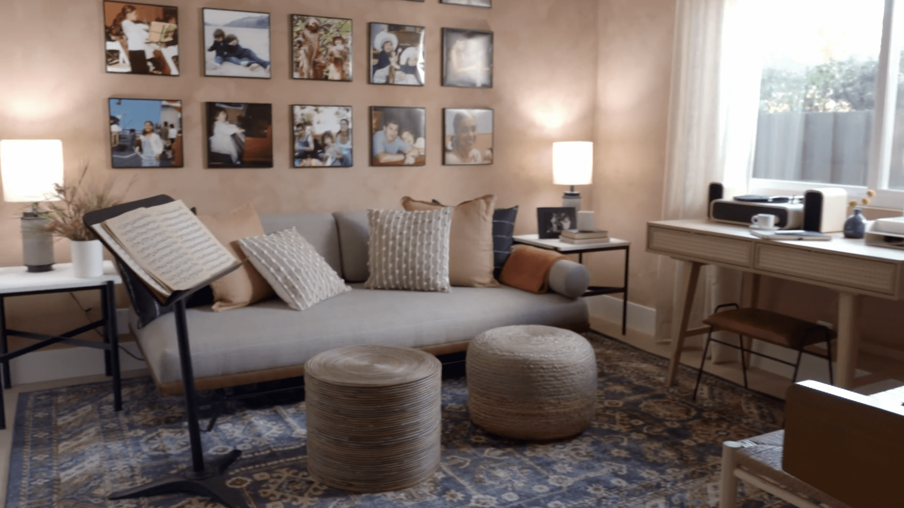
Not only do the brothers upgrade her spare bedroom with some soundproofing, but they also paint the walls a soft shade of pink (which Jonathan calls “cinnamon”) to give the space a playful look. It makes the room feel less like a place for work and more like a space to be creative.
HGTV
When Josefina sees the bold room, she’s impressed.
“It totally works,” she says. “That’s what I really appreciated about having somebody kind of hold my hand, is it’s a risk that I probably never would’ve taken, and I really love it.”
The post The Property Brothers Make a Controversial Design Move You’ll Either Love or Hate appeared first on Real Estate News & Insights | realtor.com®.
No comments:
Post a Comment