HGTV
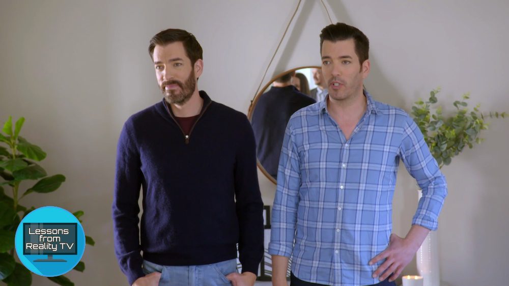
Drew and Jonathan Scott are back: After a brief hiatus, Season 5 of their show “Property Brothers: Forever Home” has resumed, and in the latest episode they help high school sweethearts turn their home into a place where they’d be happy to grow old together. Isn’t that sweet?
In “The Future Looks Bright,” the brothers help parents of two Jen and Alex renovate their 1940s home in Los Angeles. It’s up to Drew and Jonathan to add some style to this midcentury home, with a max budget of $130,000.
Here’s how they pull it off.
Keep the old, but make it feel new

HGTV
There are a lot of things in this old home that Jen and Alex adore. For example, they love the brick fireplace and the old mantel, and Drew and Jonathan like them as well.
“We can keep the surround on the mantel,” Jonathan says. “We can clean up the brick, and I think it’ll be a beautiful feature.”
They clean up the brick fireplace to make it look fresher. They also repaint the inside of the firebox black to make the black look more crisp.

HGTV
With the old fireplace looking new, the brothers also polish the front door’s 80-year-old doorbell to make it sparkle.
“I love antiques, and when you have a doorbell like this that’s, like, 80 years old, I want to make sure that we make it look like it was the day it was installed,” Drew says.
Between the fireplace and the doorbell, Drew and Jonathan prove that sometimes older features just need to be refreshed. Rehabbing rather than replacing these items saves money and lets this old home keep some valuable character.

HGTV
Never paint wood floors

HGTV
One of the biggest problems with this house is the flooring. A previous owner painted the wood floors black, and since then, the paint has started to chip.
“When we moved in, they looked OK, but it was just a shoddy paint job on top of the wood,” Jen says.
Drew has some helpful advice for all homeowners: “Don’t paint your floors and don’t paint bathtubs, because they will always slough off.”

HGTV
But it’s too late for these floors, so the brothers decide that it’s probably best to rip up the flooring and start over. They pick a light, wide-plank wood that has a nice Scandinavian aesthetic while still providing the warmth of wood. It’s a good mix of the midcentury style that’s already in the home and the clean look this couple loves.
From chipped, black paint to bright hardwood, this flooring is a major upgrade.
Two-tone cabinets are trendy today

HGTV
From the beginning of the renovation, Alex and Jen are conflicted: They like clean, Scandinavian design, but they also love the midcentury feel that their old home already has.
So when it comes time to choose cabinets, Jonathan isn’t sure which style to pick. He points out that a lot of Scandinavian designs have slab-style, high-gloss cabinets, but Drew explains that Jen and Alex are leaning toward a more natural look.
“Because they were really gravitating toward the earth tones, the wood tones, no gloss,” Drew says.
Jonathan splits the difference, using wood cabinets for most of the kitchen but including some glossy white upper cabinets. Once the cabinets are installed, it’s clear that Jonathan made the right choice.
The white cabinets brighten the space while the wood gives off a midcentury look without feeling dated. These two-tone cabinets combine Jen and Alex’s favorite styles perfectly.
Don’t be afraid to shrink a window

HGTV
When the brothers first tour this home, they find an oversized kitchen window hidden behind a dated fan and bulky shutters.
“What’s the point of even having a window if you’re going to cover it up with shutters and then put a monstrous fan in the way?” Jonathan asks. “Natural light is so important, so I definitely want it uncovered for the new kitchen.”
However, uncovering this window isn’t the only change that needs to be made. The brothers realize that this window is much bigger than the other ones in the kitchen, and it’s blocking off an area that could be valuable counter space. So the brothers reduce the size of this window and run cabinetry and counters along the wall, even putting a sink under the window.

HGTV
“That corner wasn’t being used for anything, Drew says. “It was meant to be a kitchen eat-in area, but instead it was a dead space. Now we’re going to utilize it.”
When the kitchen is finished, the window looks perfect. Sometimes, counter space trumps window size.
Carry the kitchen design into the laundry room

HGTV
Since guests don’t typically see the laundry room, it can become a home’s forgotten space.
In this house, the cabinets are dated and the side-by-side washer and dryer are old. It’s not exactly an area Jen and Alex want to show off. However, their laundry room connects to the backyard, so guests are always walking through the space.
Luckily, Jonathan has an idea to make this space more stylish, by stacking the washer and dryer and then adding cabinets and a countertop that carry the kitchen’s design.
“I’ll continue the same cabinets right into the laundry room so it feels more like an extension of the kitchen,” Jonathan says. “It’ll be incredibly functional but also stylish enough so you won’t have to cringe when your family and friends pass through to your backyard.”
Now, the laundry room is more functional, and it feels stylish and updated—just like the rest of the house.

HGTV
The post The Property Brothers Are Back! Here’s What They’ve Been Up To appeared first on Real Estate News & Insights | realtor.com®.
No comments:
Post a Comment