Discovery+
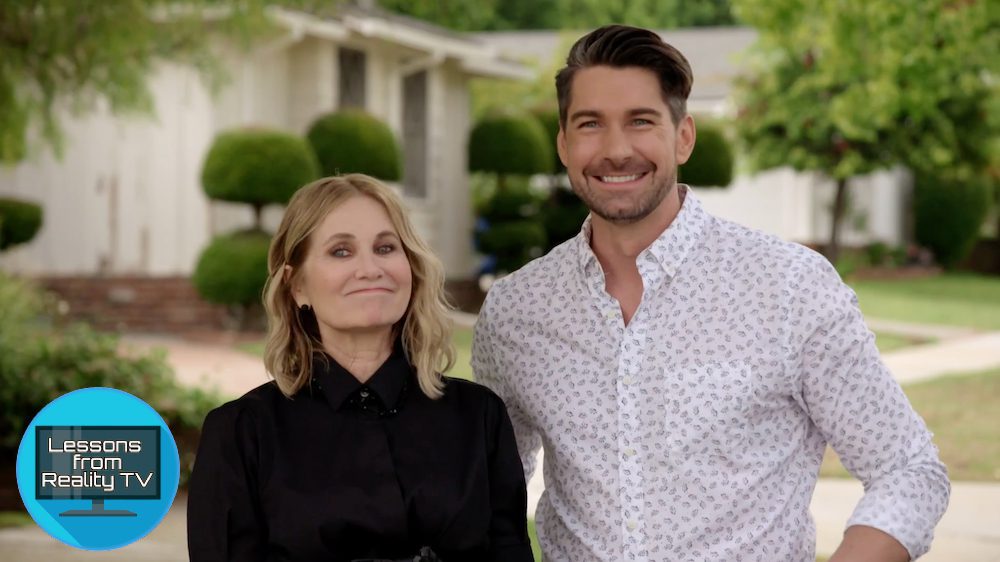
Remember Marcia Brady, the eldest daughter on “The Brady Bunch”? The actress behind this character, Maureen McCormick, is back on TV—this time, reality TV.
In 2019, McCormick helped renovate the “Brady Bunch” house on HGTV’s hit series “A Very Brady Renovation.” Now she’s returned as the host of her own show on Discovery+, “Frozen in Time.”
On the show, McCormick and designer Dan Vickery renovate homes with decor stuck in the ’60s, ’70s, and other long bygone decades, giving them a refresh without losing their retro charm.
In the “1955 House” episode, Vickery and McCormick head to Ladera Heights, CA, to help father and daughter Lewis and Jessie update their woefully dated midcentury house.
Yet with only $60,000 to spend on upgrades, McCormick and Vickery will need to use every cent wisely to drag this home out of its time warp. Here’s how they pull it off, which might inspire some changes around your own abode, too.
The right paint colors can make a big difference

Discovery+
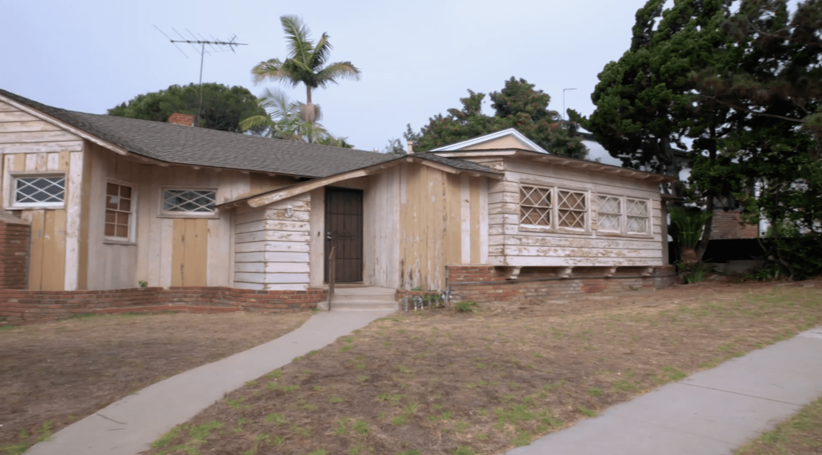
At first, McCormick and Vickery are disappointed when they find that their newest renovation project looks like an ugly, beat-up old home. But that’s nothing a fresh coat of paint can’t solve!
Vickery and McCormick repaint the home a dark midcentury color that still feels contemporary. Then, they use reddish orange on the door to bring a touch of midcentury charm, which Lewis loves.
“We really love this color, the tone, and the door, gives a nice pop,” he says.

Discovery+
To finish the exterior, McCormick and Jessie add planters in the front yard, saying that a lot of 1950s architecture included natural accents, like trees and greenery.
“I just love all the different colors and all the different shapes and texture,” McCormick says of the garden.
With the new paint and the new greenery, this house has great curb appeal and excellent ’50s style.
Wood panels make a room feel dark and cramped

Discovery+
When Vickery and McCormick first step into Lewis and Jessie’s house, they decide, right away, that the wood paneling in the living room has to go.
So they remove the paneling on the walls and use white paint to brighten the space. The new color makes the room feel larger, while the wood ceiling (which they leave unchanged) continues to give the space that homey, 1950s vibe. With the addition of a few glass and metal accessories, this space looks more colorful and less monochromatic.

Discovery+
“It was dark because of the wood. Every single surface in this room was covered with it and just sucking up the light,” Vickery explains.
Removing the paneling isn’t a big job, but it makes a big difference to the space. Now, the living room looks more like a well-designed midcentury modern home.
Go minimal with modern kitchen features

Discovery+
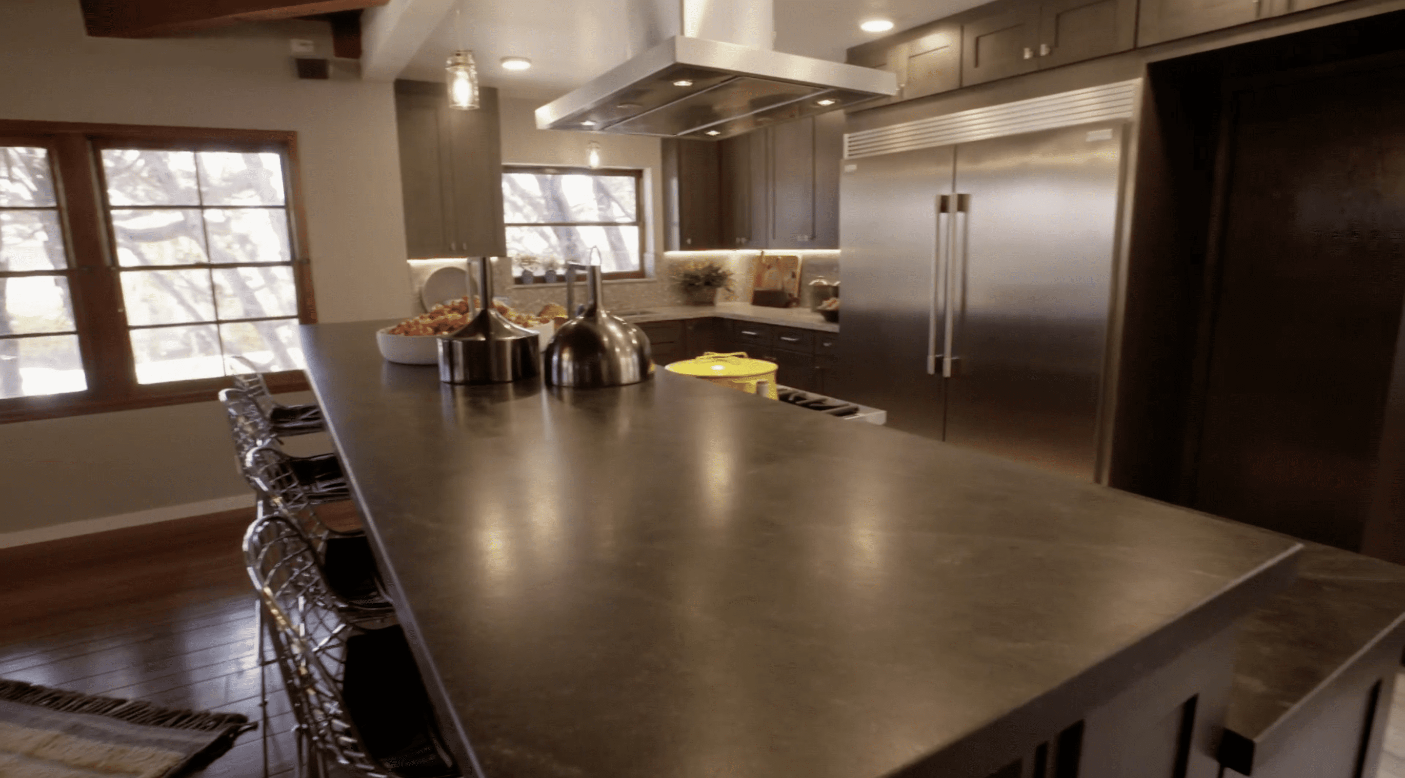
McCormick and Vickery want the kitchen to feel modern, but they don’t want to distract from the midcentury look of the rest of the house.
They decide that a gray terrazzo counter will give off a midcentury look while still having a clean, modern feel. But when Vickery tries to choose a backsplash, Lewis feels that adding a second material might be too much in this otherwise simple kitchen. Vickery realizes that the best option is to extend the terrazzo up the wall.
“The gray, I think, just brings in a subtle texture to the room, brings in all those natural materials, and to see more of it in the space is a really good way to go,” Vickery says.
Recycle old materials whenever possible

Discovery+
Vickery and McCormick keep most of the original ceilings in the home, but there is one section of the kitchen where the ceiling is lower. Vickery knows that they’ll need to remove this lower section, but he doesn’t want to take away from the home’s historic style.
“It is a 1950s detail—you don’t come across craftsmanship like this anymore,” Vickery says of the ceiling. “It matches everything else that was going on in this room, but it doesn’t match the ceiling height of the rest of the kitchen anymore.”
So he saves the classic wood to make a bench for the dining table. The midcentury-style table looks great, and it’s a smart way to keep the history in this old home.
“It’s a way of using a 1950s material in a modern piece of furniture—a nod to the era, if you will,” Vickery says.
Don’t be afraid to mix various decades in your decor

Discovery+
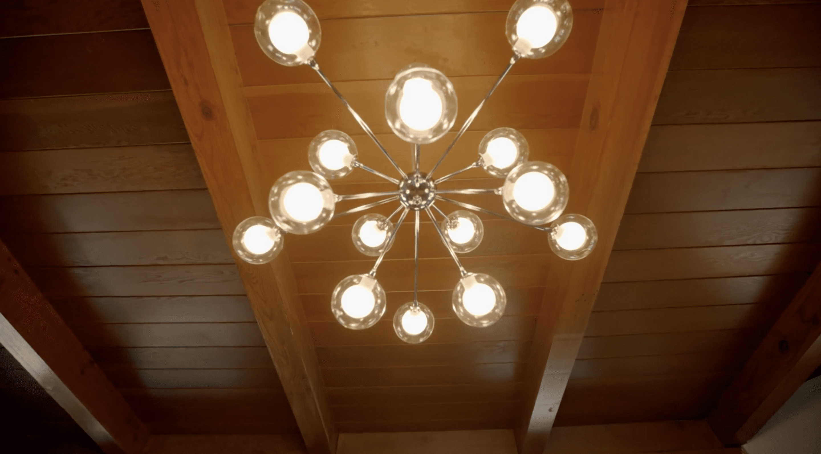
So if this home is from the 1950s, does it mean it must stick to 1950s designs? Hardly! As proof, they add a sputnik chandelier from the 1960s. Although it’s from the “wrong” decade in terms of the rest of the house, it still seems to fit right in.
“A 1950s home should show an evolution of the last 70 years,” Vickery says. “So you’ll see, like, the sputnik chandelier over the dining room table, which wouldn’t have been here in the 1950s.”
Features like this help the home blend old styles with new looks in a subtle way.
The post A ‘Brady Bunch’ Star Returns To Renovate Homes ‘Frozen in Time’ appeared first on Real Estate News & Insights | realtor.com®.
No comments:
Post a Comment