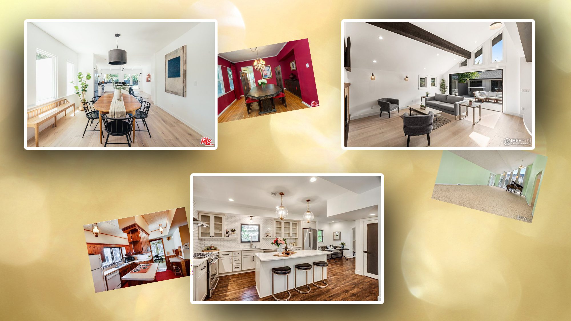
Sergey Ryumin/Getty Images; realtor.com
There are few things we love more than a great home transformation, and 2020 did not let us down. In two of our most beloved series—”Lessons From Listing Photos” and “What the Flip?“—we took a look inside properties that were once worse for wear but now have a whole new life. Each story featured some seriously jaw-dropping before and after photos as well as insight from design and real estate experts about the smart cosmetic and architectural updates that made these homes hot.
Some projects we highlighted this year saw homeowners doing massive flips that doubled their home’s value. Others showcased the simple (but mighty) power of a coat of paint or a good home stager.
Were we able to pick a favorite home? Of course not! There were too many contenders to dub just one property the most impressive home renovation we saw in 2020. Instead, we decided to break it down, room by room, and show you the best of the best.
1. Best entryway transformation
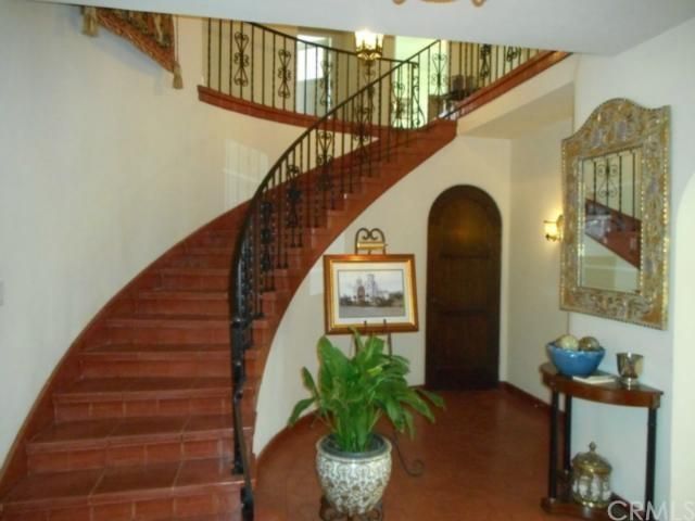

The property: A 4,100-square-foot, Spanish-style mansion in Los Angeles badly in need of a dramatic renovation.
The transformation: After a full remodel, the home still retained much of its original character, but with a significant overlay of modern sophistication. This is best displayed in the entryway, where a massive curved staircase dominated the space. The staircase still stands, but the dated clay tile was replaced with sleek black tiles that give the place a modern Mediterranean vibe.
The bottom line: “The entrance can make or break how a buyer will feel walking through your home,” says real estate agent Aislynn Radley, of Crosstown Marketing Group. “Curved staircases are no longer popular and can date a home, but thanks to the choice of a more modern Spanish tile, this space is respectful of the home’s original architecture while also carrying a sophisticated look.”
2. Best kitchen transformation

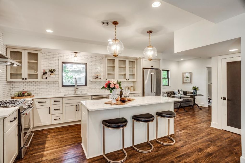
The property: A massive mansion in St. Paul, MN, just miles from downtown.
The transformation: This home had seen better days before new owners picked it up in 2018. They brought it up to date and made it HGTV-worthy. The shining star of this renovation is the kitchen.
Not only was the original kitchen small and cramped, but it was also covered in dark woods and red carpet. Thankfully, not much remained the same after the transformation. Our experts were happy to see the change in colors and textures as well as the removal of walls, which helped open up the kitchen.
The bottom line: “The open kitchen layout is a great way to connect the space with the rest of the house, giving you ample space to move around,” says Shruti Kulkarni, resident designer at NEDC.
3. Best living room transformation


The property: A striking home built in 1910 full of architectural quirks in uber-popular Boulder, CO.
The transformation: With floor-to-ceiling windows and cathedral ceilings, this house was innately full of character. But before the remodel, it was painfully outdated and not in a way that could be fixed with a paintbrush.
To overcome this, major portions of the home were completely reworked and rebuilt, and the living room fared the best of all. Long, vertical windows were removed, and replaced with an accordion door to the new rear patio.
The bottom line: “By opening up the wall to the rear patio, the space feels instantly bigger and brighter,” says Rachel Street, interior designer, real estate agent, and the TV host of the DIY Network show “Philly Revival.”
“The accordion door to the patio, while an expensive investment, is a complete game changer for the space that home buyers will appreciate,” says Street.
4. Best dining room transformation
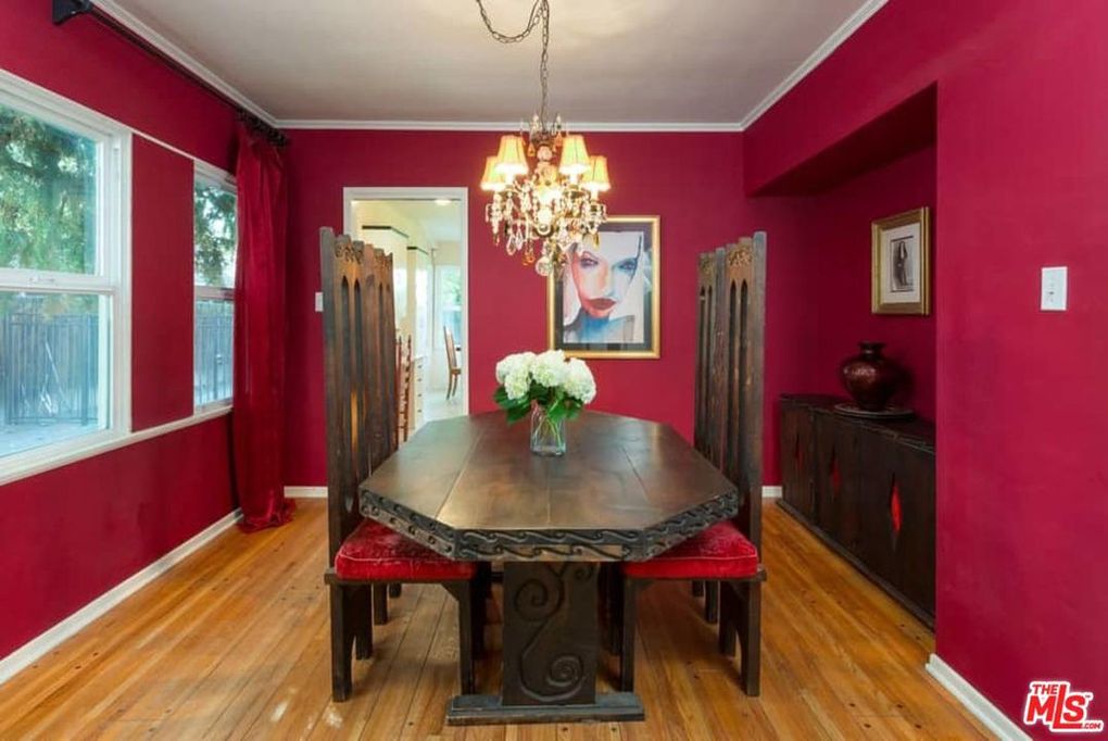
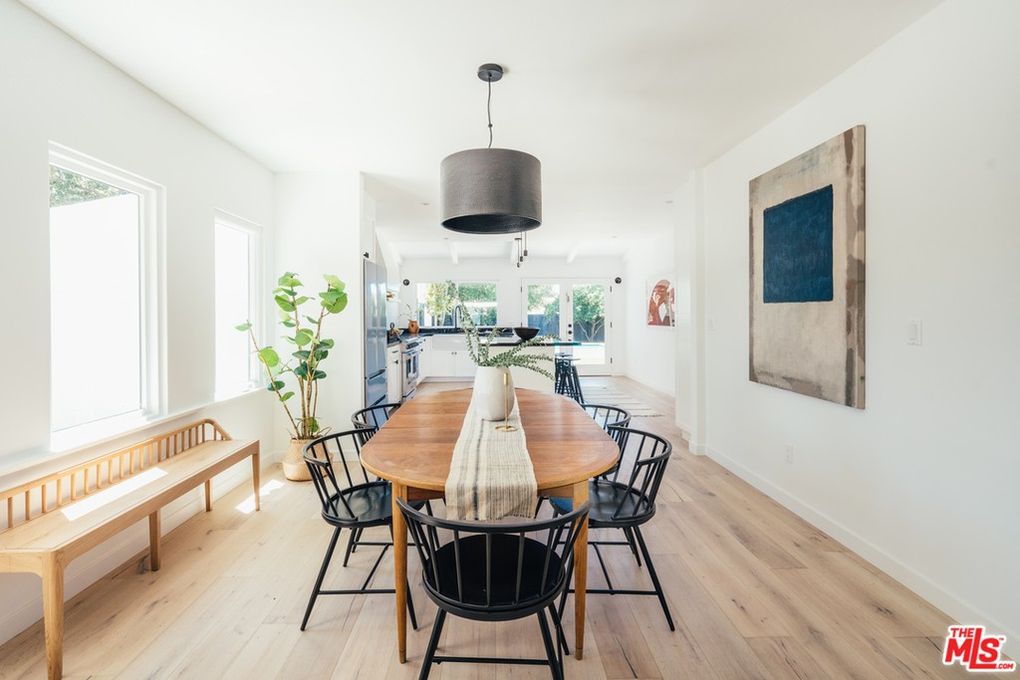
The property: In a neighborhood with ties to old Hollywood, this ranch-style home was woefully lacking in glitz and glam.
The transformation: In the old dining room, the red walls, red curtains, gaudy chandelier, and massive furniture were too hard to see beyond. Who could picture their own belongings in this room that completely overwhelmed the senses?
The previous owners did away with the bulk, painted the walls white, and brought in some chic Scandinavian-style furniture. Plus, they removed a wall to create a cohesiveness between the dining area and the kitchen. Now the dining area feels airy and inviting.
The bottom line: Removing the wall “allows the eye to travel farther, makes the space feel much larger, and improves the overall flow,” says interior designer Amy Peltier.
5. Best bathroom transformation
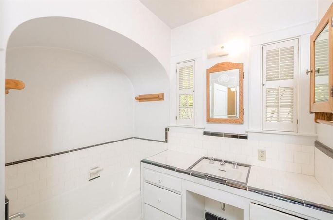

The property: An 80-year-old ranch home in a posh neighborhood in Sacramento, CA, with amazing architectural touches but painfully dated interiors.
The transformation: After eight months of renovation, the sellers brought this home up to date without erasing the details that made it truly special.
While many would have considered the arch above the bathtub an eyesore, the sellers chose to embrace it. Now, a tile mosaic on the back wall of the shower brings it right into the spotlight.
The bottom line: The arch “is an element that would typically be removed during a renovation, and I am so happy they kept it,” says Nisha MacNeil, design manager at Kerr Construction & Design. “It brings an architectural design feature that speaks to old European design.”
6. Best bedroom transformation
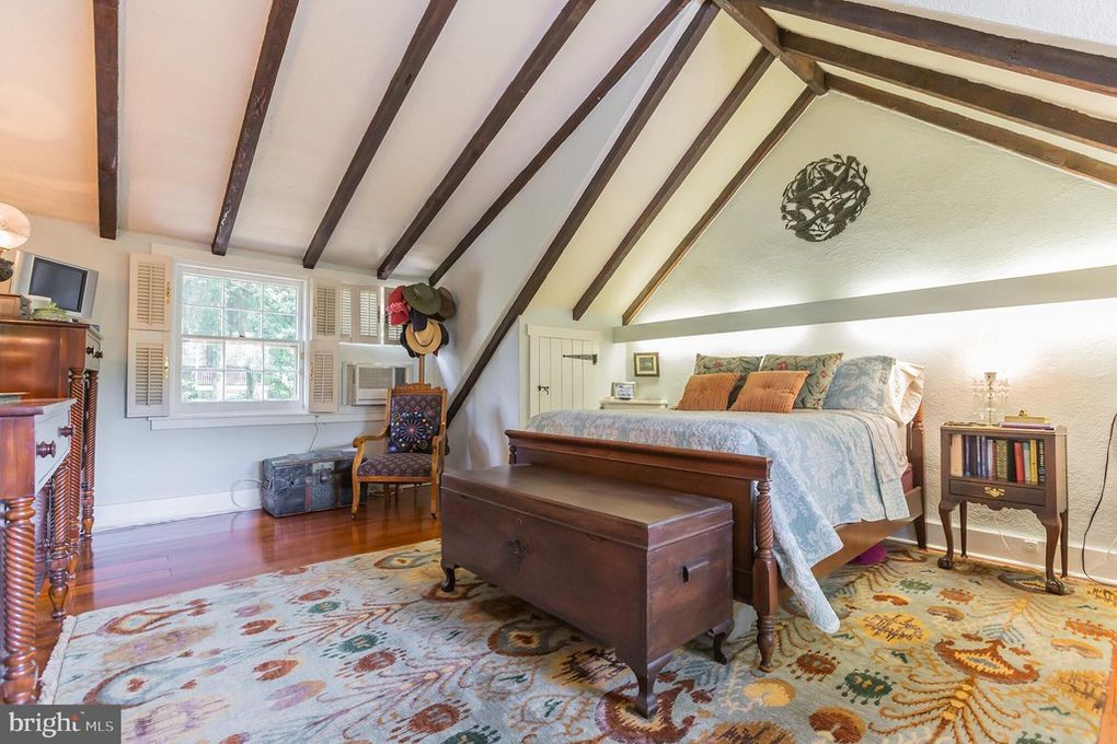
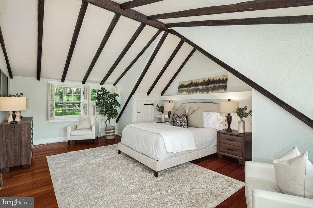
The property: A Pennsylvania carriage home built in 1925 full of amazing features and tons of character—but way too much of the owner’s stuff.
The transformation: After it didn’t sell, this house was fully staged and relisted, and was quickly snatched up for over asking price. While the whole house was amazingly staged, the real winner in this home was the bedroom.
Remarkably, not much was actually changed beyond the furniture and decor. The owners toned down the clashing colors, took out the bulky furniture, and brought in a neutral palette that’s more digestible for potential buyers.
The bottom line: “They have elevated this room simply by adding the appropriate-scale bed and neutralizing the color palette,” says Lisa Vail, designer with Vesta. “The original bed was way too high for the room and drew attention to the odd nook it was set in. But now it looks like the nook was built intentionally for the bed.”
7. Best office transformation
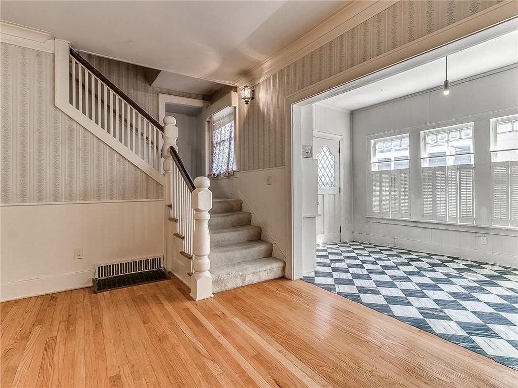
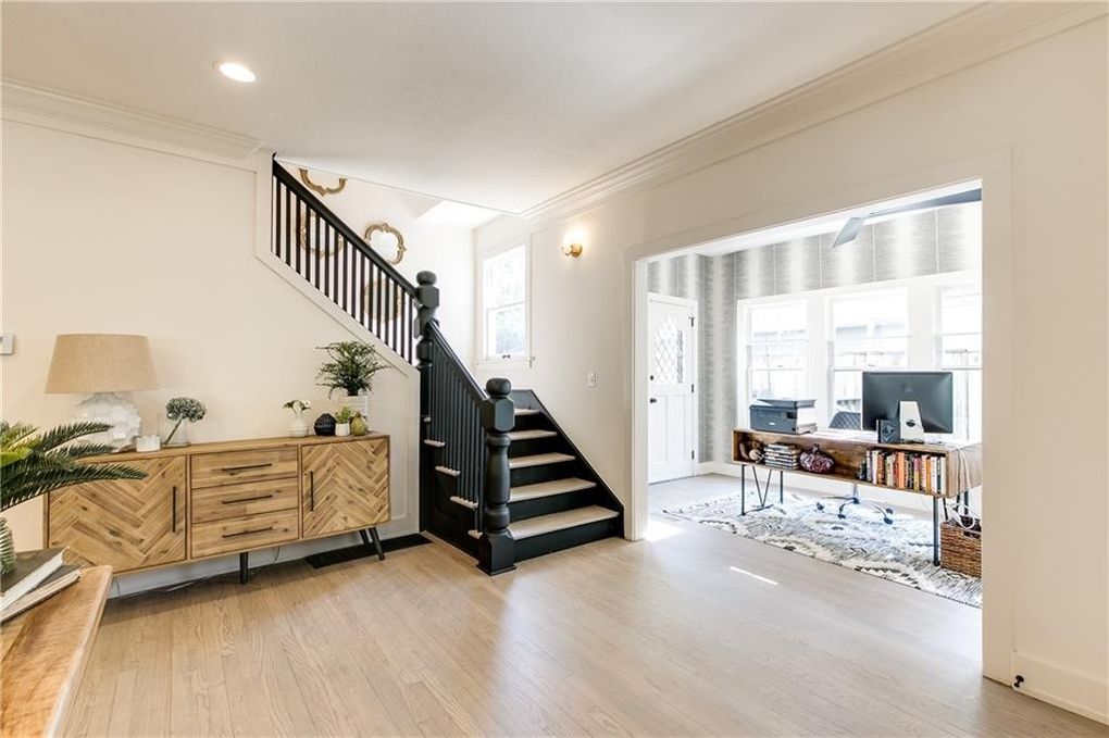
The property: A four-bedroom, three-bathroom from the early 1900s in one of Oklahoma City’s most prestigious and historic neighborhoods, Heritage Hills.
The transformation: Originally, the office’s location and appearance were more awkward than award-winning. But after the renovation, this amazing space brought nothing but potential to the home, especially during the coronavirus pandemic, when home offices are being used like never before.
The bottom line: “Home offices are one of the most sought-after spaces in our current climate of working and teaching kids remotely,” says real estate agent Sarah Bernard. “The new floor, lighting, and open, sleek modern space with windows make this a strong selling point for busy buyers.”
The post The 7 Best Home Transformations We Saw This Year—See the Before and After Photos appeared first on Real Estate News & Insights | realtor.com®.
No comments:
Post a Comment