realtor.com
It doesn’t matter how perfect your home is—if your listing photos don’t stand out, potential buyers won’t come by to take a look. In our series “Lessons From Listing Photos,” we dissect the smart updates sellers have made to their homes, and how their listing pictures highlight the home’s best assets.
If you can get over the cold weather, Minneapolis can be a pretty great place to live. The cost of living is low, the job market is strong, it’s a surprisingly great foodie destination, and there’s lots of gorgeous nature to take in when you want to get away from the city.
It’s not a huge surprise, then, that this adorable three-bedroom, three-bathroom home just outside the city was sold this month for over its asking price. What might be a surprise, though, is that it was for nearly $50,000 over what the sellers paid for it just two years ago.
During the time they lived there, the sellers made some small but pivotal interior decor changes, and they were just the right moves to bring in a cascade of offers.
So what upgrades made the biggest differences when it came to selling this home? We went straight to the experts to find out, and they had plenty to say.
Kitchen
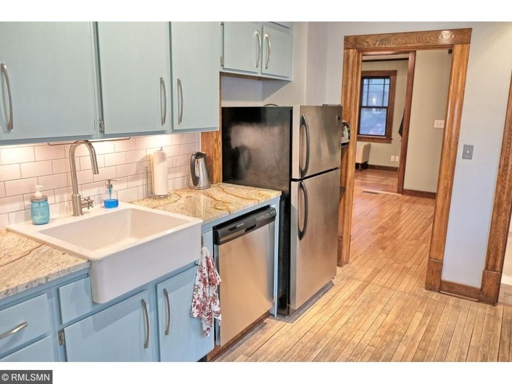
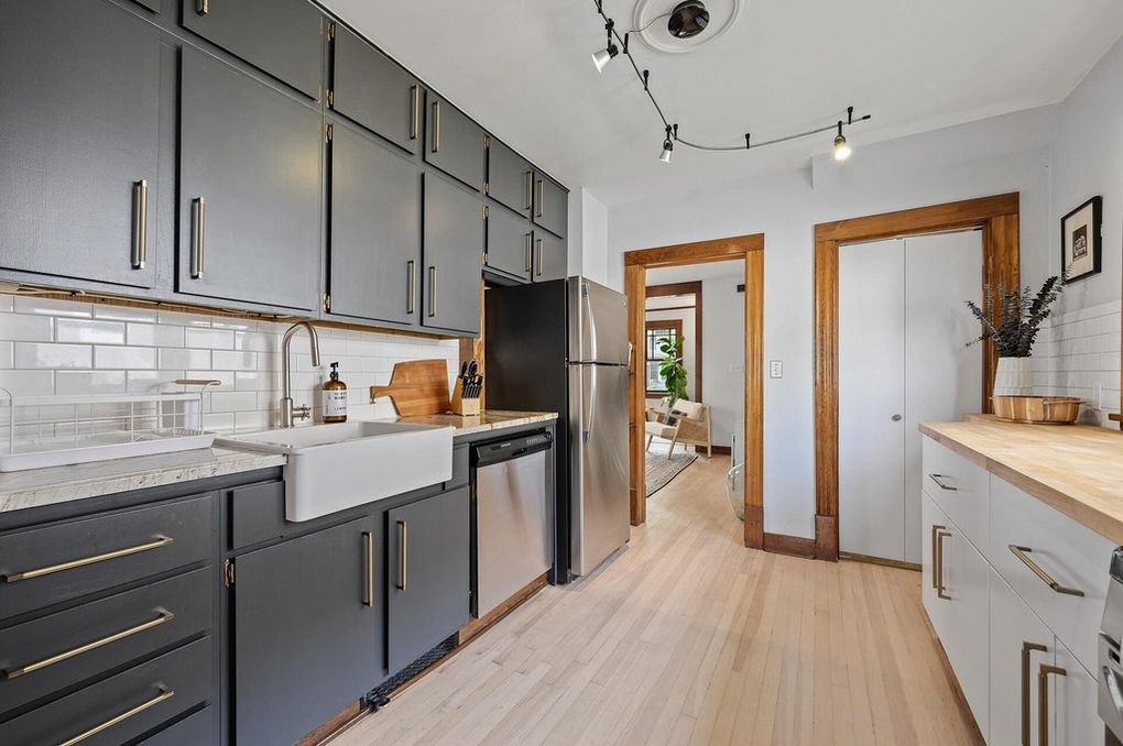
The updates to this room were purely cosmetic, but the style in the kitchen has been highly elevated.
“Achieving an up-to-date look can be as simple as changing color tones and adding refreshed hardware, which is exactly what was accomplished in this sleek kitchen update,” says Jonathan Spears, founder of Spears Group with Scenic Sotheby’s International Realty.
“The gray-color cabinetry provides a handsome pop of color, while the linear cabinet pulls add a contemporary and much needed improvement to the existing cabinetry.”
Real estate agent Maxine Peck, of Maxine Peck Real Estate in Southern Nevada, notes another change evident in the before and after photos that have nothing to do with the makeover.
Peck picked up on the different camera angles in the listing photos, which make a huge impact on the first impression potential buyers have of the home. The angles in the after photos make this room look larger.
“When trying to sell your home for top dollar, remember how important lighting and professional photography are,” she adds.
Living room
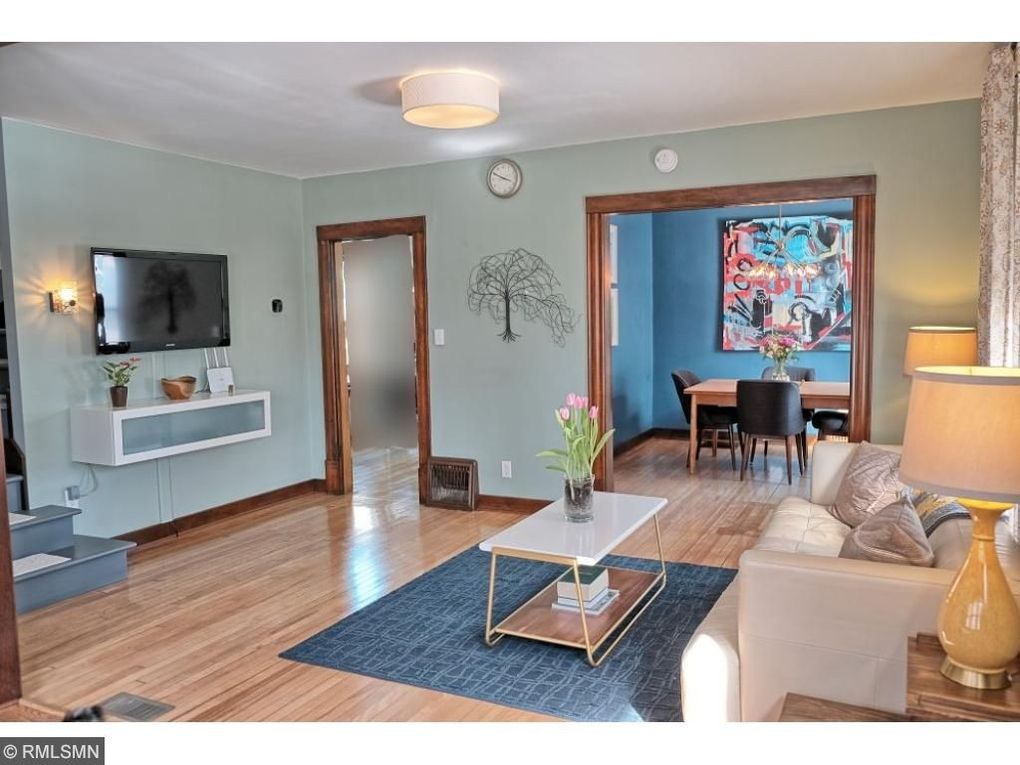
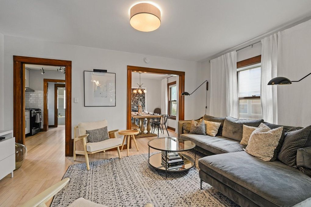
At first glance, the living room walls appear to be the same color in the before and after photos, but they’re not.
“The ‘before’ paint is so tired-looking. It’s neither subtle nor sharp,” explains Lisa Queen, founder and principal designer of Los Angeles–based Lisa Queen Design. “The new paint creates a nice blank canvas for the rest of the room to pop.”
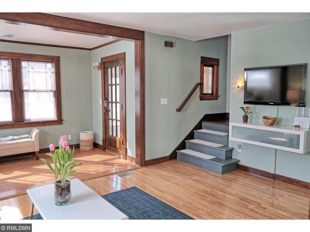
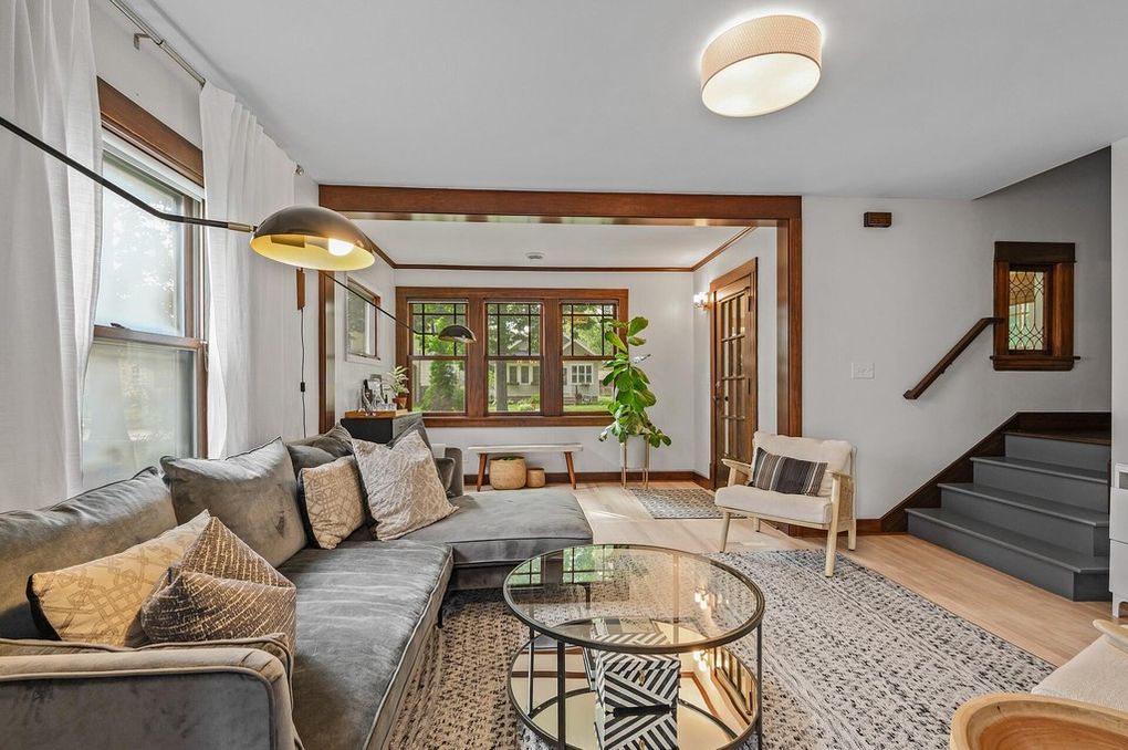
Spears is a fan of the new wall color and the new midcentury modern furnishings.
“They properly scale the space [and] bring a modern and fresh approach, which not only boosts aesthetics but also adds function into the most widely used space in your home,” he adds.
Dining room
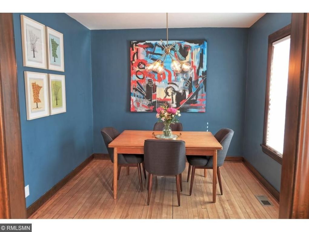
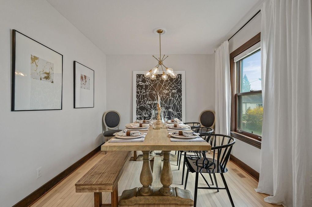
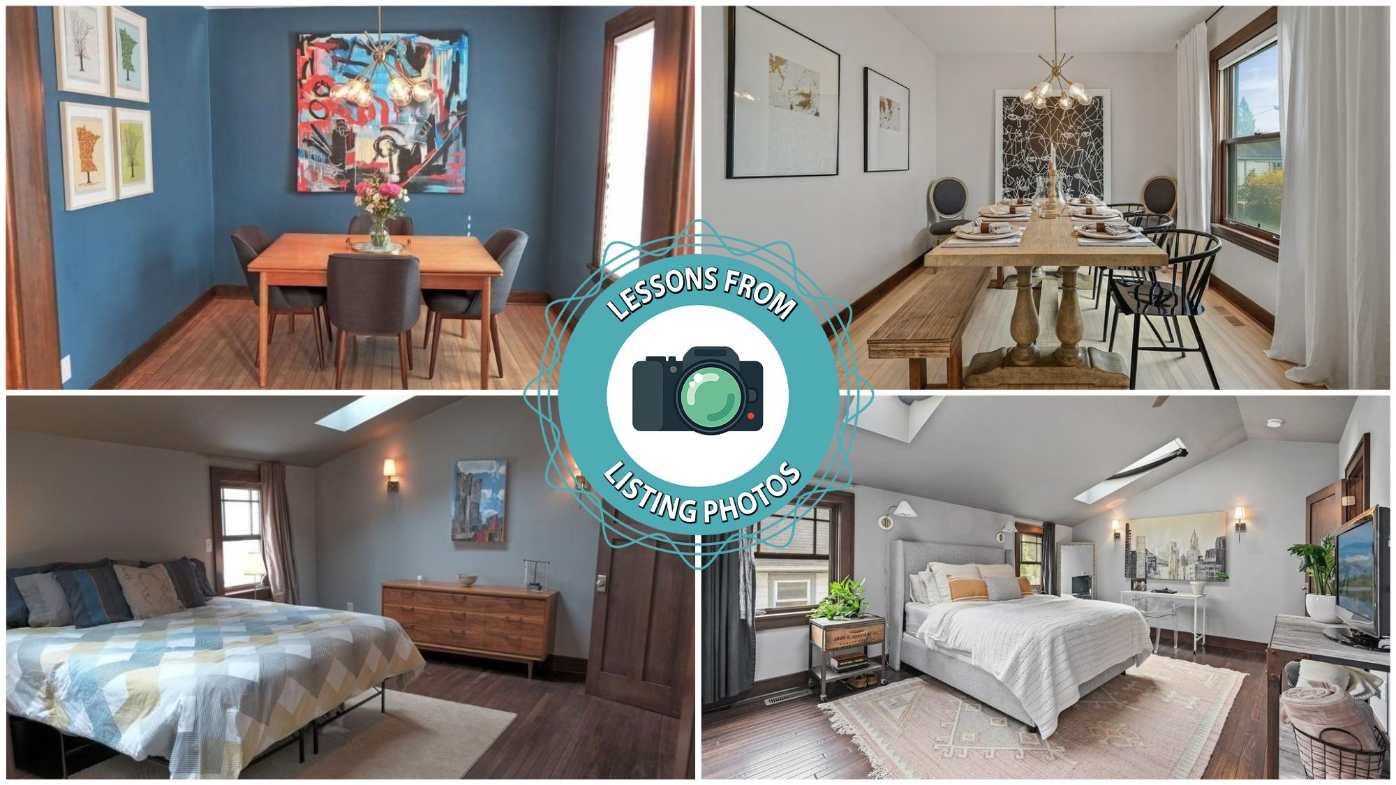
It’s fairly obvious what the biggest change in the dining room is: Those shockingly blue walls are gone for good—and our experts say that’s a good thing.
“Toning down the bold color palette with a neutral gray tone and allowing the artwork to make a bold statement really enhances the beauty of this dining room,” says Spears.
Queen called the neutral color palette “icing on the cake” for the new calmer space, but her focus was on the updated furniture.
“Choosing a longer table with a similar finish to the floor makes the room feel uniform and bigger,” she explains.
Bedroom
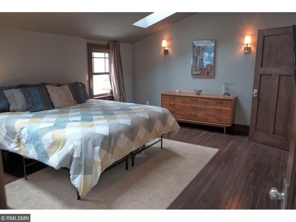

The changes in this bedroom were subtle, much like in the rest of the house, but they go a long way toward improving the overall appearance of this space.
“The difference here is not only in the paint, but also in the furnishings,” says Queen. “The unity in the new modern/transitional furnishings makes this bedroom feel so much more elegant and put together.”
And while Peck definitely appreciates the interior updates, she doesn’t give the sellers solo credit for the great look of this “after” photo.
“Lighting and angle make a difference again,” says Peck. The new photos “highlight the high ceilings. Also, the beautiful staging, bright colors, and greenery make it all come together.”
Bathroom
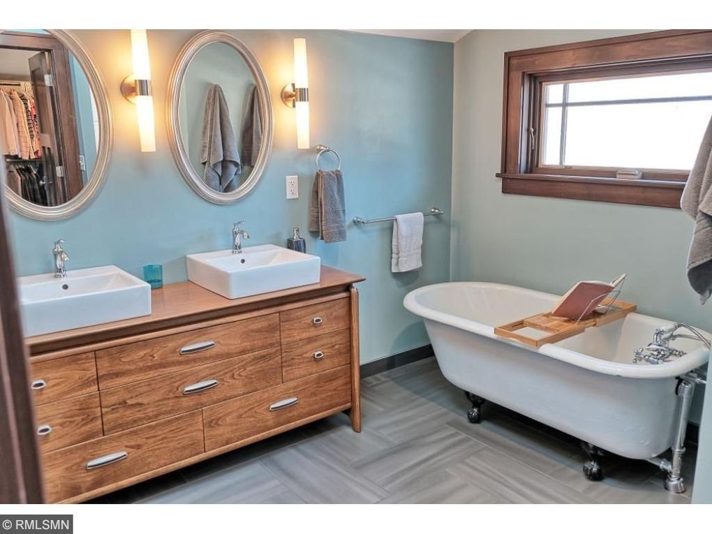
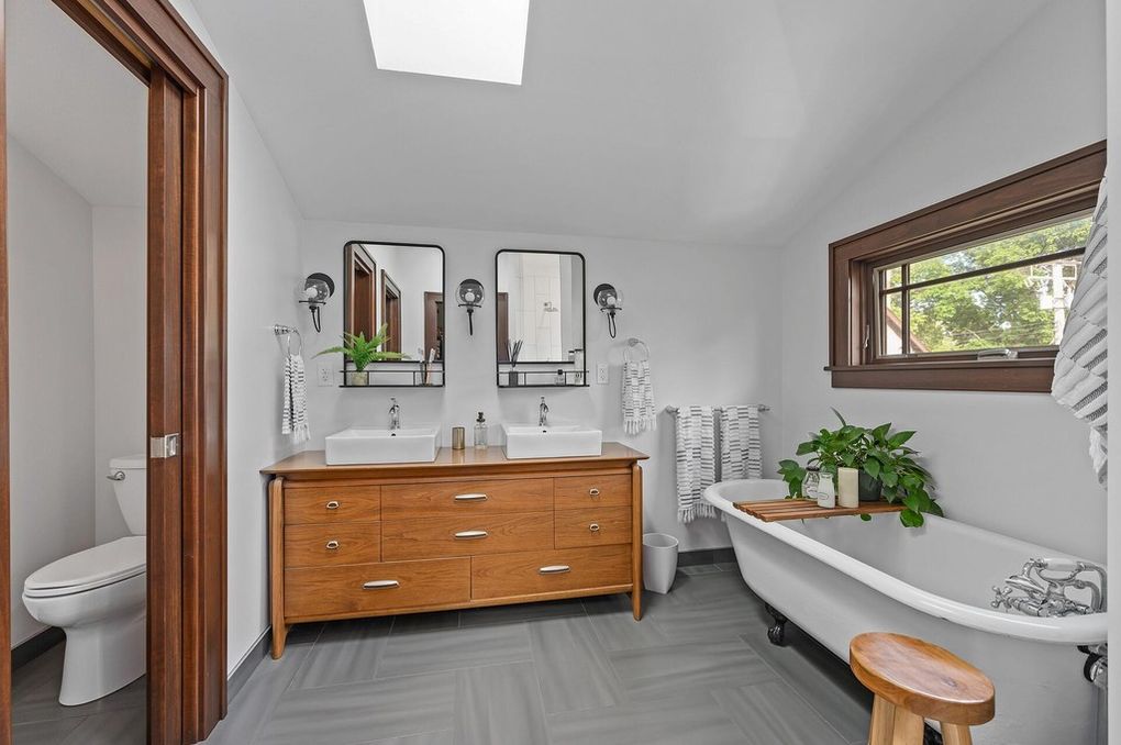
Are you thanking your lucky stars the sellers didn’t ditch that gorgeous tub? We are, too! But one thing we weren’t sad to see go was that blue bathroom wall.
“The original bathroom design feels disjointed with too many styles going on,” says Queen.
“The new color palette accentuates the natural lighting and makes the space feel larger and more approachable,” says Spears. “The new lighting and mirror design, plus the pop of greenery from the indoor plant, turn this bathroom into a cozy oasis.”
The post Lessons From Listing Photos: Easy Changes Make This 1908 Midwestern Home a Hot Buy appeared first on Real Estate News & Insights | realtor.com®.
No comments:
Post a Comment