HGTV
“Home Town” stars Ben and Erin Napier have renovated a lot of homes in Laurel, MS, but on the latest episode of their hit HGTV show, they tackle a different kind of space: a restaurant.
On the “Cafe House” episode, Erin and Ben team up with Connor and Elliot, two brothers who want to open a cafe in Laurel. They’re hoping to find a building that could work as a restaurant with an apartment in the back where Connor can live.
And guess what? It turns out that a renovation for a restaurant and a house aren’t all that different—and there’s a ton that regular homeowners can learn about how to make their own kitchen and dining area more efficient. Read on to get tips on how to make your own mealtime feel more restaurant-worthy!
Every kitchen should have an efficient layout

HGTV
The key thing any kitchen—whether it’s in a restaurant or a home—should have is a layout that helps its users make meals and clean up as efficiently as possible. Erin and Ben are used to creating functional kitchens for updated family homes, but Elliot and Connor need a kitchen that will make cooking extra easy and efficient.
Erin and Ben decide to give this kitchen a square layout, with lots of counter space all around so that the brothers can have plenty of room to work.
“You can comfortably work four people in here, for sure,” Connor says, admiring the space.
And while the square kitchen is enclosed, it doesn’t feel closed off because it has great sightlines to the dining room, making the whole restaurant feel big and open.
“The big thing I like is the fact that you can stand in the kitchen and see every seat in the place,” Connor says.
Wood walls can feel cozy

HGTV
With great sightlines from the kitchen to the living room, Erin and Ben know that the dining room has to look perfect. After all, these brothers will be staring at it all day long!
While the kitchen needs to be updated with easy-to-clean surfaces, Erin knows that she can get a little more creative in the dining room. So, she decides to keep the original dark wood walls to give the space a rugged, but cozy, look.
“We want the dining areas to have so much ambiance,” Erin says, explaining that wood will give the space a little “roughness.”
To finish the design, Erin settles on red crown molding. The color breaks up the wood tones while still keeping the “woodsy and masculine” feel Erin likes.
Spare windows make great decor—or room divider

HGTV
Windows can be an important part of any renovation, but in this project, Erin decides to double down. Not only does the building itself get all new windows, but Erin also adds a window feature to the dining room.
Ben and Erin collect a few windows from the house, as well as some other white-framed windows for variety, and create a hanging window feature that creates a cool effect.
“We wanted to create just a little bit of a divider,” Ben says, explaining that this wall of hanging windows will give the diners a sense of privacy, without making the space feel closed off.
It proves that spare windows can look great as a wall hanging in a home, or even as a hanging wall in a restaurant!
Give a typical counter some personality

HGTV
Laurel was built on the lumber industry, and Elliot and Conner actually have some ancestors who helped turn Laurel’s lumber into a booming business. So, it’s only fitting that Ben create a nod to the lumber industry with the café’s point-of-sale counter.
He has the idea to make the counter look like the end of a stack of lumber. He starts by cutting small pieces of wood that have different thicknesses, sizes, grain patterns, and colors, and placing them all together.
It’s a lot of tedious work, but in the end, this counter looks beautiful and unique. And the best part? Elliot and Connor love it.
“That’s really incredible,” Connor says. “It’s going to be a focal point when you walk in.”
Small kitchens can still be functional

HGTV
Erin and Ben have their hands full when it comes to designing the café, but they have a whole other challenge when it comes to creating living quarters for Connor.
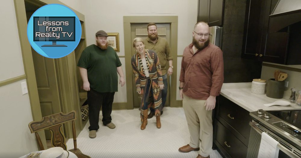
Of course, Connor needs his own kitchen and dining area, but this second kitchen will differ from the cafe kitchen. For one thing, there’s a much smaller footprint in this area, so Erin and Ben have to find a layout that will work with the space. They decide to put all the cabinets and appliances on one wall, and pair it with a small breakfast table off to the side.
While designers usually like to use light colors in small spaces in order to make it feel brighter and bigger, Erin and Ben decide to go with a more rugged feel and install dark cabinets they know Connor will love. With cream-colored walls and light countertops, this kitchen is perfectly cozy and homey.
“It’s small but mighty,” Erin says.
Is this ‘Home Town’ house a hit?
Ben and Erin transform this old house into a beautiful cafe with a modern living space—but it takes a lot of work and a big budget.
While the brothers purchase the house for just $22,000, Erin and Ben need $170,000 to renovate it. In the end, Connor and Elliot are all in at $192,000, but this price seems well worth it. The cafe looks amazing, and the living quarters are perfect for Connor.
It looks like Erin and Ben’s first restaurant renovation is a big success!
The post Erin and Ben Napier on ‘Home Town’ Reveal One Key Thing Every Kitchen Design Should Have appeared first on Real Estate News & Insights | realtor.com®.
No comments:
Post a Comment